The network for creativity
Join 1.25M professional creatives like you
Connect with clients, get discovered, and run your business 100% commission-free
Creatives on Contra have earned over $150M and we are just getting started
Back to feedPost
Taste Test
Which would you pick?
95 voted
59%
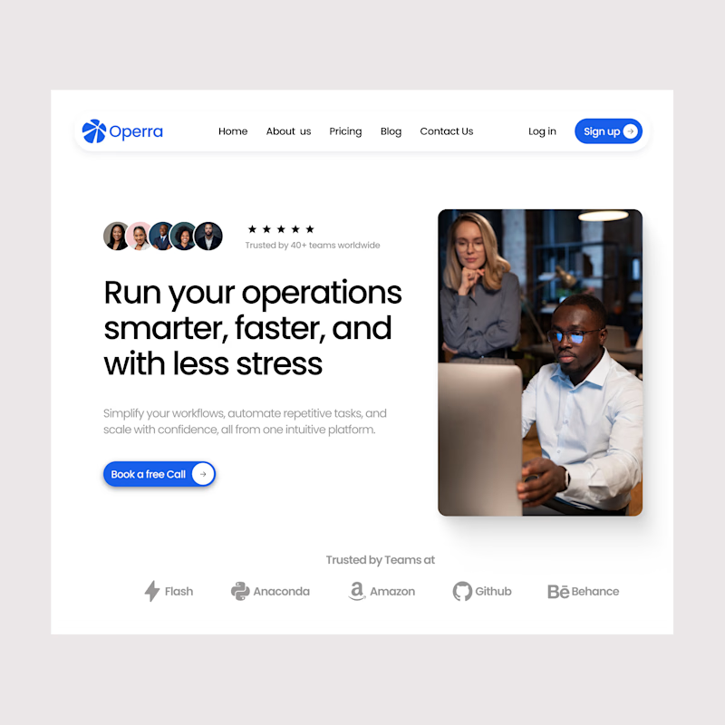
66 voted
41%
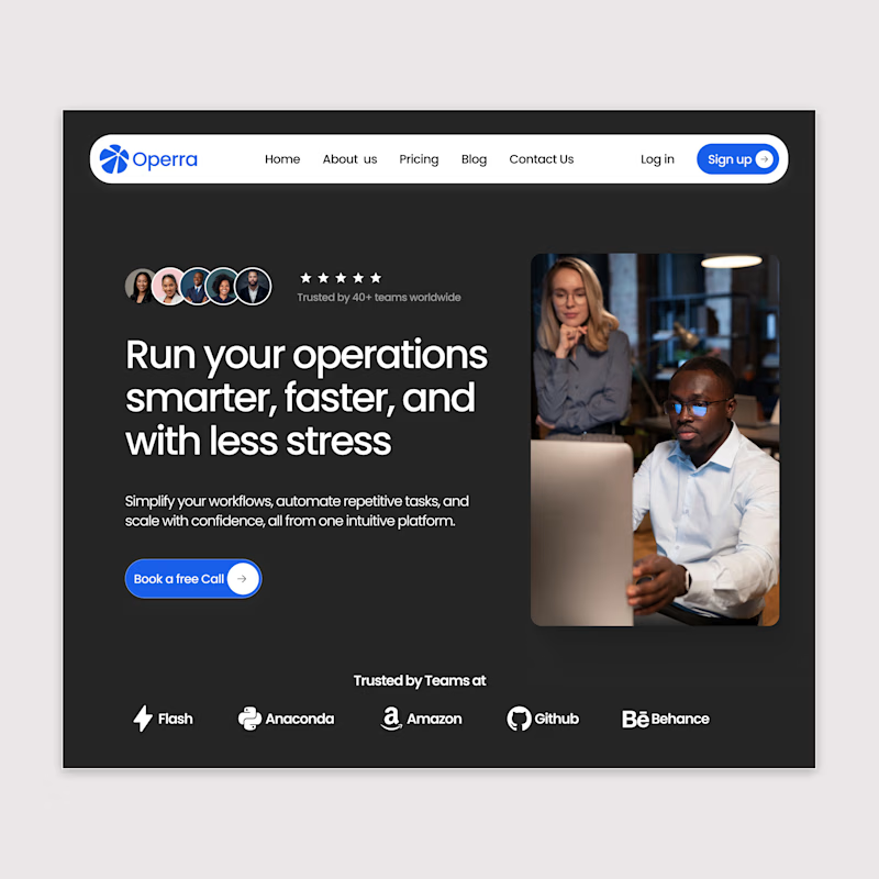
161 votes
Closed

I prefer white. Great design

Thank you sir

Black appears with high elegance.
Thanks
Appreciate thee Feedback

Dark

black looks more better
Thanks

structured and clean work!
Thank you sir


I’d pick the black version🙌
On the white one, the current shadow makes the navigation and button look less clean.
In the black version, this issue isn’t noticeable, so it feels more polished overall.
Thanks for the feedback

Both looks awesome Hissa 🙌
Thanks

And what are the improvement sir

I’d pick black if this is a daily use ops tool. The darker surface makes the content feel calmer and more focused, especially with dashboards or long sessions. White feels friendlier, but also a bit more “marketing page” to me
Thanks for the feedback

Always a big fan of dark theme. Both desings look great

Definitely Team Black, it's so easy to look at.
Thanks

I think the white just works better for an enterprise solution, but maybe that’s why you would choose it, it stands out! Great work!

Why not both?

Team black🚀

As a dev, you can never go wrong with Black theme :)

Light Mode goes for me.


nice work

White looks nice

I will always go with black

I prefer white, it's cleaner and feels more professional.
Nice work btw

I go with white

White looks good as well... But dark mode is my fav


I prefer white because it's a default for a design in that niche. I could have chosen both, but it's a choice thing. I'll go for white.
Thanks

I prefer the White more
I am team White

Nice work

white looks really clean


I’d prefer the white version.
But if you need to emphasize the buttons in the navigation bar, the dark version is more suitable.

Dark mode. Always!
The network for creativity
Join 1.25M professional creatives like you
Connect with clients, get discovered, and run your business 100% commission-free
Creatives on Contra have earned over $150M and we are just getting started





