The network for creativity
Join 1.25M professional creatives like you
Connect with clients, get discovered, and run your business 100% commission-free
Creatives on Contra have earned over $150M and we are just getting started
Back to feedPost

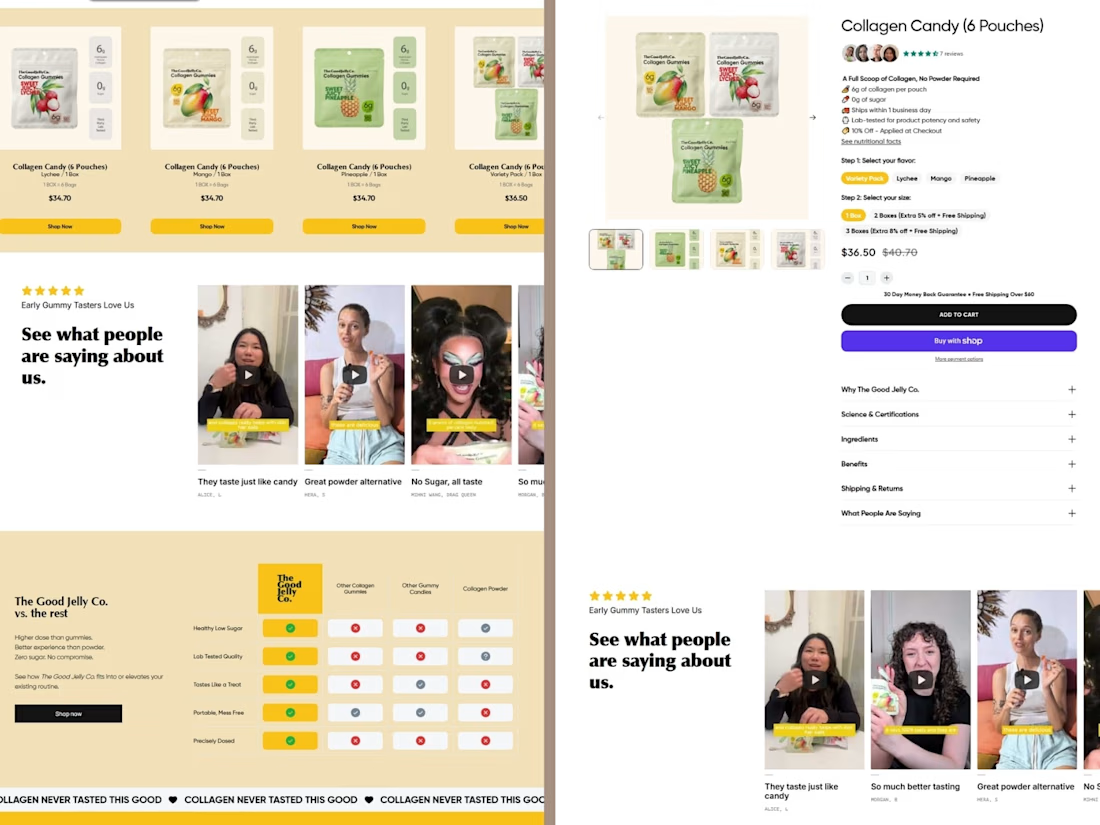
Shopify Instant AI Page Builder was used to build this collagen brand website.
Many supplement websites feel boring and hard to follow. Users do not enjoy the experience and often lose interest. The message is not clear, and the product value feels weak.
I created a clean and simple layout with bold text and soft colors. I focused on clear sections to show the problem, solution, and real benefits. I used short sentences and strong visuals to make everything easy to understand.
Now the website feels fresh, fun, and easy to use. Users can quickly see the value and trust the product. It also creates a daily lifestyle feeling, not just a supplement.
This project helped me improve simple design, clear message, and user-friendly flow.




Great work!
Clean, simple, and very engaging design. The message feels clear, and the layout makes it easy to understand the product’s value. Really like the fresh and user-friendly approach well done!
The network for creativity
Join 1.25M professional creatives like you
Connect with clients, get discovered, and run your business 100% commission-free
Creatives on Contra have earned over $150M and we are just getting started







Related posts


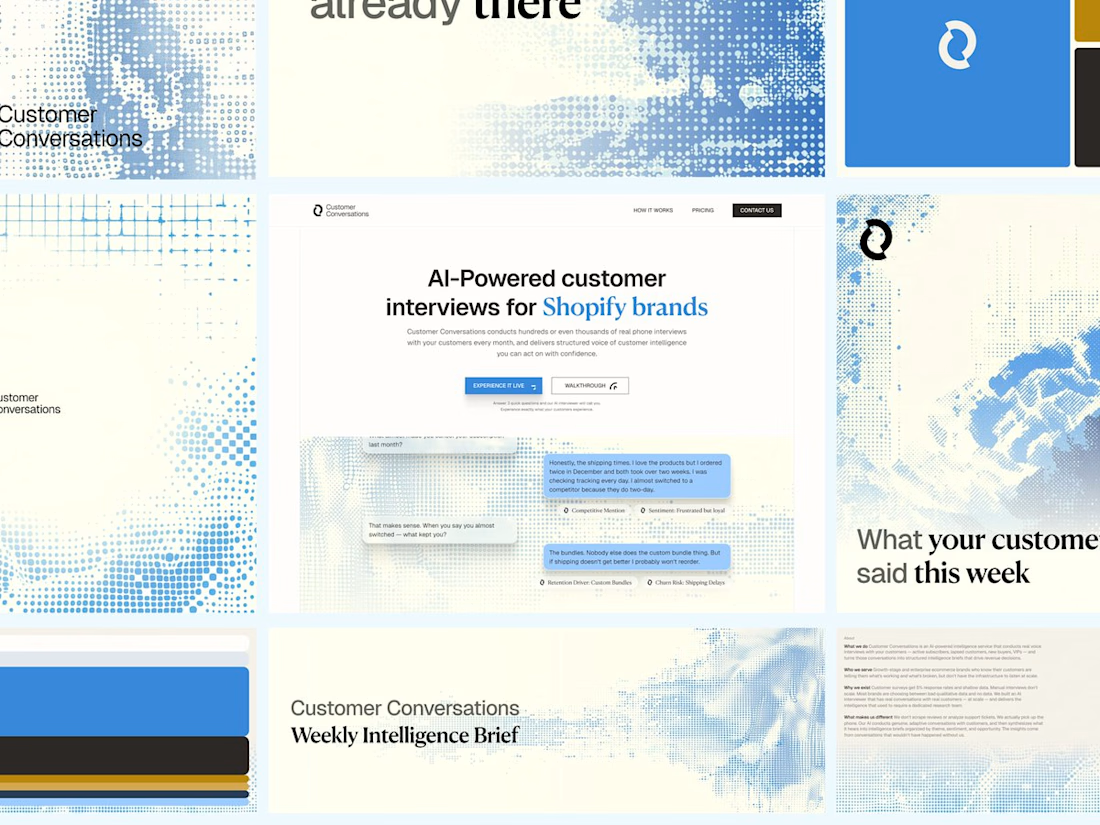
Customer Conversations is an AI that calls a store's customers and interviews them. Explaining that took half of every sales call.
Three weeks after Bryan Starck brought it to us, it had a brand and a homepage built to do the explaining. Answer three questions and the AI calls you for a real interview in 60 seconds.

Nice design


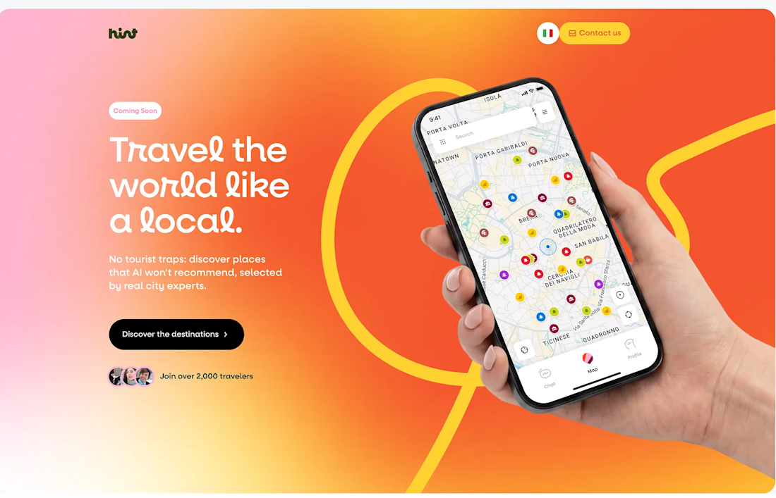
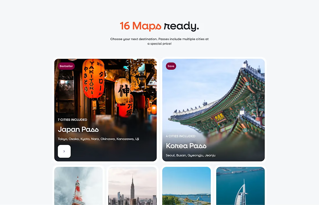
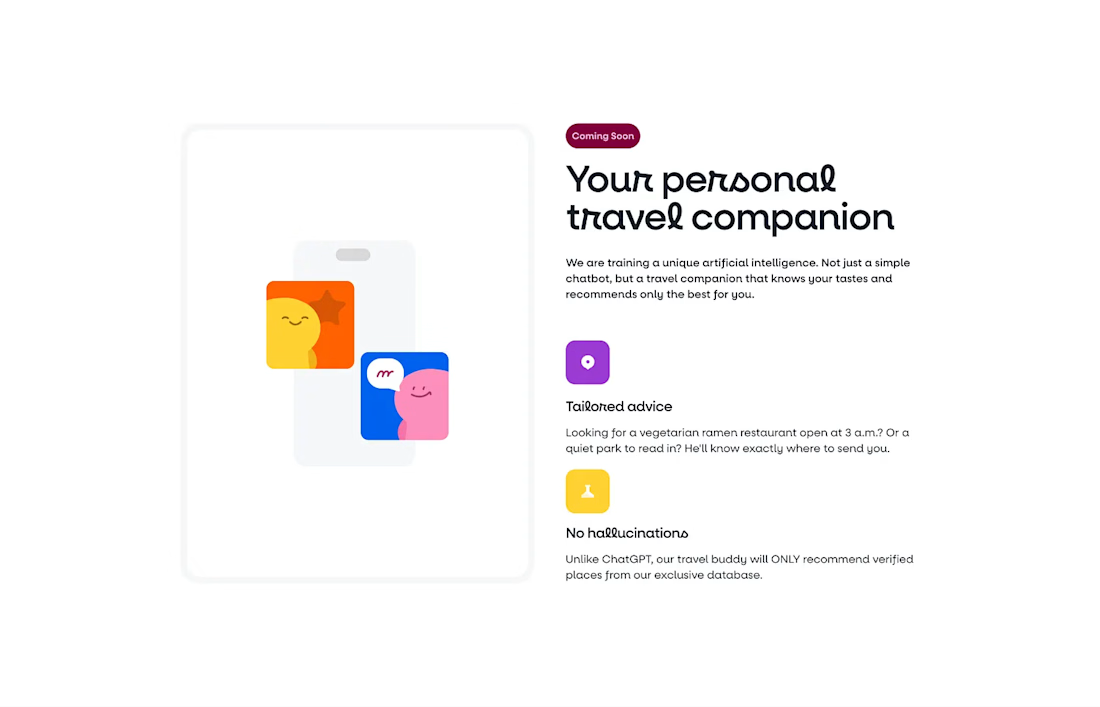


The design feels clean and inviting. Love the direction for Hint!


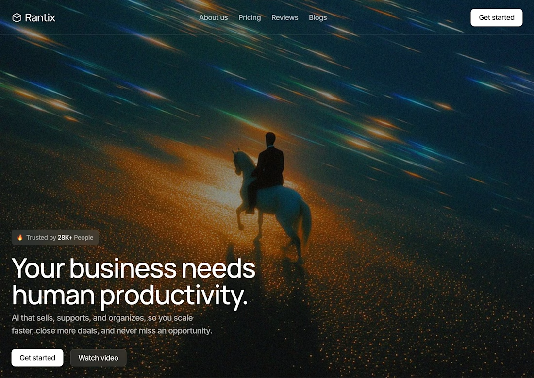

Great design the visual effects is unique 🎉🎉