The network for creativity
Join 1.25M professional creatives like you
Connect with clients, get discovered, and run your business 100% commission-free
Creatives on Contra have earned over $150M and we are just getting started

The network for creativity
Join 1.25M professional creatives like you
Connect with clients, get discovered, and run your business 100% commission-free
Creatives on Contra have earned over $150M and we are just getting started











Related posts

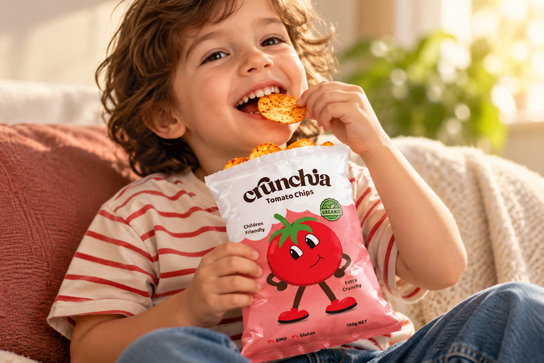
Crunchia – Brand Identity & Packaging Design
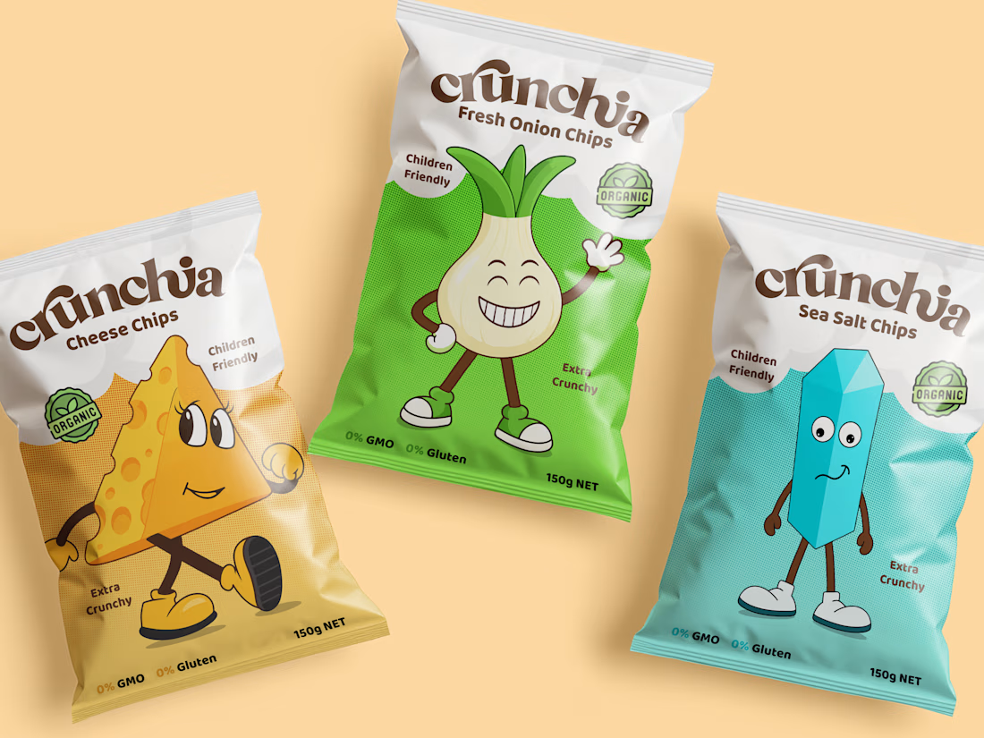
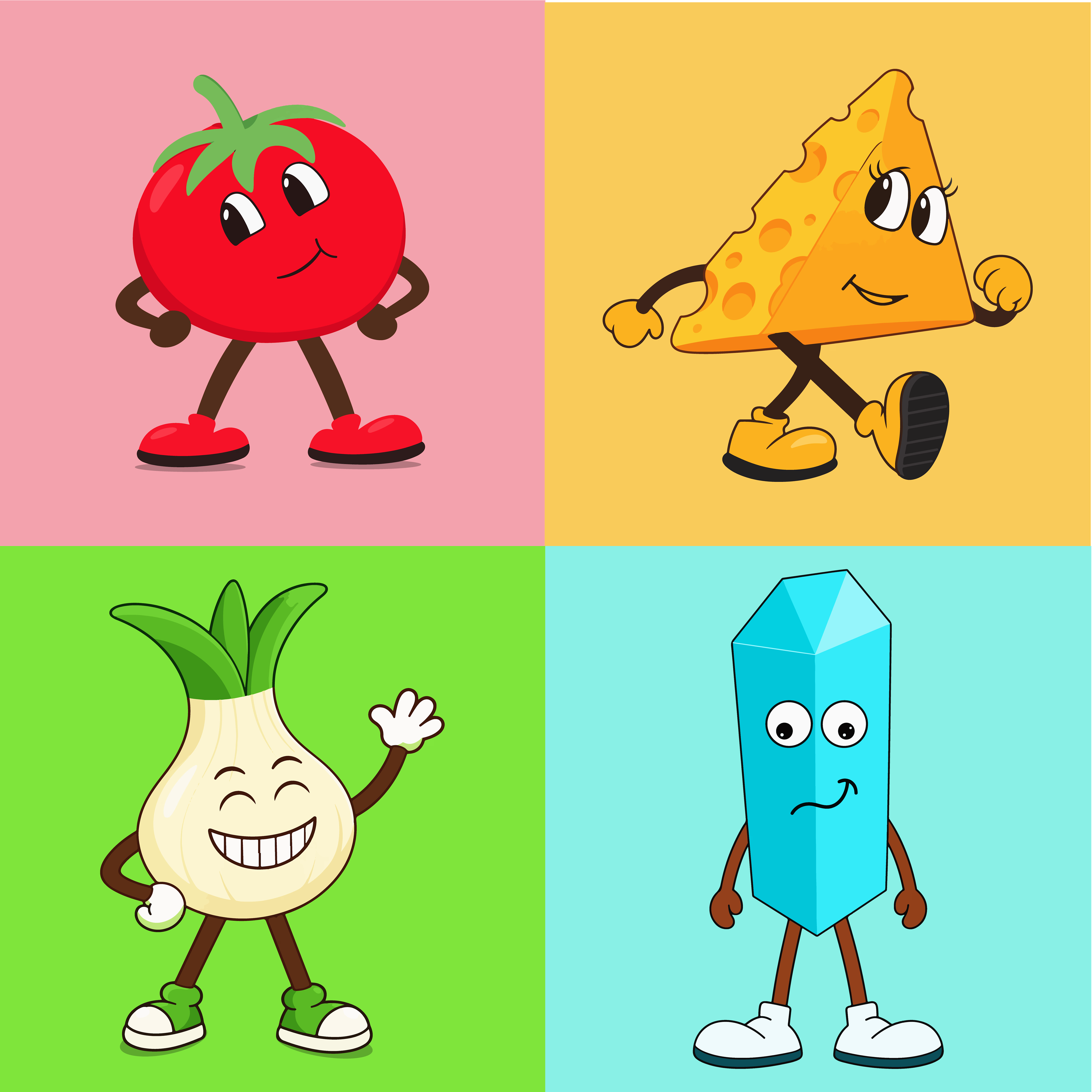
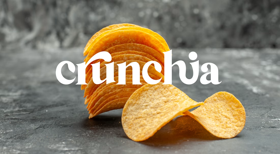
Developed a playful and eye-catching brand identity and packaging design for Crunchia, a tomato chips brand aimed at children and families. The project included a custom logo, vibrant packaging design, and a friendly tomato mascot to create a memorable and recognizable brand.
I also created realistic product mockups and lifestyle visuals to showcase the packaging and present the product in an engaging, market-ready way.




One thing I really liked exploring with ZAPPED was the contrast between the typography and the illustrations.
The front of the packaging is all about the big wordmark and the character, but when you look at the back, it feels more like a technical report. I added a little “Misfit Quality Audit” checklist, some sidebars and all the product details to make it feel like ZAPPED is actually checking the quality of these weird-looking potatoes.
I also wanted the typography to have that same contrast. The main type is chunky, bold and full of personality, while the smaller text uses a clean, typewriter-style font. I like how these two styles work together. One grabs your attention, while the other keeps all the information easy to read.
I think this contrast makes the packaging more interesting. It's playful and a little chaotic, but there's still some structure to it.
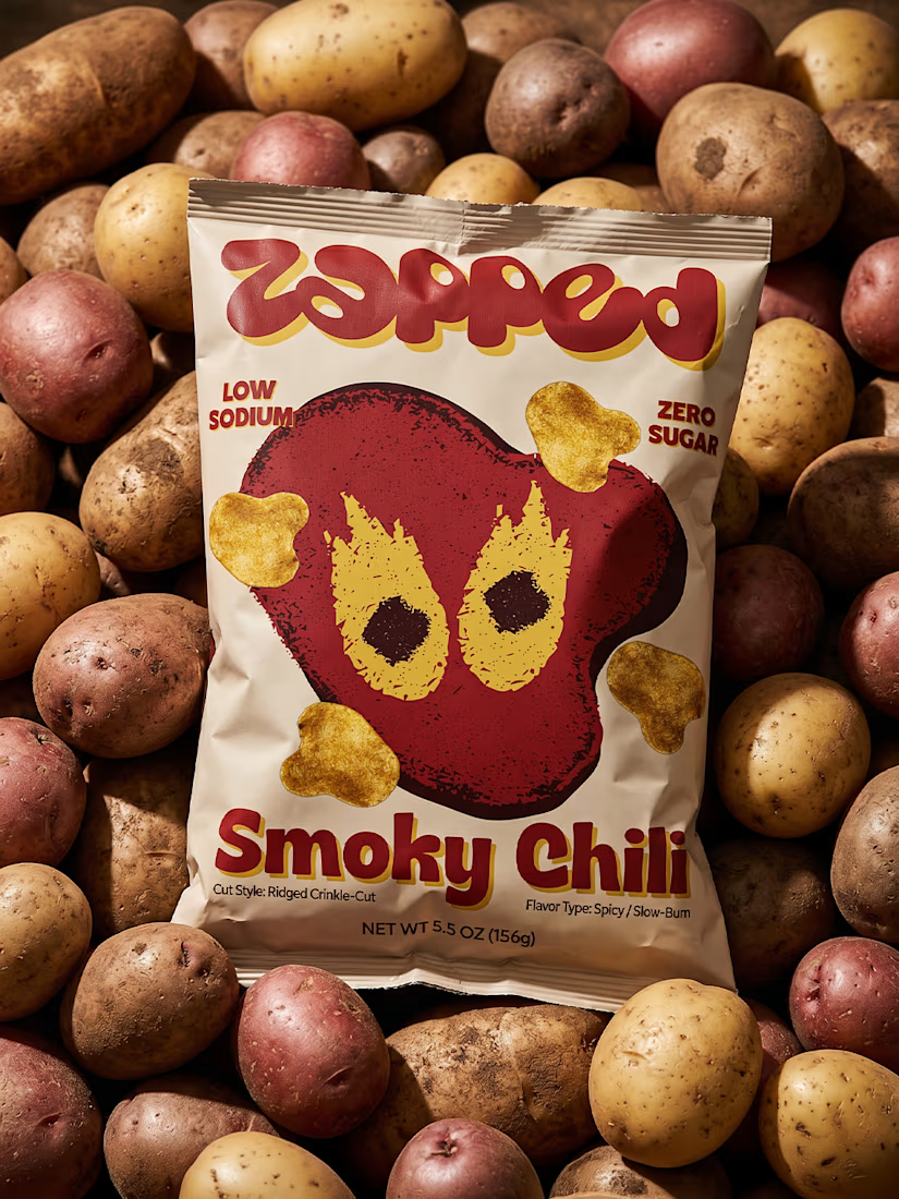
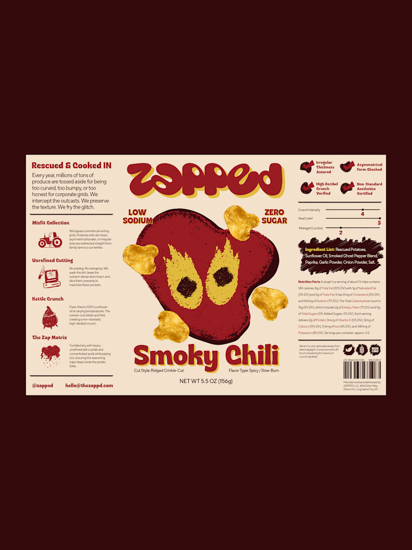


The chunky wordmark against the typewriter-style back panel works nicely, and the deep maroon makes the yellow chili illustration pop off the bag.

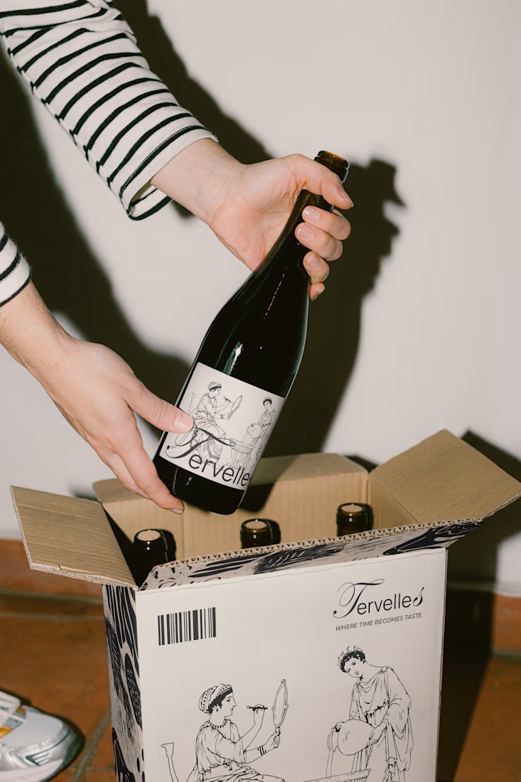
TERVELLES — Wine Packaging Design
I developed packaging design for TERVELLES, a premium wine brand. The project includes wine labels, branded boxes, and packaging elements, combining elegant typography, artistic illustrations, and a timeless aesthetic.