The network for creativity
Join 1.25M professional creatives like you
Connect with clients, get discovered, and run your business 100% commission-free
Creatives on Contra have earned over $150M and we are just getting started
Back to feedPost
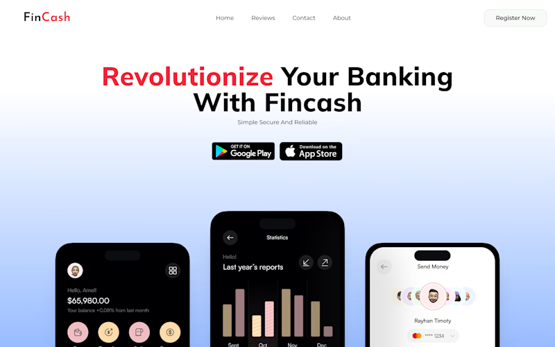
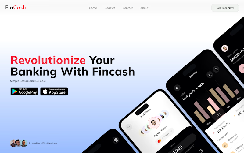
Taste Test
Testing two hero layouts for Fincash. Same message, different visual flow. Which one feels clearer to you, left or right?
2 voted
40%
3 voted
60%
5 votes
Closed
Right feels clearer. The diagonal phone composition adds movement and naturally guides the eye from headline → CTA → product. Feels more premium.
Love your perspective Abhiram. i think you haven't voted yet it, please have a vote
Thanks, Sachin! Will vote now.
@Sachin Das Right One 🔥
💯 Thanks for your voting Asif
FOr me!!! right wins
It won, thanks for voting!
The network for creativity
Join 1.25M professional creatives like you
Connect with clients, get discovered, and run your business 100% commission-free
Creatives on Contra have earned over $150M and we are just getting started
Related posts
Clean!
Without knowing what it's for, here's a very uniformed critique:
I really like how it looks as a whole, the lowercase vibe makes it feel modern and approachable, I'm assuming is for some sort of tech brand, like a digital app or something. Something feels off on the...
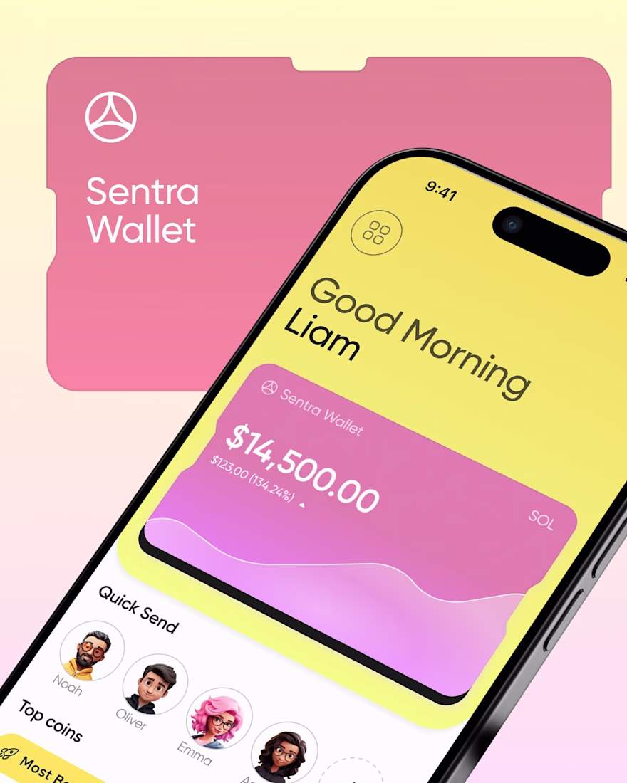
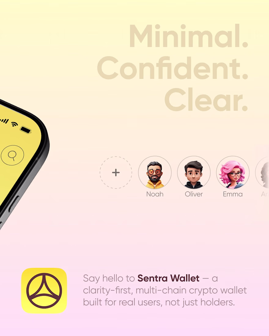
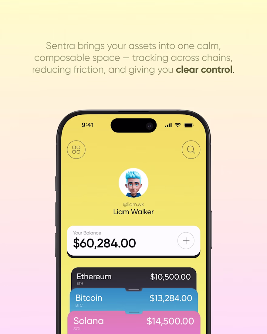
One of our older concepts that still stands out to us is Sentra Wallet.
At the time, most crypto wallets leaned into dark themes and interfaces that felt built for experienced users. We wanted to explore a different direction. Something brighter, friendlier, and easier to navigate without losing the feeling of security or control.
The goal was simple: make managing digital assets feel approachable. We focused on clear information hierarchy, intuitive navigation, and a visual identity that didn't rely on the usual Web3 design trends.
Looking back, we'd definitely refine parts of it today, but the core idea remains the same. Great product design isn't about making crypto look more complex. It's about making it feel easier to use.
Going brighter and friendlier for a crypto wallet is still the harder design problem, most teams default to dark mode because it's easier to fake secure. What was the biggest pushback from users used to the darker wallet convention?
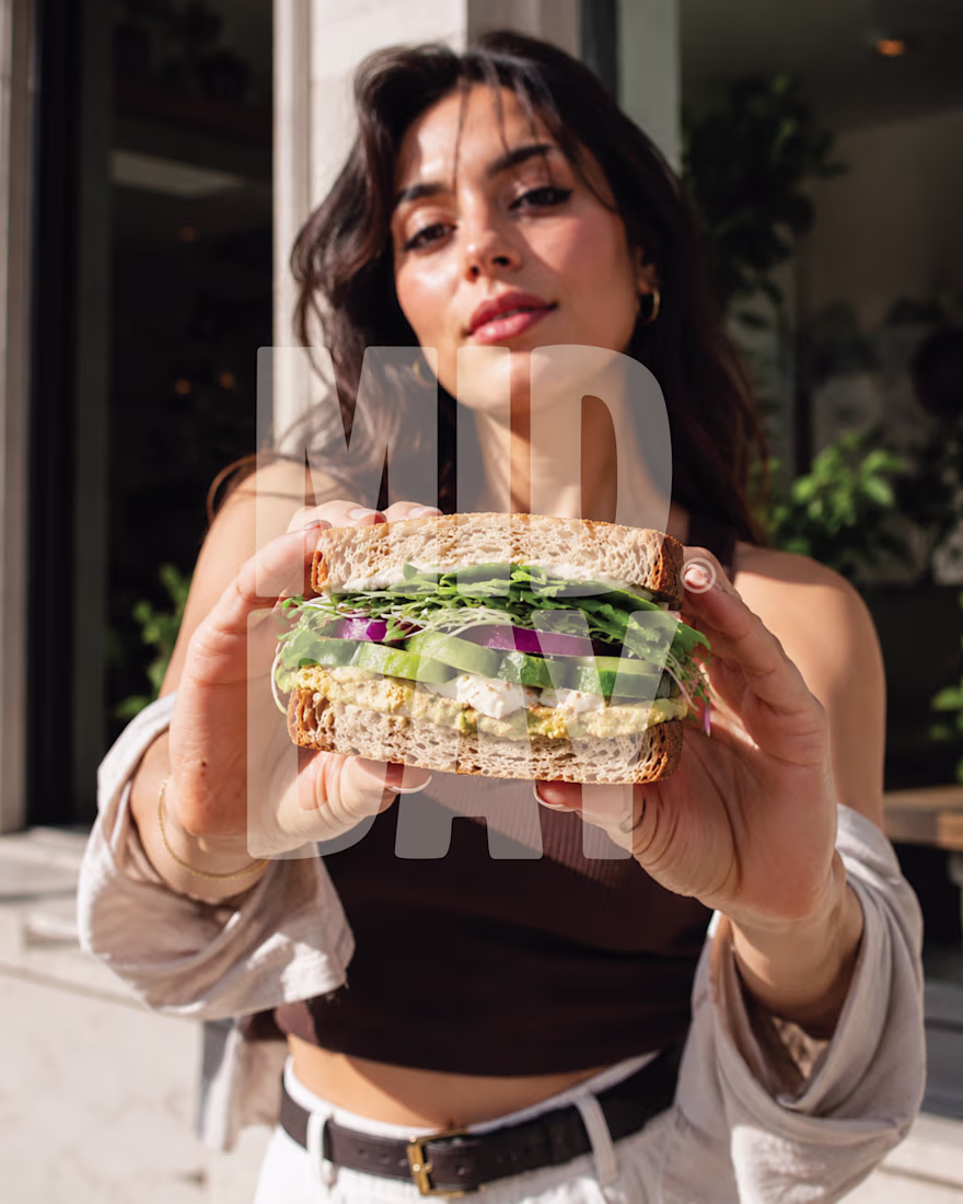
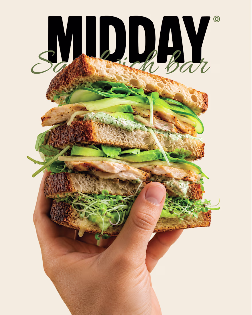
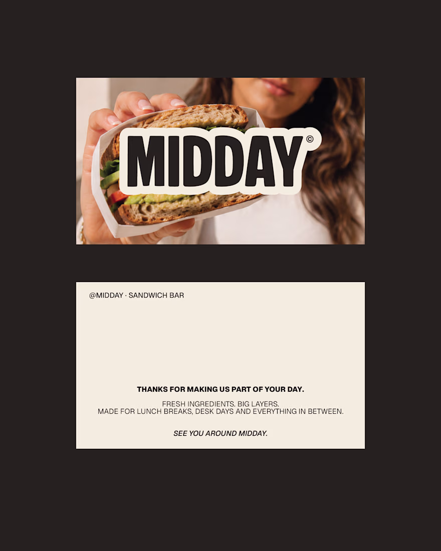
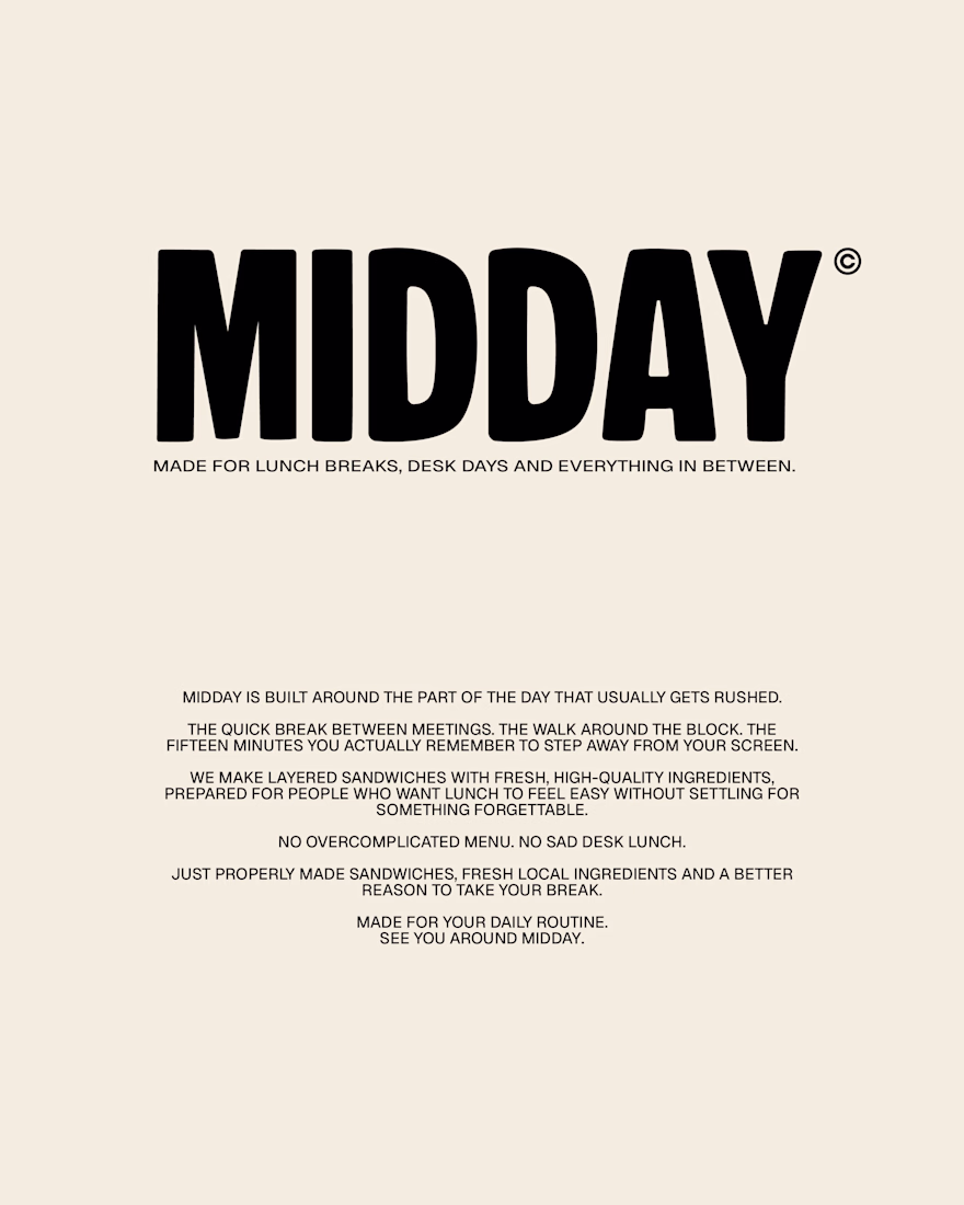
MIDDAY | Sandwich Bar Brand Identity
A self-initiated brand identity for MIDDAY, a contemporary sandwich bar built around one simple idea: everyday lunch should still feel worth looking forward to.
The identity combines bold editorial typography, warm lifestyle photography and familiar deli-inspired details to create something considered, approachable and easy to return to.
Your 12:30 deserves better.
more posts on this one in the upcoming days!
Amazing work!
Trending
Claude
Claude has entered the design space. How are you using Claude Design?
Contra University
Learn from expert creatives how to earn more using next-gen AI tools.
creativeaiflow
Creative AI workflows are evolving. What tools do you use, and what are their strengths and weaknesses?
freelancerlife
Freelancer life is wins, pivots, and everything in between. What’s yours right now?