The network for creativity
Join 1.25M professional creatives like you
Connect with clients, get discovered, and run your business 100% commission-free
Creatives on Contra have earned over $150M and we are just getting started
Back to feedPost

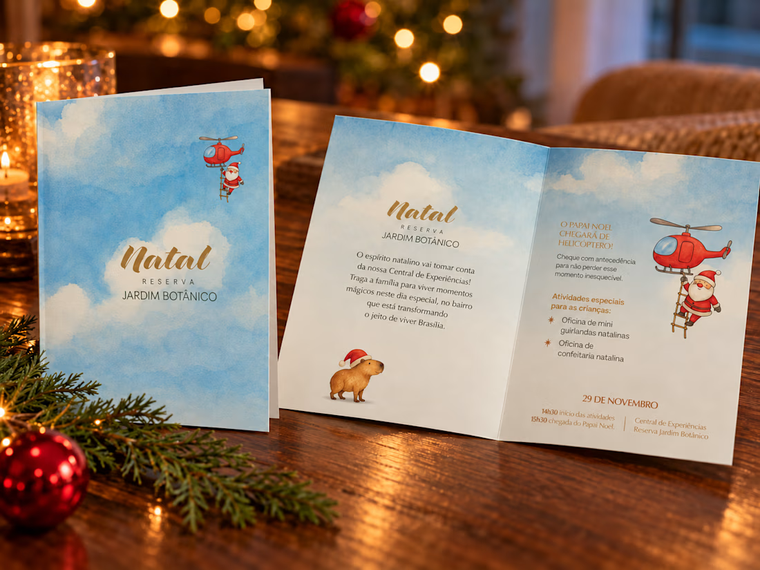
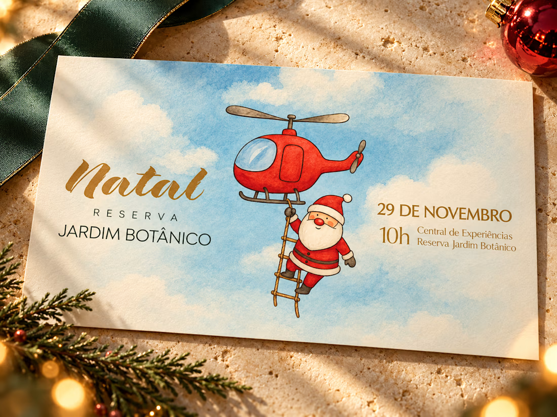
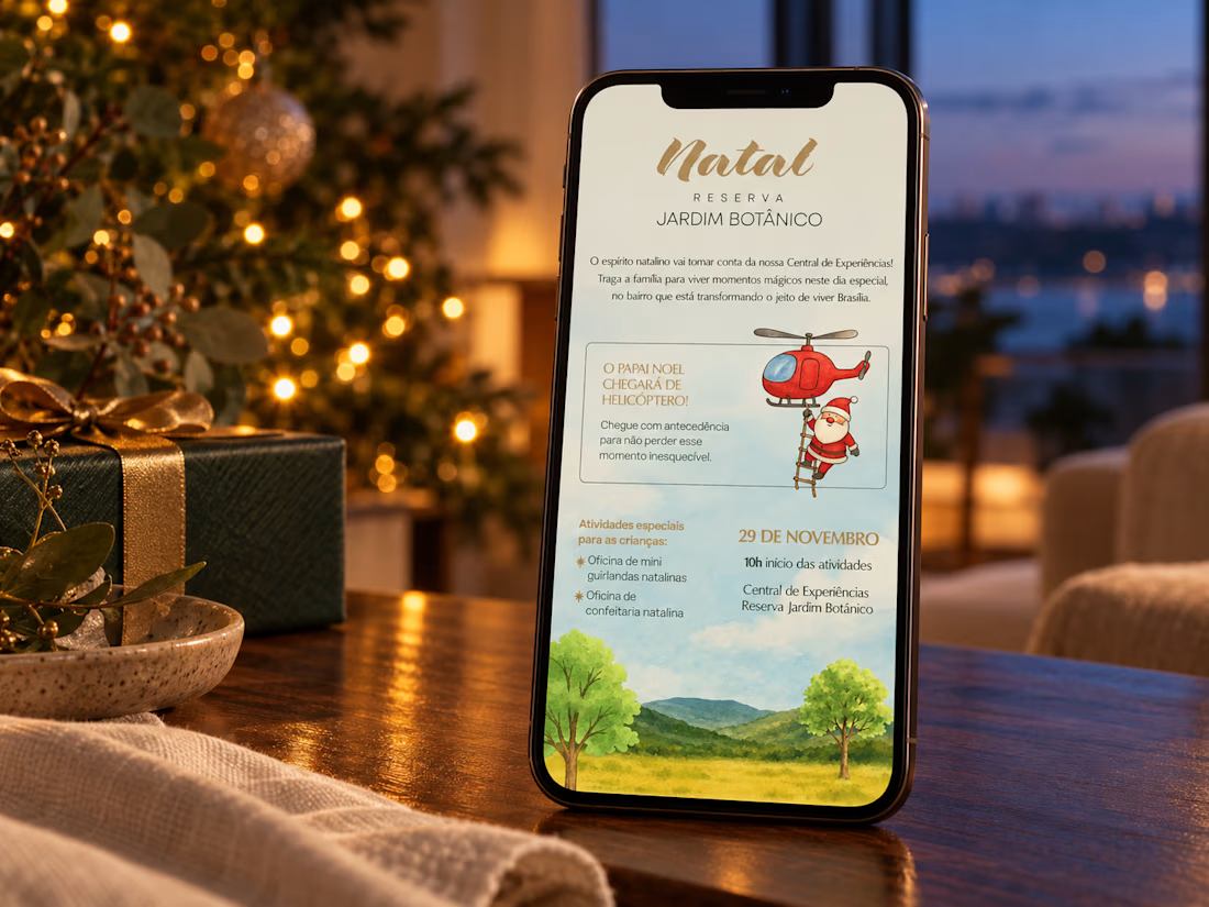
Christmas is getting closer, and for us designers, that means it’s already time to think ahead. I’ve been revisiting some festive work, including this campaign for Reserva Jardim Botânico, a real estate development in Brasília.
Does anyone else find the line between charming Christmas design and something painfully kitsch surprisingly thin? A little more gold, one extra ornament, another festive font… finding the right balance can be tricky.
For this project, having a clear theme helped. Although it was a sales and client relationship event for a real estate brand, the celebration was centred on children and their families.
I leaned into a children’s storybook illustration style, with watercolour skies, soft colours and two characters connected to the event.
The capybara brings a local reference to a celebration set in Brazil’s Cerrado. And Santa hanging from a helicopter wasn’t just a playful invention: he actually arrived by helicopter and came down to meet the children.
Those details gave me a story to work with and a reason for the visual choices.
I’d love to hear what fellow designers think. Does this approach strike the right balance? How do you decide when festive feels inviting, and when it starts to feel overdone?
The network for creativity
Join 1.25M professional creatives like you
Connect with clients, get discovered, and run your business 100% commission-free
Creatives on Contra have earned over $150M and we are just getting started



Related posts

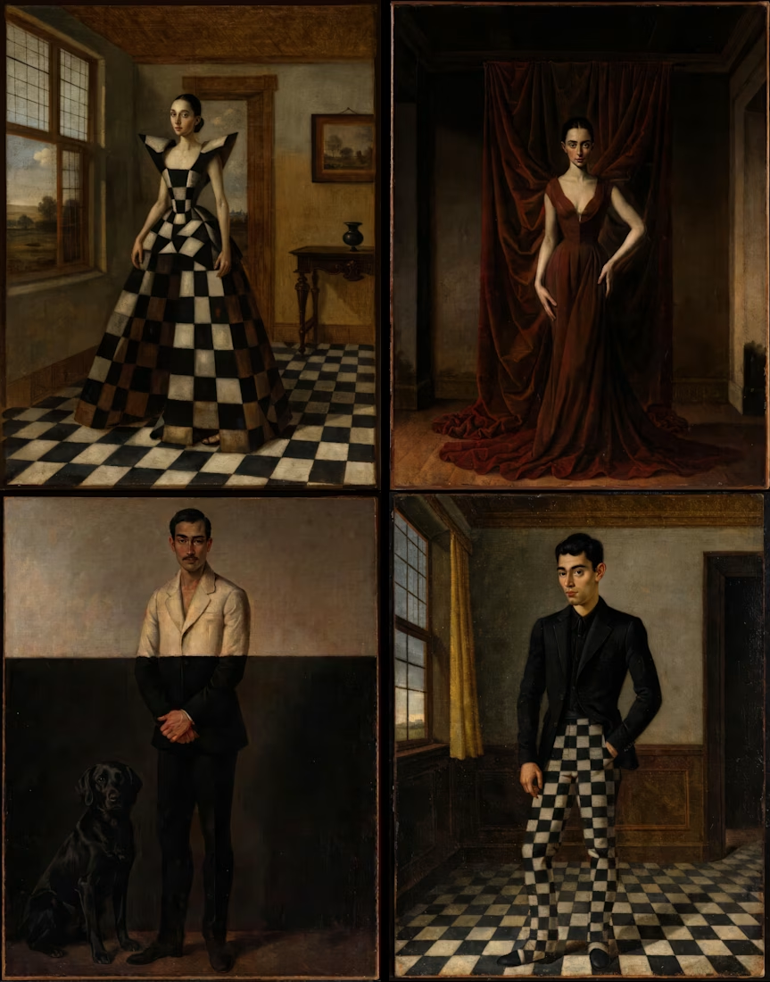
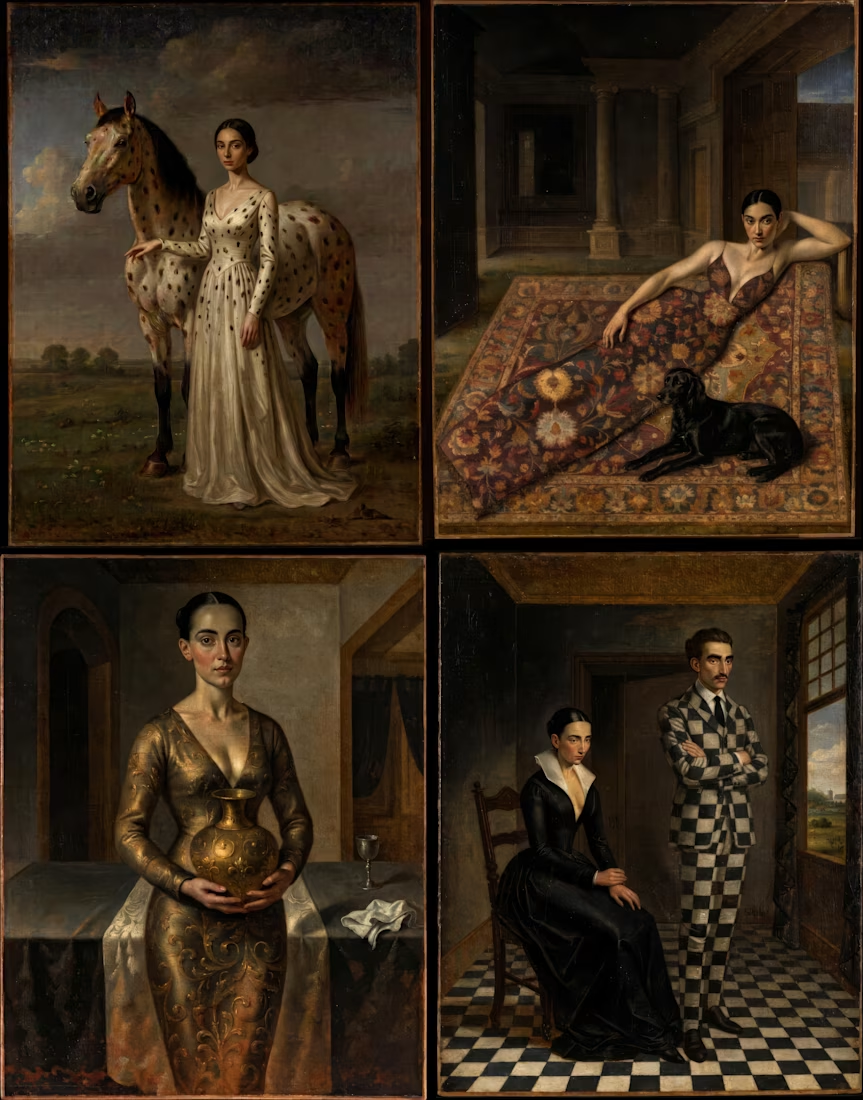
MIMESIS
What happens when fashion becomes part of a painting?
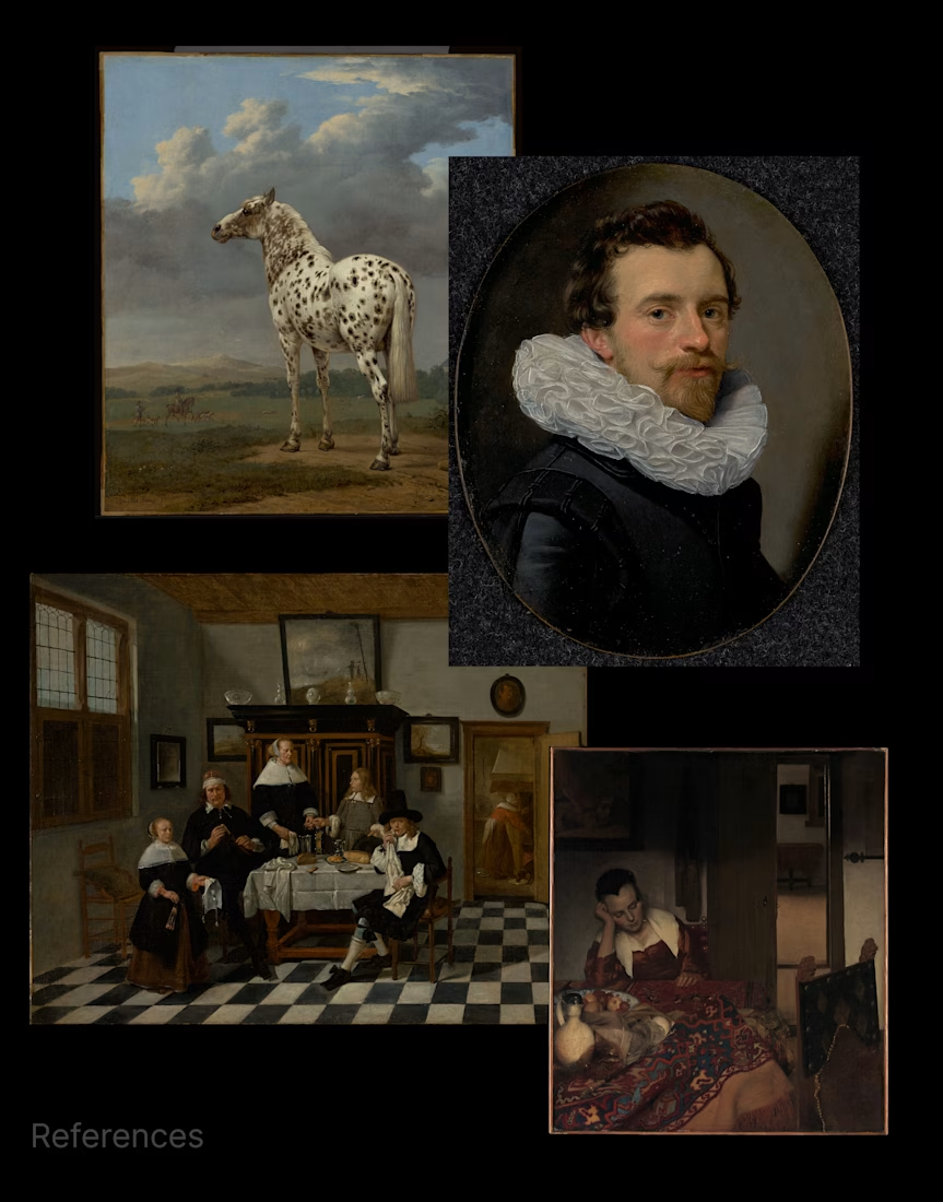
Inspired by 17th-century Dutch paintings from the Getty collection, I created a custom style in Recraft to explore the relationship between fashion, art, and visual perception.
From patterned floors to velvet curtains and spotted horses, each look blends into its surroundings, blurring the line between clothing and the world around it.
Created for the Contra × Recraft Archive Style Challenge.



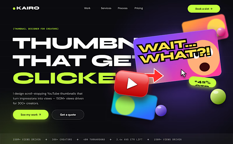
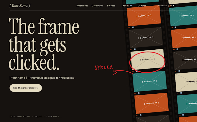
I explored two directions for a thumbnail designer’s portfolio and can’t decide.
A: loud, editorial, poster-like
B: quieter, cinematic, built around a photographer’s contact sheet
Which one is more memorable, and which has the better first screen? Honest feedback welcome. Concept project, placeholder content.


5 voted
63%
3 voted
37%
8 votes
Closed

Voted v2. The contact sheet idea feels specific to a thumbnail designer, while v1 is louder but more generic.

For this challenge, I decided to redesign the existing website of Savannah Space,https://savannahspace.com/ , a Kenyan furniture brand whose eclectic designs celebrate African luxury.
My goal was to translate that visual identity into a more elevated, luxurious digital experience. The current website directs customers to downloadable documents and catalogues, making product discovery more tedious than it needs to be.
I created an editorial-style website that feels like an exploratory journey, with details that reward curiosity. One of the new features is Shop the Room, where visitors can explore thoughtfully designed interiors and discover the furniture within them before deciding what they want to bring into their own spaces.
Demo video in the comments.

savannahspace.com
Savannah Space
Furniture and Home Decor items made in Kenya. Do you make furniture? Register to become one of our vendors.
the catalogue are actual products sold by the brand whereas tsome of the interior visuals are ones i generated using AI and reiterated till they brought out my desired feel of the brand.