The network for creativity
Join 1.25M professional creatives like you
Connect with clients, get discovered, and run your business 100% commission-free
Creatives on Contra have earned over $150M and we are just getting started
Back to feedPost

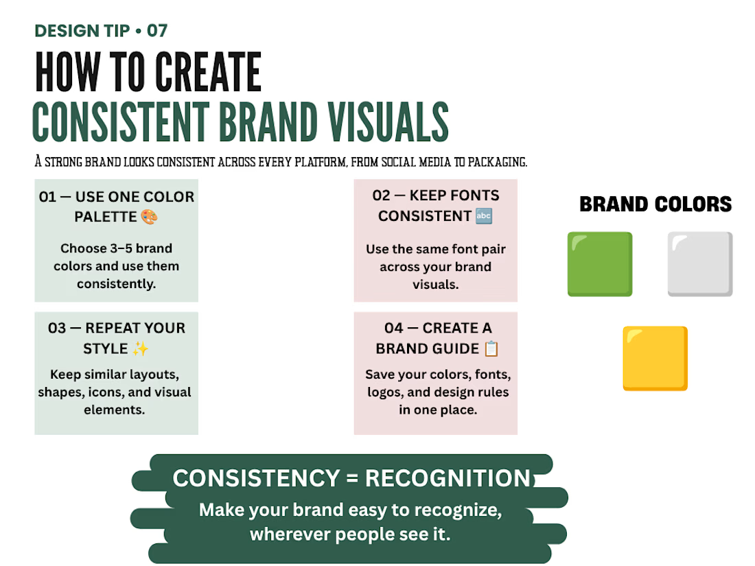
How to Create Consistent Brand Visuals
A visual design tip project focused on the importance of brand consistency.
The concept explains four key principles that help brands maintain a recognizable and professional visual identity:
• Consistent color palette
• Consistent typography
• Repeated visual elements
• A clear brand guide
The design uses a clean editorial layout, soft neutral backgrounds, dark green typography, and subtle gold accents to demonstrate how a consistent visual system can create stronger brand recognition.
Skills: Graphic Design, Branding, Visual Identity, Typography, Layout Design, Social Media Design

The network for creativity
Join 1.25M professional creatives like you
Connect with clients, get discovered, and run your business 100% commission-free
Creatives on Contra have earned over $150M and we are just getting started





Related posts

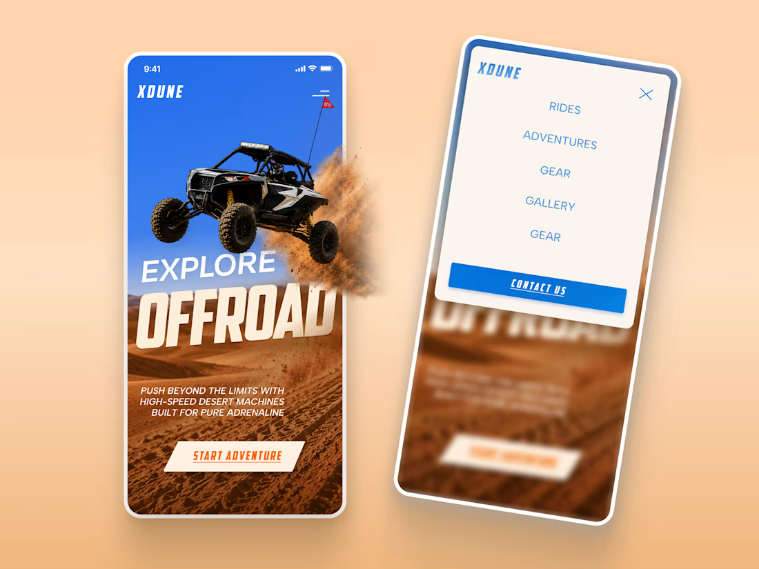
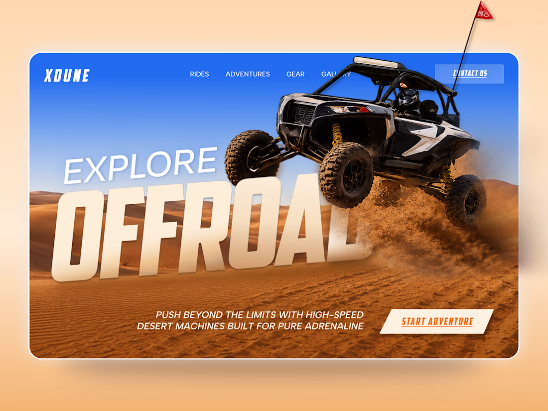
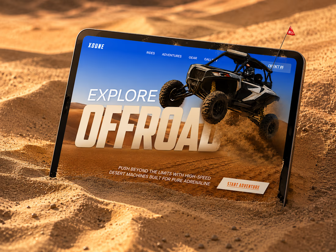
XDUNE — Off-Road Adventure Landing Page
A bold landing page concept built around speed, freedom, and off-road adventure 🔥
The visual direction combines desert landscapes, oversized typography, and a dynamic vehicle composition to make the experience feel energetic from the first screen
Special attention was given to:
• Strong action-focused hero composition
• Bold typography and clear hierarchy
• Desert-inspired visual atmosphere
• Adventure-focused CTA
• Responsive mobile experience
• Simple and clean navigation
The result is a high-energy landing page that feels fast, adventurous, and made for people who want to get off the road
Looking to create a bold website for an automotive, outdoor, or adventure brand? Let’s connect 🚀




love the vibe

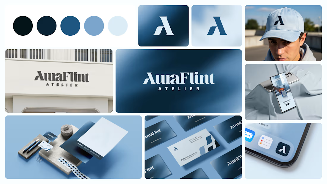
Logo Design & Brand Identity created for Auraflint Atelier — a scent & fragrance brand.
©2025

I liked colour palette.

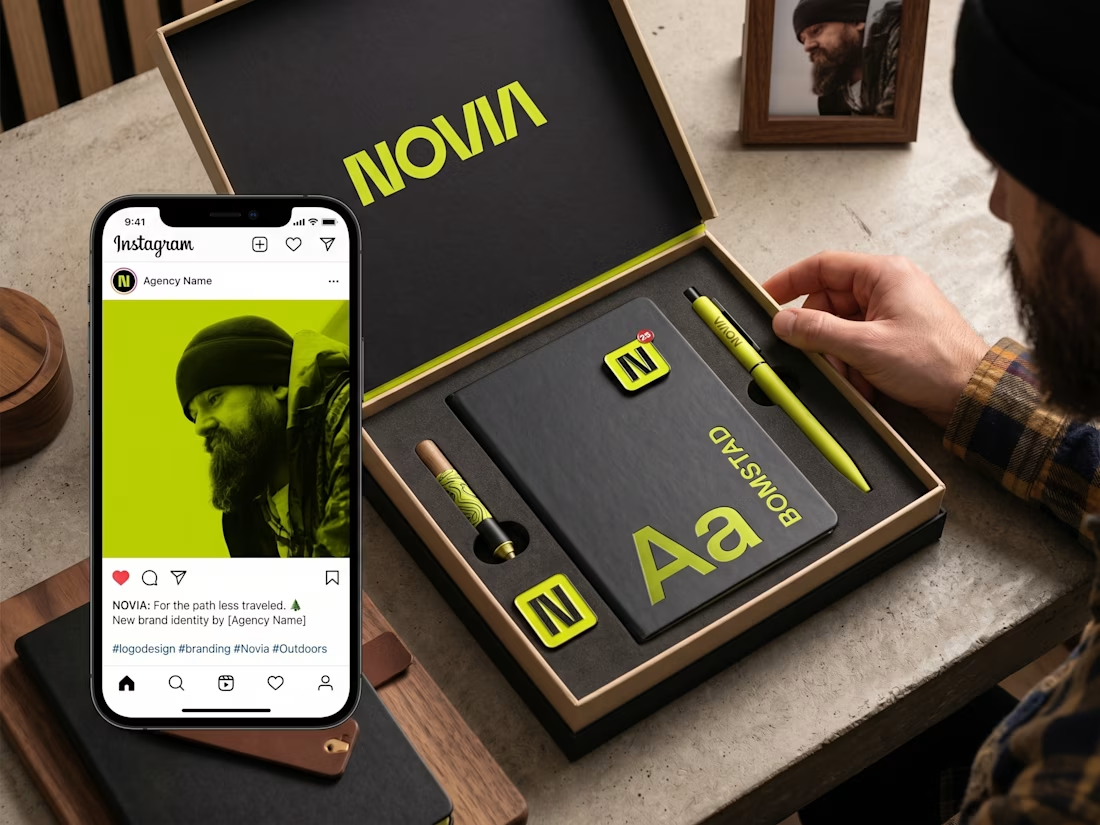
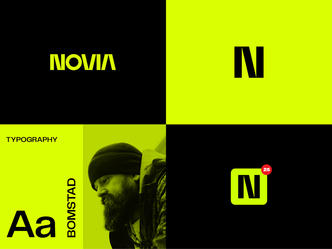
✨ Recent Work | Logo Design for Novia
Recently completed a logo design project for Novia, creating a distinctive and modern mark that gives the brand a clear visual identity.
The goal was to develop a logo that feels clean, memorable, and versatile — one that can work confidently across digital platforms, print materials, marketing assets, and future brand applications.
I focused on creating a strong balance between simplicity and personality, with careful attention to typography, proportions, visual balance, and scalability.
Project: Logo Design
Client: Novia
Services: Logo Design • Visual Identity • Typography • Brand Direction
Another identity project where a simple mark is designed to give a brand a strong and recognizable starting point.
#LogoDesign #BrandIdentity #Branding #VisualIdentity #GraphicDesign #LogoDesigner #CreativeDesign #BrandDesign #Novia