The network for creativity
Join 1.25M professional creatives like you
Connect with clients, get discovered, and run your business 100% commission-free
Creatives on Contra have earned over $150M and we are just getting started
Back to feedPost

MyHomeServices: #FigmaMakeathon Entry 🏠✨
I built MyHomeServices to simplify household management by integrating Laundry 🧺, Cleaning 🧹, and Medical Care 🏥 into one seamless UI.
Key Features:
Interactive 360 Experience: Functional "Smart Flush" and "Live Laundry" animations.
Trust-First UI: Transparent pricing and pro profiles for reliability.
Built with Figma Make to reshape service culture 🛠️.
Full Design: 🔗https://radar-wheel-16767967.figma.site/
The network for creativity
Join 1.25M professional creatives like you
Connect with clients, get discovered, and run your business 100% commission-free
Creatives on Contra have earned over $150M and we are just getting started


Related posts

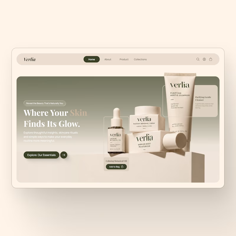
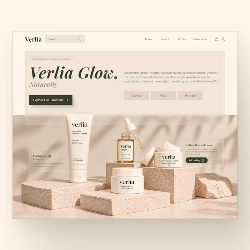
One skincare brand. Two different hero experiences.
I designed two homepage hero concepts for **Verlia**, a premium skincare brand, exploring how visual storytelling can shape a brand's first impression.
Both concepts use a warm, neutral palette and minimal luxury aesthetic, but each has its own personality.
Option 1 — Minimal & Product-Focused. A clean, framed layout that puts the products and shopping experience in the spotlight.
Option 2 — Editorial & Immersive. A bold brand introduction paired with rich product photography and a more expressive visual composition.
Which hero design would you choose for a luxury skincare website?
Vote for Opt. 1 or Opt. 2, and share what made you choose it in the comments.


7 votes
Ends in 1h


Designed a user-friendly mobile app experience for Neetha’s Studio, a sewing education platform offering online courses and tutorials.
Focused on intuitive navigation, clean layouts, course discovery, and seamless access to learning content for a better mobile learning experience.
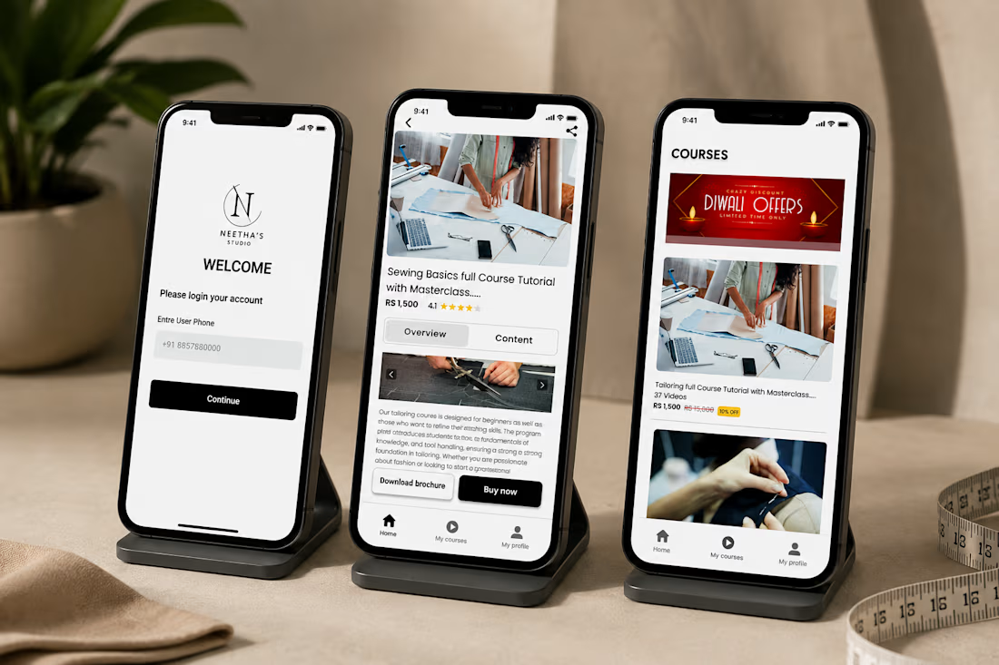

Clean execution, Aniket! Designing learning apps for craft-based skills like sewing requires a really strong focus on media visibility and step-by-step clarity. The visual hierarchy on the course detail card looks super intuitive for fast browsing. Nice work on keeping the layout clutter-free! 👏

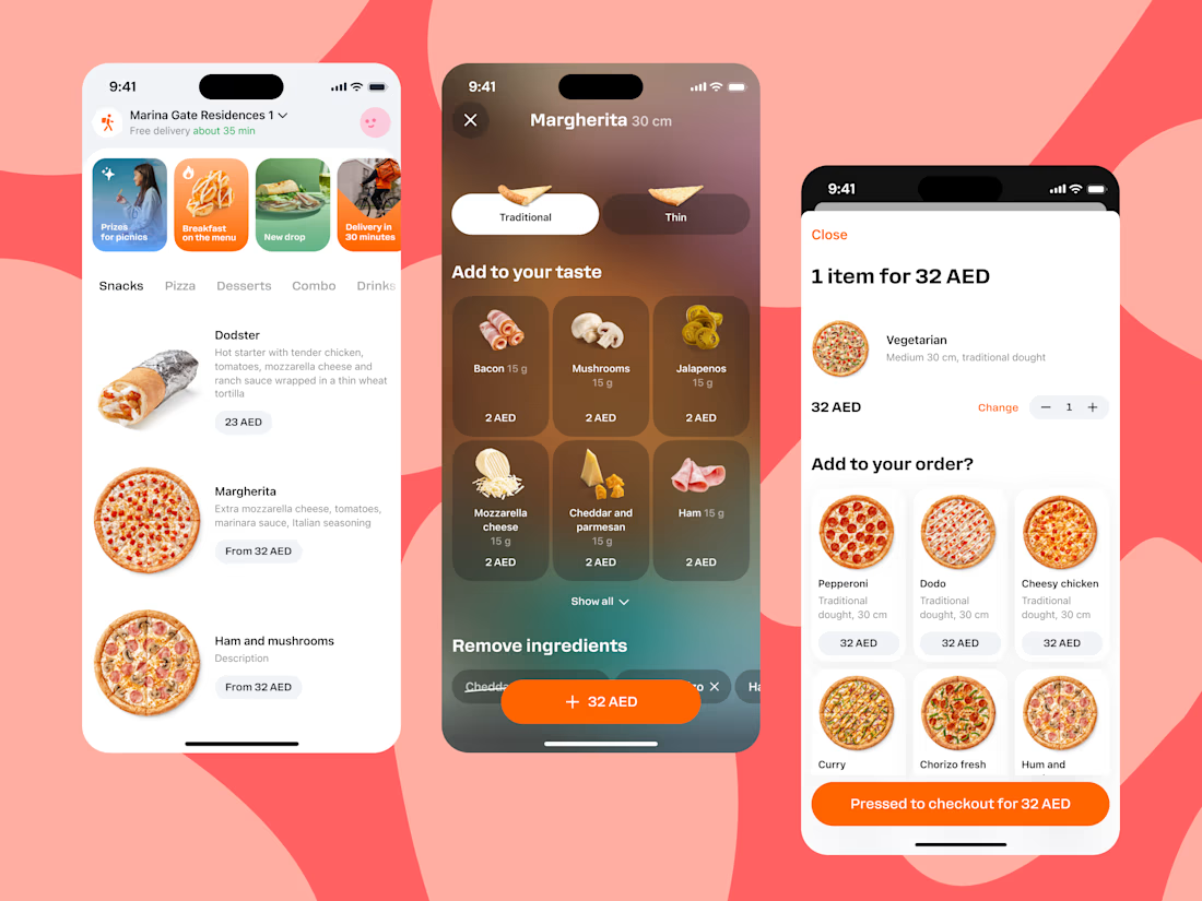
We designed and crafted an intuitive food delivery mobile app UI in Figma, featuring seamless menu browsing, interactive meal customization, and a streamlined checkout flow.
Check out the full case study on Contra and let's bring your next mobile app to life: https://contra.com/p/AObqsgcX-food-delivery-app-uiux-design?r=airzon_agency 🚀