The network for creativity
Join 1.25M professional creatives like you
Connect with clients, get discovered, and run your business 100% commission-free
Creatives on Contra have earned over $150M and we are just getting started
Back to feedPost

This one was a fun little moment. For an investment client a while back, I created and animated these simple 3D icons for the major sections of their investment portal. I then worked with our developer (this is back when I was still on staff at Pennebaker in Houston, TX) to turn those animations into hover states for the buttons beneath them. While not every client needs something like this, it goes a long way in differentiating a company from their competitors and creating a stronger impression in the users mind. 🧠


The network for creativity
Join 1.25M professional creatives like you
Connect with clients, get discovered, and run your business 100% commission-free
Creatives on Contra have earned over $150M and we are just getting started



Related posts


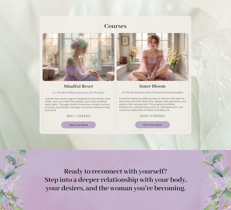
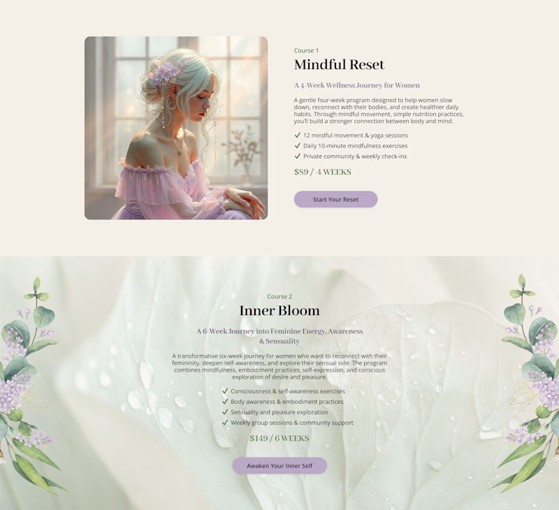
Cards or sections? How should you showcase courses on a Kajabi website?
It depends on what you want visitors to see first.
Course cards are great when you want to show the full picture at a glance – “Here are all the programs we offer.” They make the product range clear before visitors start scrolling.
Separate sections work better when each course needs more attention – its story, audience, benefits, and outcomes.
When we design Kajabi websites, we don’t use one layout for every course.
We choose the structure that makes the offer easier to understand – and easier to explore.

28 voted
65%
15 voted
35%
43 votes
Closed

Cards

CASETiFY Essentials — 3D campaign visuals
A series of 3D product films created by Se3D Studio.


Sonder One: product site for a repairable headphone
Sonder One is a headphone built to be taken apart, so this site shows it that way. As you scroll, the headphone comes apart piece by piece, from the finished pair down to its six parts, with each part labelled as it separates.
The site responds to the mouse throughout. The custom cursor holds a small sound wave that grows as you move faster. Headlines are made of soap bubbles that float up under the cursor. Guide boxes with live coordinates follow the pointer, and product photos tilt and catch the light as you pass over them.
There are three pages: Object, Anatomy and Specifications, with smooth transitions between them and a reserve form on the last page. A light and dark mode lets you view the product in chalk white or graphite.
Built with React, GSAP ScrollTrigger, Lenis, Three.js and Vite.

Good work!