The network for creativity
Join 1.25M professional creatives like you
Connect with clients, get discovered, and run your business 100% commission-free
Creatives on Contra have earned over $150M and we are just getting started
Back to feedPost


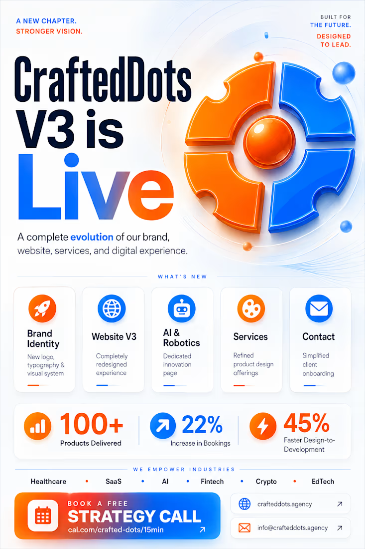
🚀 CraftedDots V3 is Live!
We've completely reimagined CraftedDots with a new logo, visual identity, typography, color system, and a faster, premium website experience.
✨ New pages:
• About Us
• AI & Robotics
• Services
• Contact
We help startups build SaaS products, brands, and digital experiences that drive measurable growth—100+ products shipped across Healthcare, Fintech, AI, Crypto, EdTech, and E-commerce.
📈 22% increase in bookings
⚡ 45% faster design-to-development
No templates. Just thoughtful product design built for growth.
🌐 crafteddots.agency
📅 Book a free strategy call: cal.com/crafted-dots/15min
📩 info@crafteddots.agency
#CraftedDots #ProductDesign #UXDesign #UIDesign #SaaS #WebDesign #BrandIdentity #AI #Startup #DesignAgency #Webflow #Framer #DigitalProducts #GrowthDesign




Nice evolution of the brand.
The network for creativity
Join 1.25M professional creatives like you
Connect with clients, get discovered, and run your business 100% commission-free
Creatives on Contra have earned over $150M and we are just getting started











Related posts

The team is cooking
Motion design for the logo we are making for Nation e-commerce


Wou

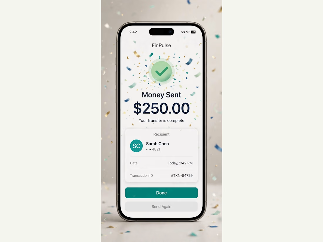
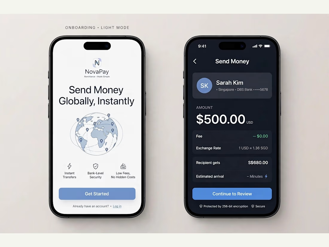
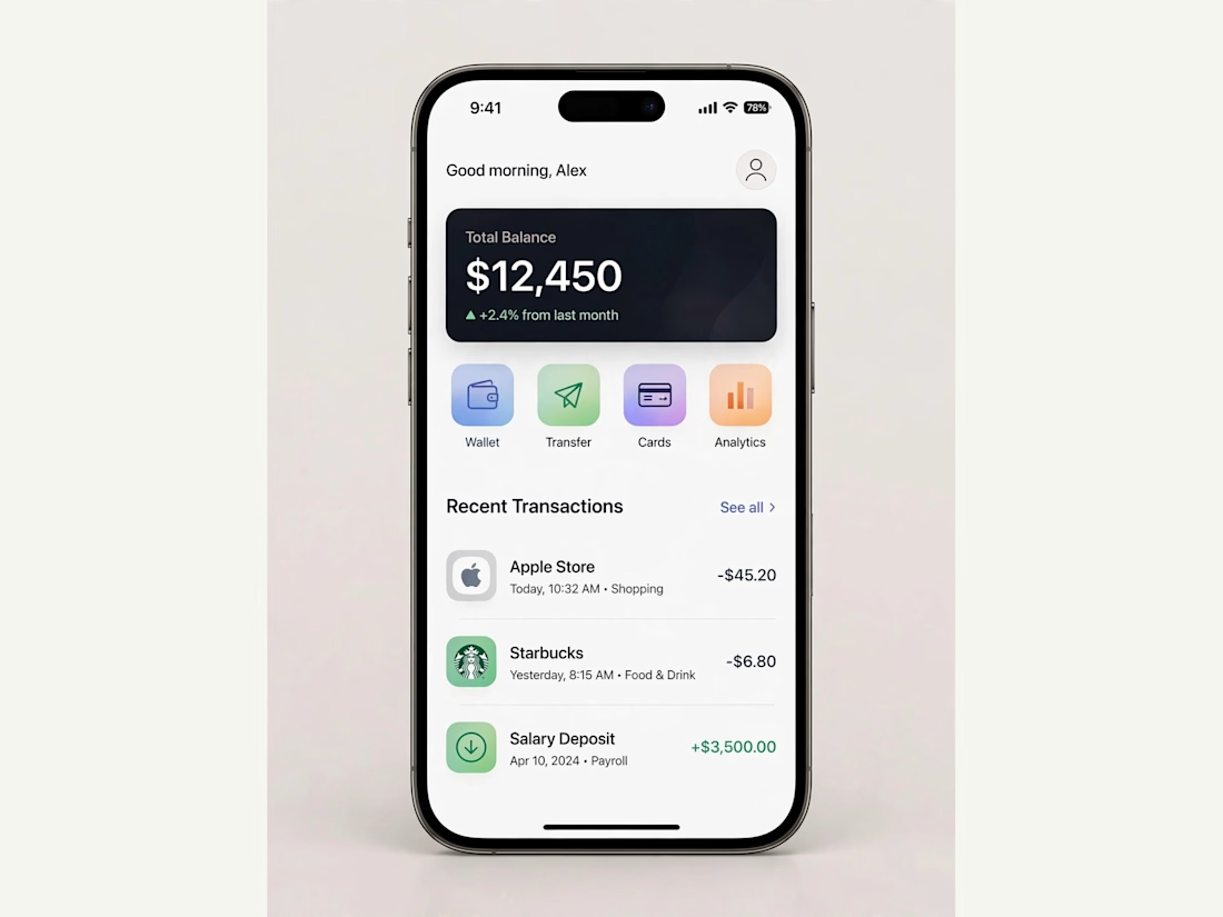
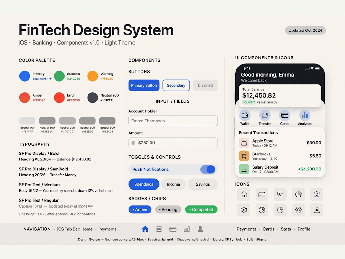
FinPulse — Premium Cross-Border Remittance App
Designed a trustworthy FinTech mobile app for global money transfers.
Process: Started with user flow & wireframes for 3-tap transfer, then built a scalable design system in Figma with 100+ components.
Outcome: Final UI focuses on clarity and trust — from onboarding to Home Dashboard ($12,450 balance), Send Money, and Money Sent success state. Built for conversion and speed.
Tools: Figma, iOS Design System, SF Pro
Tags: Mobile App, FinTech, UI/UX, Product Design



Really solid FinTech mobile design. Clean, trustworthy, and the user flow sounds well thought out. Great outcome on the final UI!

Behind the scenes of the Treal Studio brand film.
Built in one week, from creative direction to sound design.


Love the overall feel, looks amazing 👌🏼