The network for creativity
Join 1.25M professional creatives like you
Connect with clients, get discovered, and run your business 100% commission-free
Creatives on Contra have earned over $150M and we are just getting started
Back to feedPost

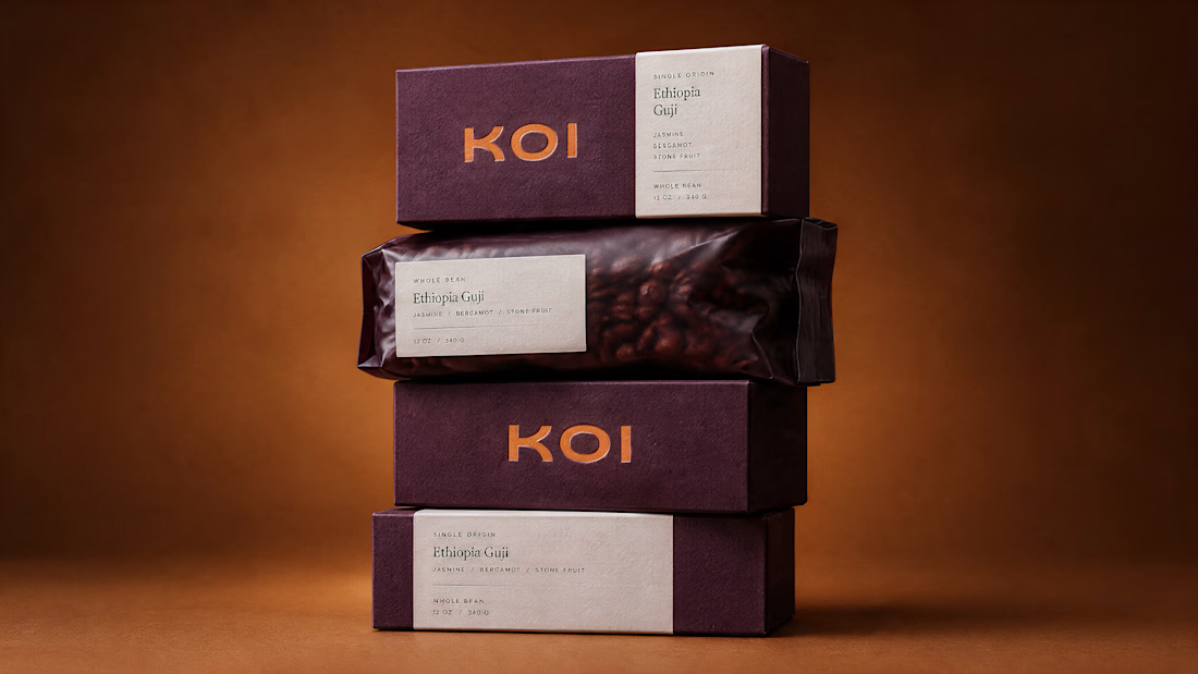
The client brought us the name and a real love for coffee, the kind where they can tell you the farm, the process and the harvest year off the top of their head. Our job was everything after that.
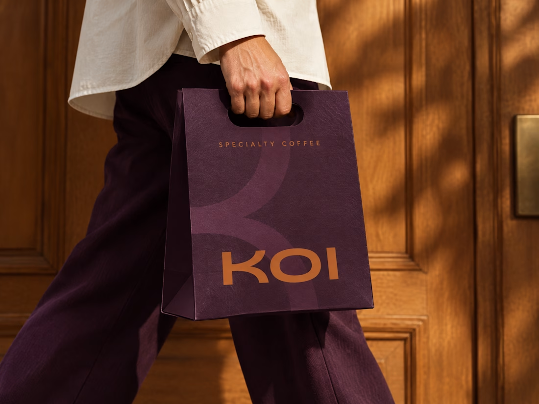
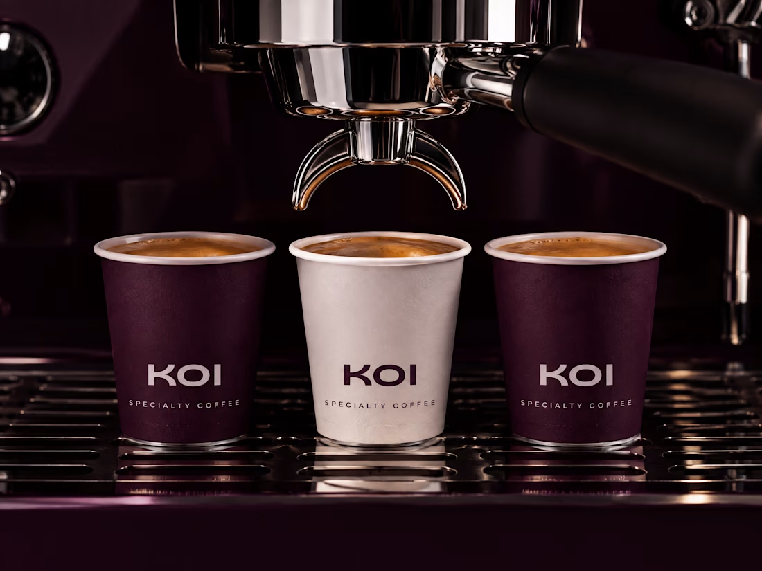
Colour first - deep plum as the ground, burnt amber as the only saturated thing in any composition. That single restraint is what lets the word mark carry across a shelf.
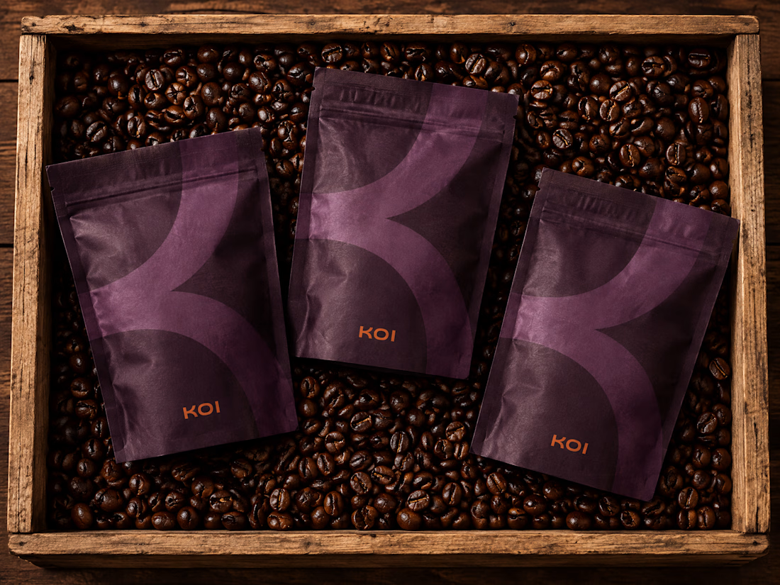
Then the wordmark - geometric, flat-topped K and the pattern pulled directly from it, mirrored and tiled, printed tone-on-tone so it reads as texture rather than competition.
Then packaging: retail boxes, pouches, gift sets, cups, bags. One drawing at three scales.
Brand Identity Design and Art Direction by Agenci SEVN. Website coming soon.


The network for creativity
Join 1.25M professional creatives like you
Connect with clients, get discovered, and run your business 100% commission-free
Creatives on Contra have earned over $150M and we are just getting started



Related posts

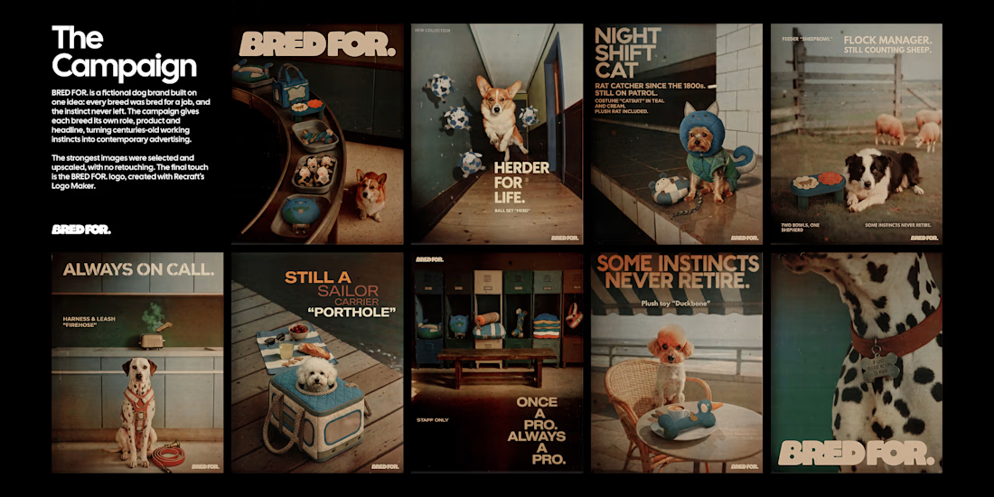
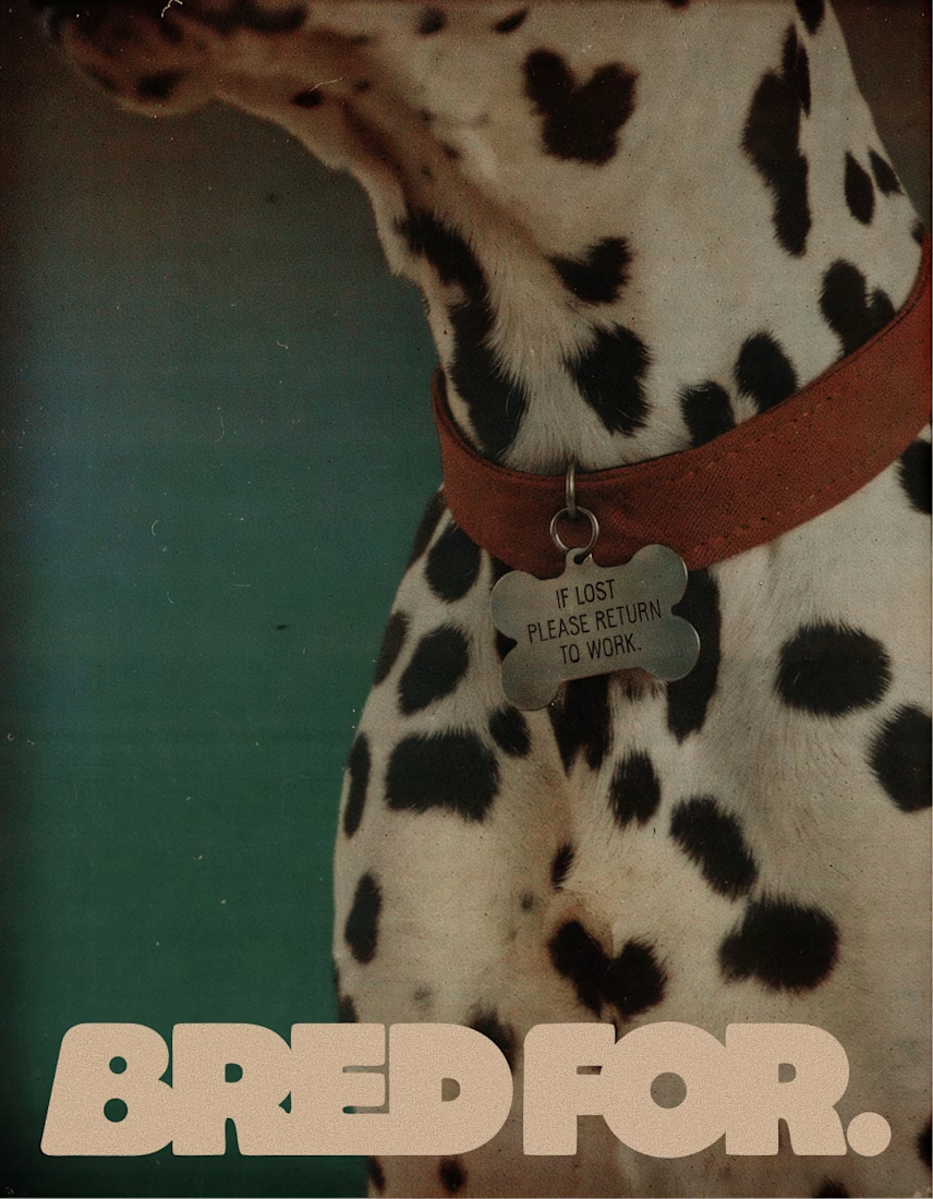
BRED FOR. is a fictional dog brand built on one idea: every breed was bred for a job, and the instinct never left. Collies herded sheep, poodles retrieved ducks, Yorkies hunted rats, Dalmatians ran beside fire carriages, so each product turns a breed's original work into an everyday object.
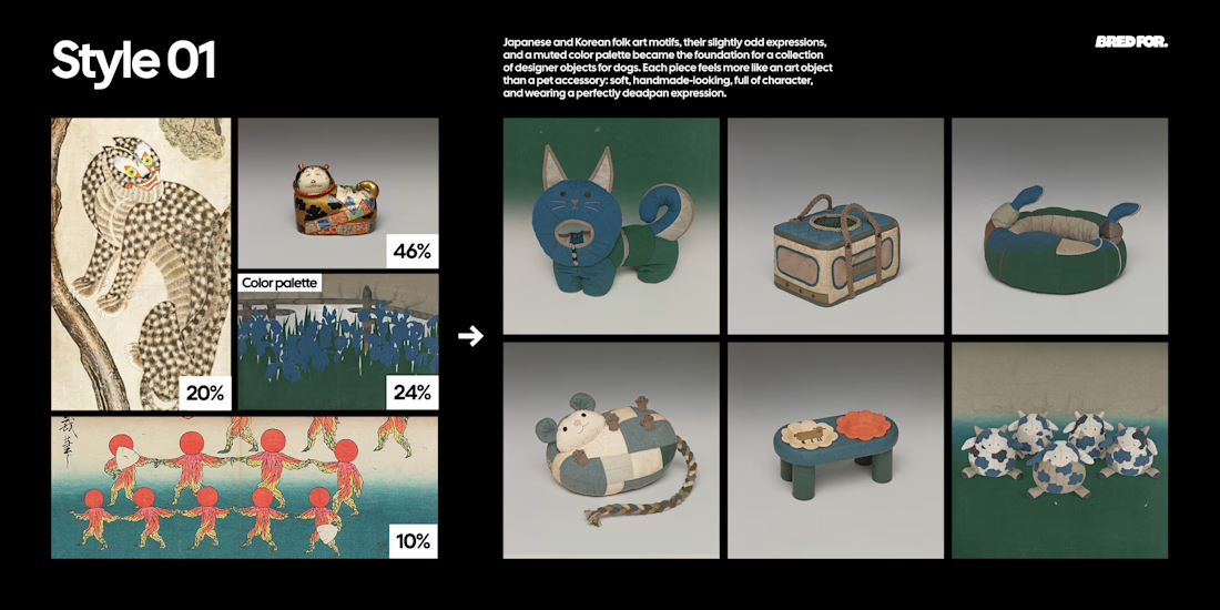
Style 01 is built from Japanese and Korean folk art found at the Cleveland Museum of Art, The Met, LACMA and the Rijksmuseum, and designs the products as soft, deadpan designer objects.
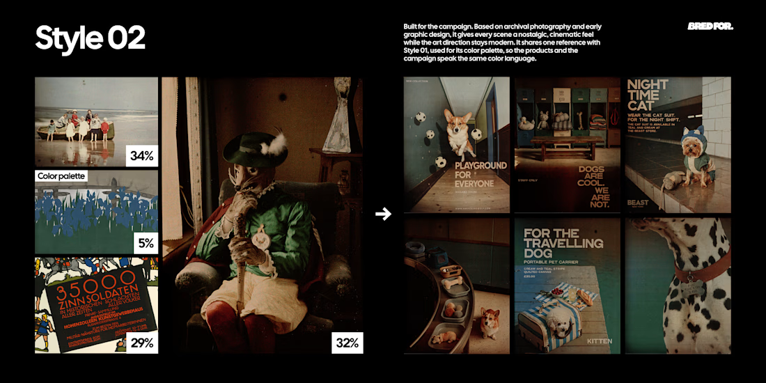
Style 02 is built from early colour autochromes and a 1914 lithographic poster from the Rijksmuseum and the Albertina, and turns every scene into a modern fashion campaign with an archival feel.
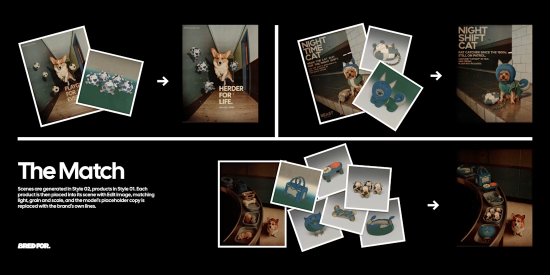
The two Styles were chained with Edit image: Style 01 products placed into Style 02 scenes, every headline rewritten in the brand's dry, deadpan voice. The strongest images were selected, upscaled and finished with a logo made in Recraft Logo Maker.
Style 01 (products): https://www.recraft.ai/styles/b8e1a6b6-ae61-49db-907d-74229530b596
Style 02 (campaign): https://www.recraft.ai/styles/7f2a89de-d69a-4fad-aa0d-ba6302c9a2f3


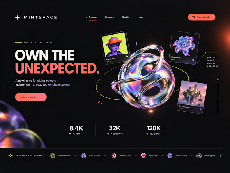
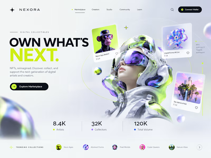
Two directions. One NFT marketplace.
Which visual direction would you choose?
🖤 A — Dark & Futuristic
🤍 B — Bright & Minimal
Both explore the future of Web3, but with completely different visual identities.
Drop your vote in the comments: A or B?
#UIUXDesign #WebDesign #NFT #Web3 #ProductDesign
10 voted
29%
25 voted
71%
35 votes
Closed

Strong design, well done

Redesigned the ModaZ fashion e-commerce storefront with a clean, modern shopping experience focused on product discovery and brand presentation. The project included a refreshed homepage, curated product collections, new arrivals, best-selling sections, and responsive layouts.
I also focused on improving navigation, product visibility, and the overall shopping journey to create a more engaging online store.
Have a fashion brand that needs a storefront upgrade? Let's talk.


I love the layout. Impressive work