The network for creativity
Join 1.25M professional creatives like you
Connect with clients, get discovered, and run your business 100% commission-free
Creatives on Contra have earned over $150M and we are just getting started

The network for creativity
Join 1.25M professional creatives like you
Connect with clients, get discovered, and run your business 100% commission-free
Creatives on Contra have earned over $150M and we are just getting started











Related posts

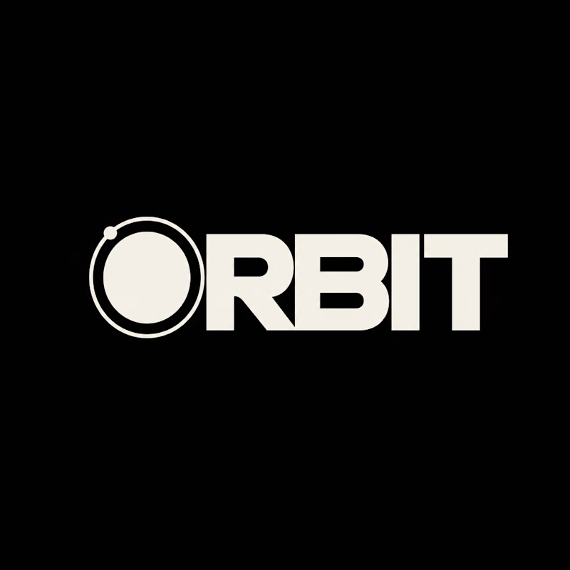
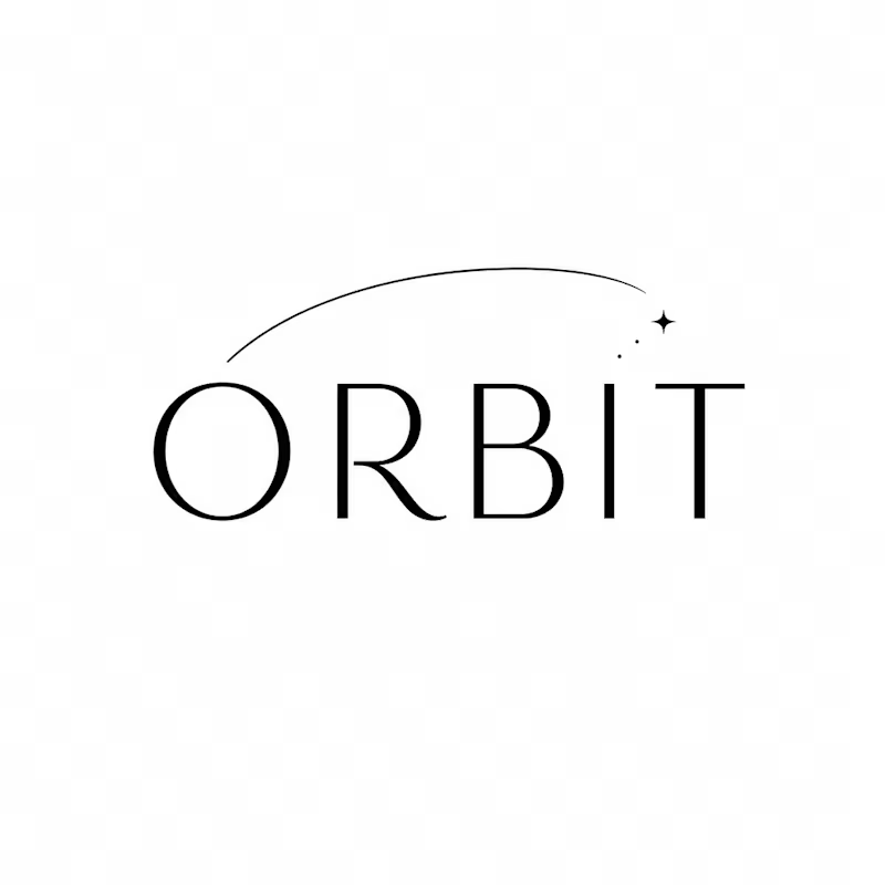
Which ORBIT pulls you in: the quiet one or the loud one? ✨
One name, two directions. Same idea, an object in motion around a center.
A → Heavy extended sans on black. The orbit is built into the O, a ring with a single satellite. Compact, graphic, impossible to ignore.
B → Light, high-contrast serif with a hairline arc and a tiny spark. The orbit is a gesture, a trail you almost miss. Elegant, airy, a little mysterious.
If you ask me, I'd pick A.

20 votes
Ends in 1d


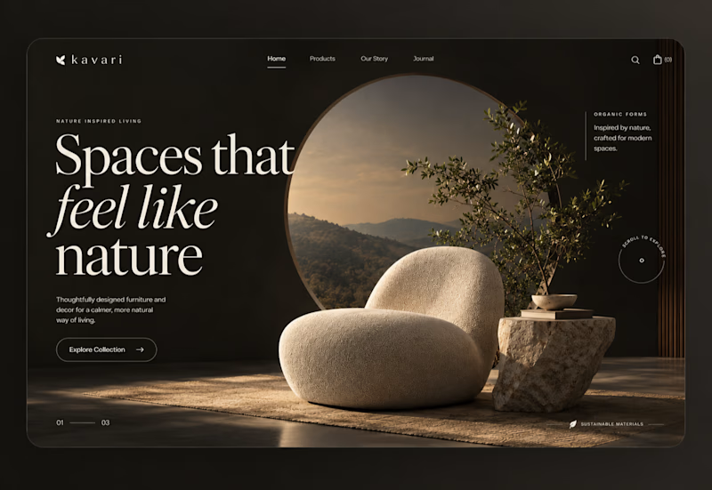
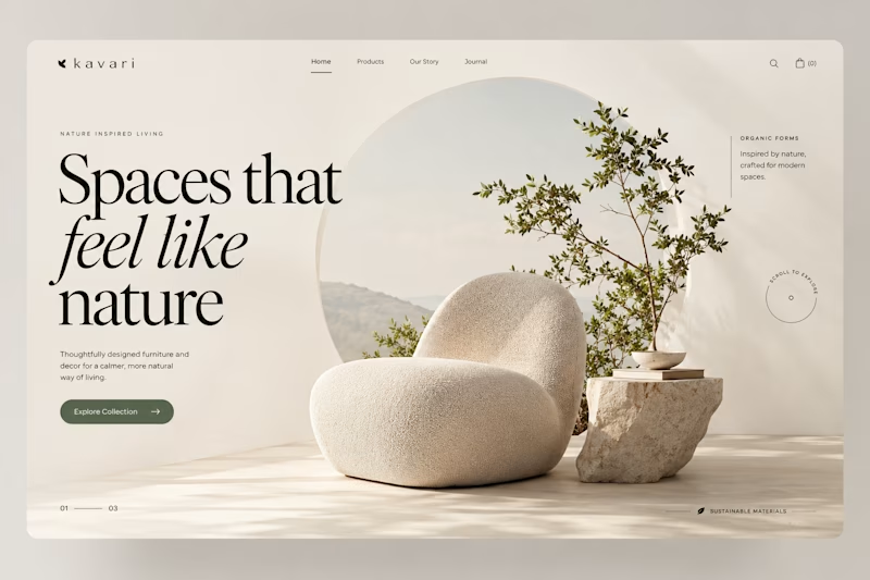
Spaces that feel like nature.
I kept coming back to one question on this concept: does a furniture brand feel more premium in low light or in daylight? So I built both.
The warm version sells atmosphere. The light version sells the product. Both use the same type scale and the same circular motif holding a landscape behind the piece.
Still undecided. Which would you ship?

7 votes
Ends in 1d

Dusk has that rich, cinematic aesthetic!

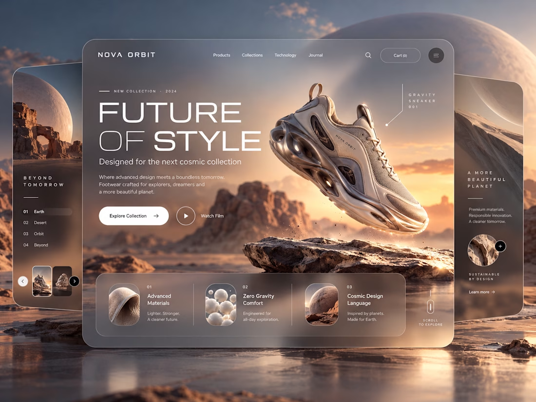
NOVA ORBIT a futuristic sneaker e-commerce landing page concept designed in Figma.
Exploring the intersection of fashion, technology, and immersive digital experiences.
The concept combines a space-inspired visual direction, cinematic product imagery, glassmorphism, bold typography, and layered UI elements to create a distinctive shopping experience.
AI-assisted creative exploration helped shape the visual direction, while the interface was designed in Figma.
I'd love to hear your thoughts on the design!
Open to UI/UX design opportunities and creative collaborations.

This is nice