The network for creativity
Join 1.25M professional creatives like you
Connect with clients, get discovered, and run your business 100% commission-free
Creatives on Contra have earned over $150M and we are just getting started
Back to feedPost

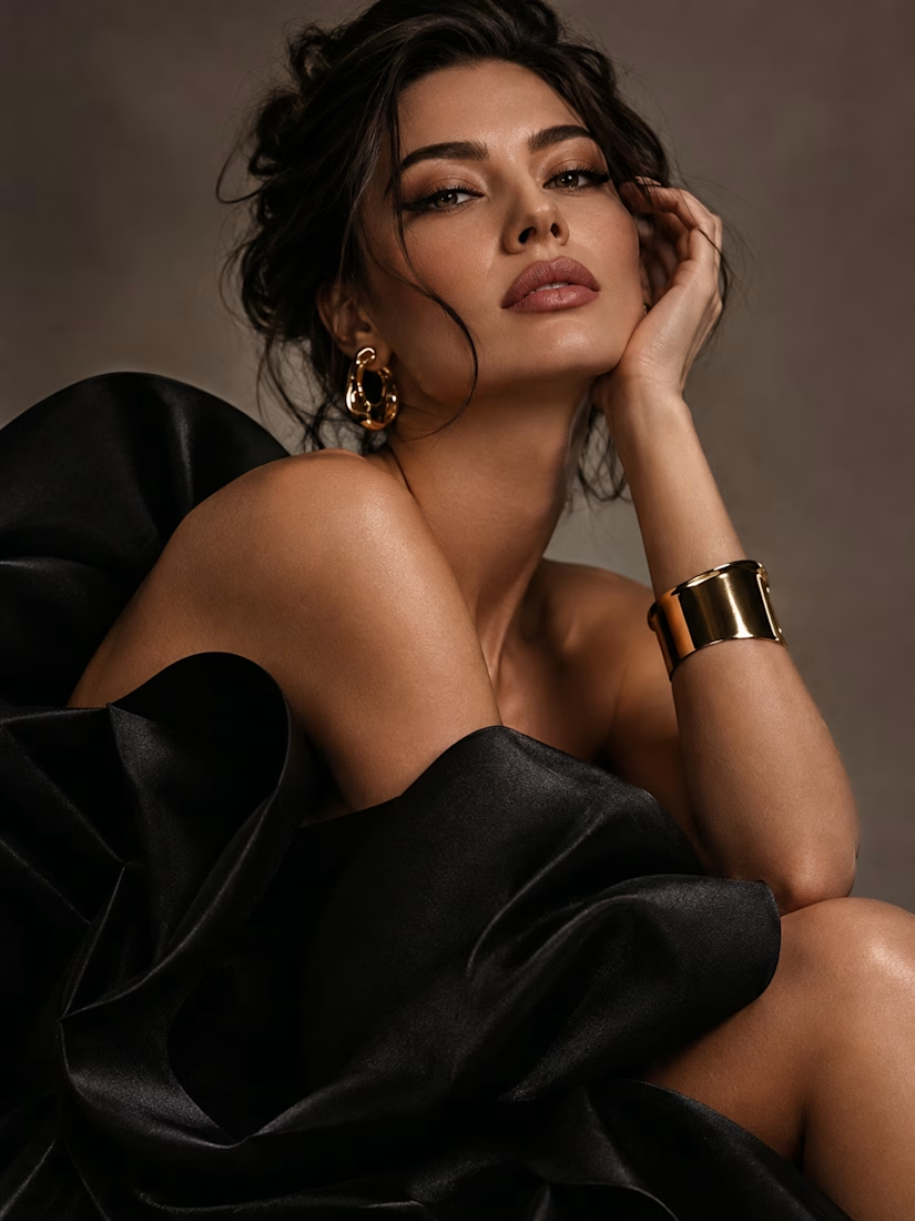
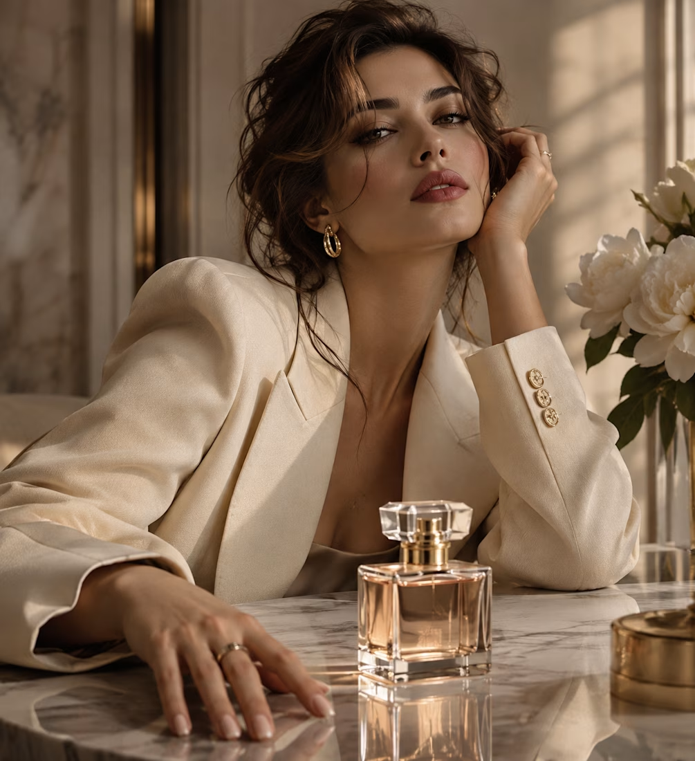
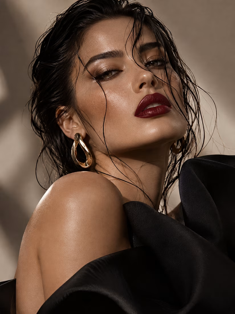
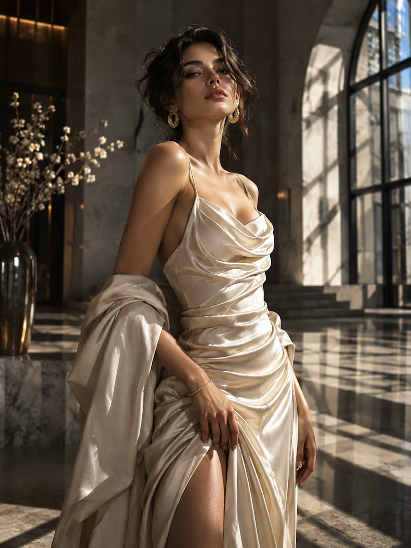
✨ 4 Styles. Endless Creativity.
Photorealism, Abstract Art, 3D & Cinematic Design.
Premium AI-assisted visuals for brands, advertising and creative projects.
Natalya Visual — Let's create something extraordinary!
The network for creativity
Join 1.25M professional creatives like you
Connect with clients, get discovered, and run your business 100% commission-free
Creatives on Contra have earned over $150M and we are just getting started





Related posts

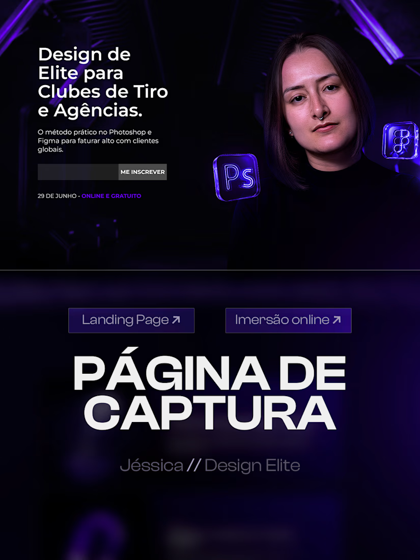
Just wrapped up a high converting landing page design for an online design masterclass.
The goal was to build a clear visual journey that turns visitors into students, guiding them from the hero section and class schedule down to the instructor presentation.
Key visual choices:
Deep purple and black color palette for a futuristic look
Custom 3D glass assets to elevate perceived value
Strong typography and structured cards for high readability
Swipe through to see the full layout structure. Available for new web and landing page design projects.

excellent work, Jessica



A modern brand identity concept designed for the architecture, interior design, and construction industry.
The visual identity is built around a distinctive geometric symbol, combining four interconnected forms to create an abstract interpretation of the letter “N.”
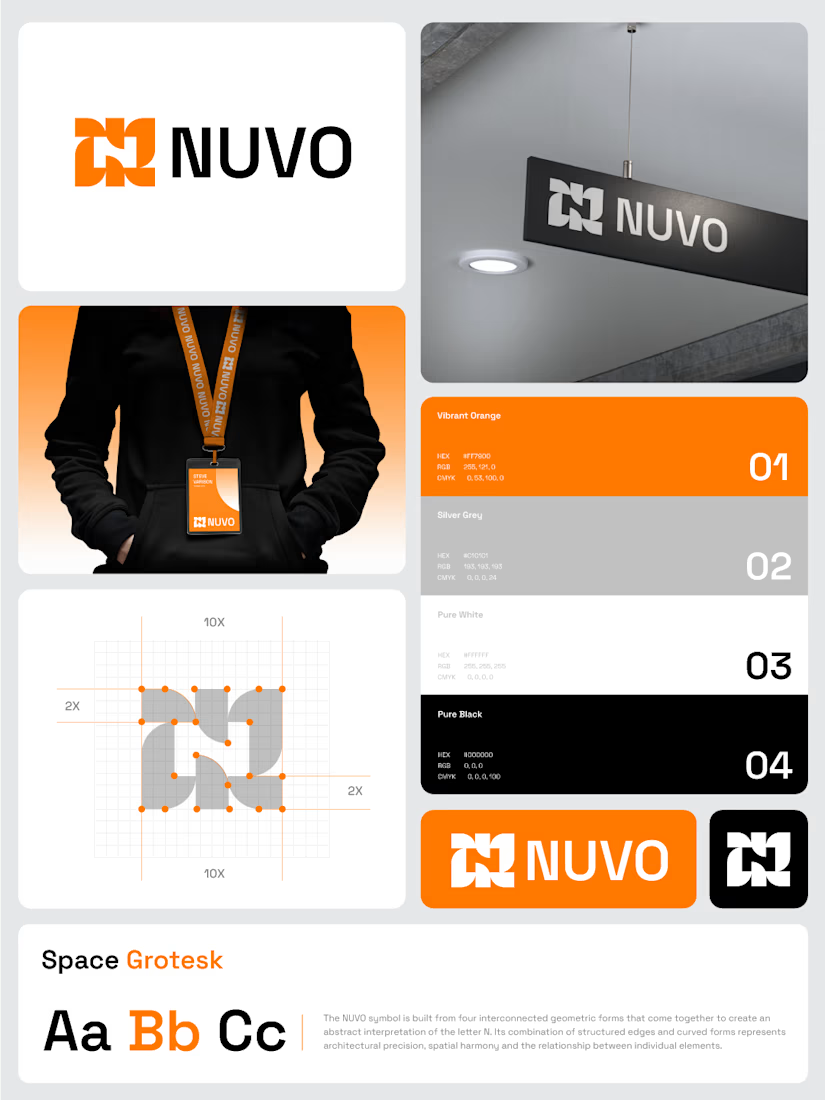

The construction grid with those 2X margins makes the N read as a system, not a one-off mark. Did you test the four-form symbol at favicon or lanyard-badge size, where the gaps between the forms start to close up?