The network for creativity
Join 1.25M professional creatives like you
Connect with clients, get discovered, and run your business 100% commission-free
Creatives on Contra have earned over $150M and we are just getting started
Back to feedPost

The Brand Story: "Steel in the Dirt"
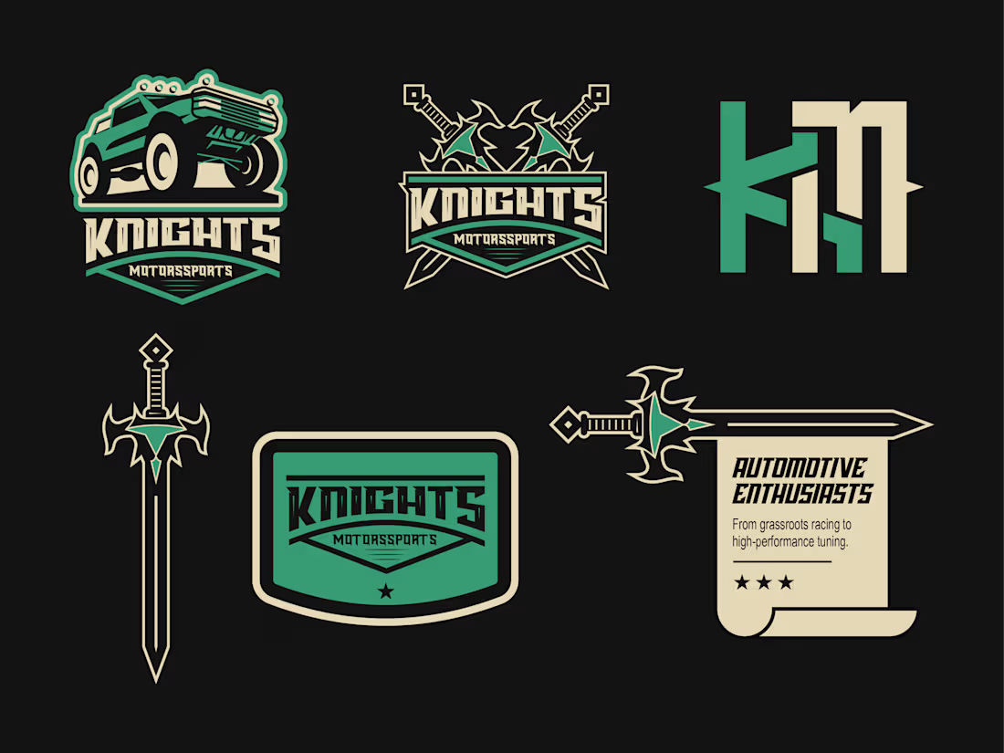
In the world of motorsports, machines are often treated as mere tools. At Knights Motorsports, this brand believe they are armor.The name was born from a philosophy of precision and courage. Just as the knights of old mastered their blades to defend their honor, their team masters the machine to conquer the terrain. They don’t just race against other drivers; they battle the element the dust, the mud, and the impossible slopes with the same discipline and grit that defined the warriors of legend.
When I sat down to create Knights Motorsports, I wasn't just designing a logo; I was crafting an identity for a team that refuses to compromise. I wanted to build a bridge between two worlds that rarely intersect: the raw, chaotic power of off-road racing and the disciplined, ancient code of the chivalric era.I began by dissecting what made a knight a legend. It wasn't just about the sword, it was about the unwavering commitment to a cause. I took that concept of the "blade" and transformed it into the core of the brand. When you look at the sword, I want you to see precision engineering. It’s sharp, it’s calculated, and it’s lethal on the track.But a sword is useless without the right armor. That’s where the Jeep comes in. I envisioned these machines as modern-day chargers indestructible, relentless, and designed to thrive where the terrain tries to tear everything else apart. I wanted the silhouette of that vehicle to feel heavy, stable, and ready to dominate the mud.Finally, I tied it all together with the checkered patterns. To me, that’s not just a finish line; it’s the battlefield. It’s the tactical grid where my drivers pit their skill against the grit of the earth. And to bring it all together, I designed the KM letter mark. It serves as the brand’s signature.I didn't want this brand to just be another racing team logo. I wanted it to feel like a brotherhood. When I look at these designs, I see a team that races with honor, treats their machines like trusted steeds, and approaches every race as a quest to be won. 🤘💀
Full project -
The network for creativity
Join 1.25M professional creatives like you
Connect with clients, get discovered, and run your business 100% commission-free
Creatives on Contra have earned over $150M and we are just getting started



Related posts

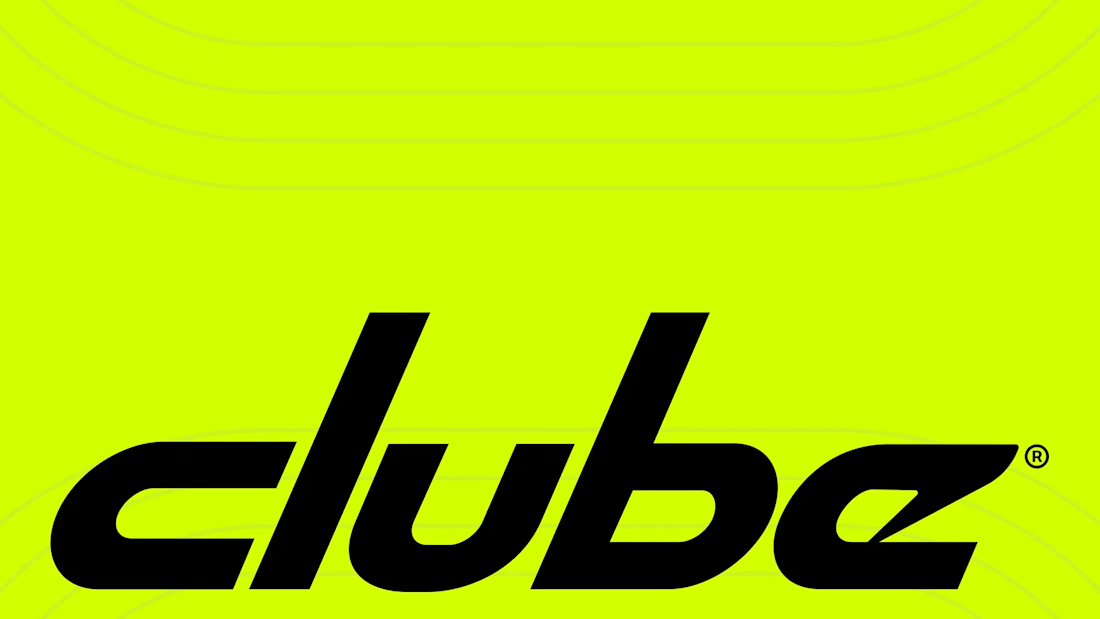
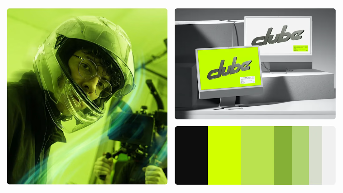
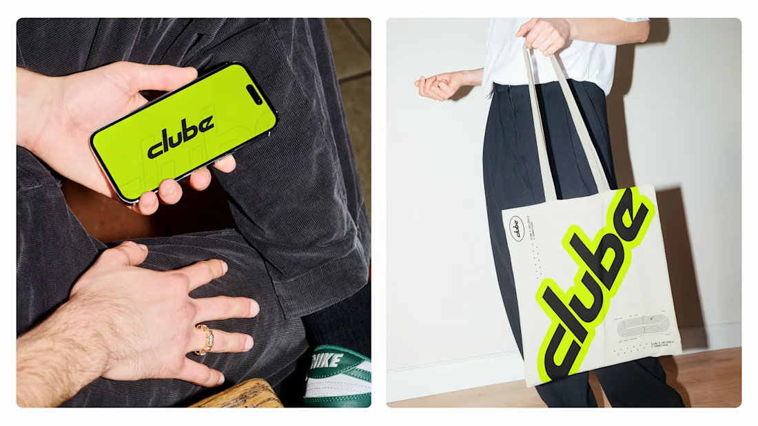
Clube Influência® connects brands with sports creators who speak for real communities. On this one I spent most of my time on the logo, pitching ideas and pushing refinements until we landed on the final mark. I also had a hand in the main brand colors and some of the supporting elements.
Full project at the link below.


Great work on the identity.

Investors and users judge your brand first.
here is the first impression it should make.




Brand apparel design exploration