The network for creativity
Join 1.25M professional creatives like you
Connect with clients, get discovered, and run your business 100% commission-free
Creatives on Contra have earned over $150M and we are just getting started
Back to feedPost

The Design Story
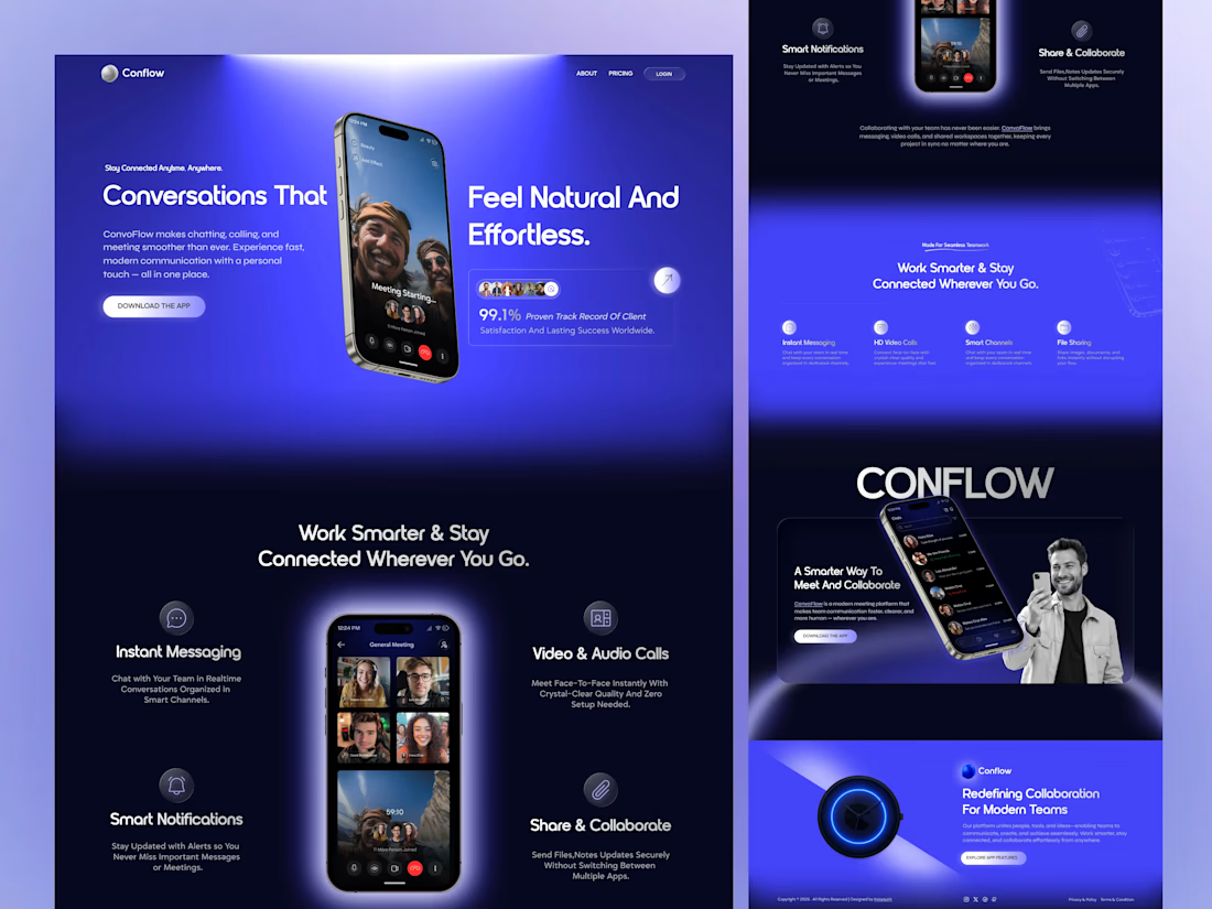
In a world where communication apps are everywhere, how do you make yours stand out? The answer: immersive design that speaks to benefits, not just features.
This landing page for Conflow transforms the typical "here's what we do" approach into "here's how we improve your workday."
Design Highlights
Immersive Gradient Universe That purple-to-blue gradient isn't just eye candy—it's strategic. The glowing, ethereal aesthetic creates a premium feel while the color palette (blue = trust, purple = innovation) subconsciously positions Conflow as both reliable and cutting-edge.
Real Product, Real Context iPhone mockups with actual interface designs let users visualize themselves in the experience. No abstract concepts—just clear, tangible value they can see and understand immediately.
Social Proof That Converts "99.1% Proven Work Record" with distinctive emoji badges hits visitors right in the hero section. It's not bragging—it's building the trust needed to get that download.
Benefit-Driven Content Architecture
Not "Messaging Features" → "Work Smarter & Stay Connected Wherever You Go"
Not "Video Capabilities" → "Keep Face To Face Meetings With Crystal-Clear Quality"
Every word is about the USER, not the product.
Strategic CTA Flow Multiple "Download The App" touchpoints appear at natural decision moments. High-contrast buttons that guide without screaming.
Scannable Feature Grid Four-column layout with custom icons makes info digestible. Busy professionals can grasp the value in seconds—exactly what modern web design demands.
What Makes This Work
This isn't just a pretty design—it's psychology + aesthetics = conversions.
The gradient creates emotional resonance. The real screenshots reduce friction. The benefit-focused copy addresses pain points. The social proof eliminates doubt. The CTAs capture intent.
Every pixel serves the business goal: turning scrollers into users.
Design Tools
Figma
Custom gradient system
Component-based design system
Mobile-first responsive grid
Typography & Spacing
Modern sans-serif hierarchy ensures readability while maintaining that contemporary, approachable vibe. Generous whitespace prevents cognitive overload—letting each section breathe and be absorbed.
Available for new projects! Let's create landing pages that don't just look amazing—they drive real business results. 🚀
What do you think? Drop a ❤️ if you dig the immersive gradient approach!ext here...

The network for creativity
Join 1.25M professional creatives like you
Connect with clients, get discovered, and run your business 100% commission-free
Creatives on Contra have earned over $150M and we are just getting started
Trending

Claude
Claude has entered the design space. How are you using it?

Contra University
Learn from expert creatives how to earn more using next-gen AI tools.
Brand Design
The best brand designers are on Contra. Scroll to see what's trending in brand design. What are you building?
creativeaiflow
Creative AI workflows are evolving. What tools do you use, and what are their strengths and weaknesses?
freelancerlife
Freelancer life is wins, pivots, and everything in between. What’s yours right now?



Related posts

Meridial — Wealth Management Platform
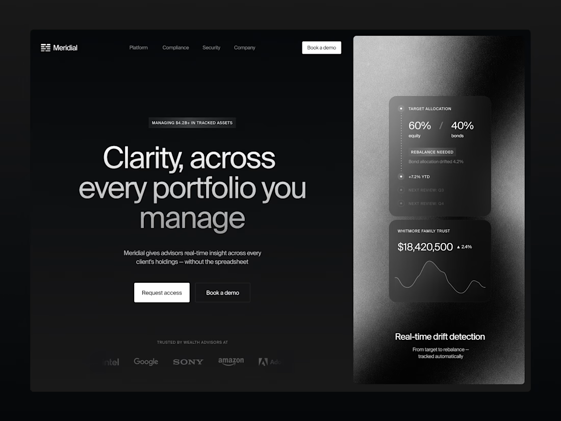
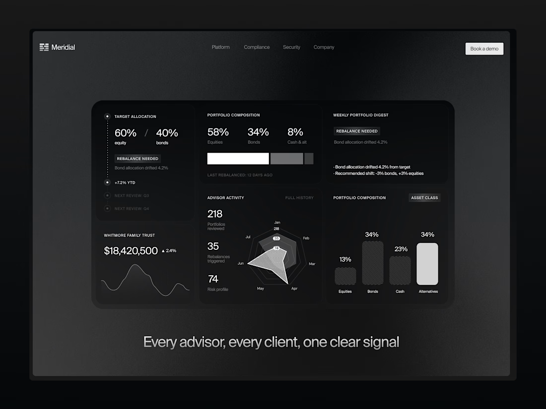
For Meridial, I designed a system where the one thing that matters — portfolio drift — always surfaces first, no matter how many clients an advisor is tracking.
Signal over noise, even at 200+ portfolios. ⚪
The challenge:
Advisors managing dozens of portfolios need to instantly spot what's drifted from target — without digging through spreadsheets or noisy dashboards that bury the signal in data.
A dark, grain-textured UI gives Meridial a private-banking feel instead of typical fintech blue. The landing page proves the product directly in the hero with live allocation and drift cards, while the dashboard extends the same card system into radar charts, composition breakdowns, and a weekly digest — built so advisors can scan hundreds of portfolios at a glance.
A case in making complex portfolio data resolve into one clear signal.


The dark grain-textured UI gives this a truly exclusive private-banking feel. Did you animate the allocation drift cards and radar charts using Jitter or native Figma prototypes?

🚀 Design Challenge — Which Concept Wins? 👀
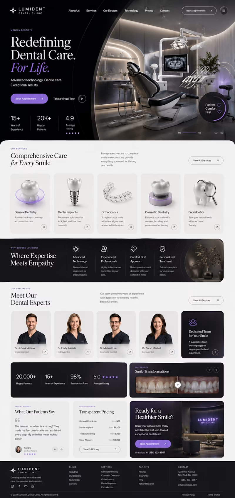
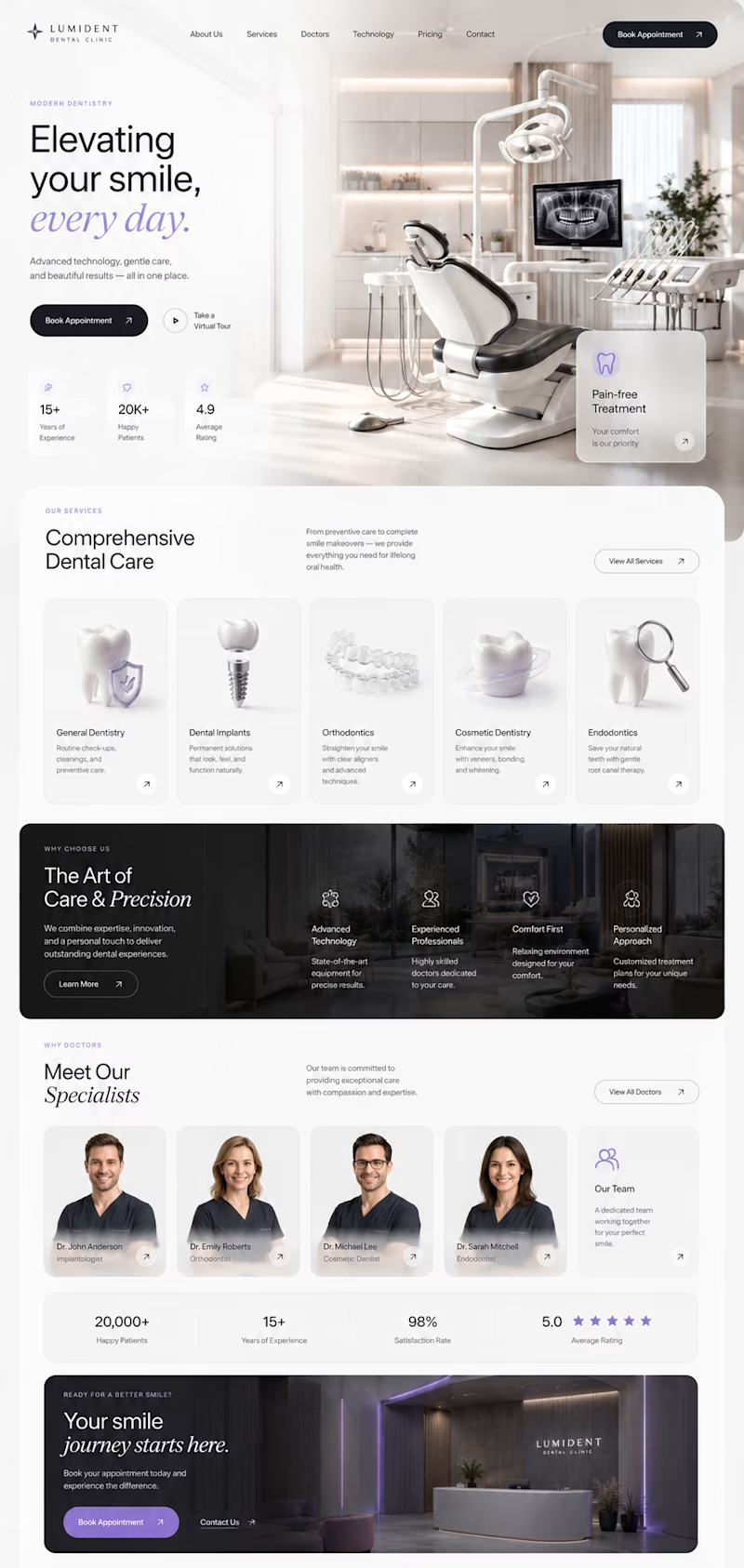
I've been exploring two different directions for a premium dental clinic website, both designed from scratch with a focus on modern UI, clean UX, and strong visual storytelling.
🦷 Concept A
✨ Bold editorial layout
✨ Minimal luxury aesthetic
✨ Large typography
✨ Premium 3D visuals
✨ High contrast & cinematic feel
VS.
🦷 Concept B
🌿 Bright and elegant
✨ Spacious composition
✨ Softer premium look
✨ Modern cards & subtle glass effects
✨ Clean, approachable experience
Both concepts are aimed at creating trust while feeling distinctive—not like another generic medical website.
👇 Which one would you choose and why?
A or B?
Your feedback will help shape the final direction. 💜

4 voted
27%
11 voted
73%
15 votes
Closed

Concept A's dark cinematic mode feels premium but might read as a little intimidating for a dental site, patients usually want reassurance over drama. Was this tested with actual patient personas or is it more of a portfolio exploration?


@Brady Patterson (From 49ers to Roofers) 🏈 → 🛠️
How to Out-Strategy as a Designer AI in 2026 🎬
In this episode, we sat with @Brady Patterson who went from working with top sport brands like 49ers, USC, Fox Sports, Apple, and Hulu to building cult‑like brands and high‑converting websites for roofers, garage door companies, and blue‑collar businesses.
We also unpack why “unsexy” trades might be the best niche designers are sleeping on, and how to turn creativity into consistent, lead‑driven income.
Watch Full Episode below ↓


Great episode, really enjoyed recording it.