The network for creativity
Join 1.25M professional creatives like you
Connect with clients, get discovered, and run your business 100% commission-free
Creatives on Contra have earned over $150M and we are just getting started
Back to feedPost

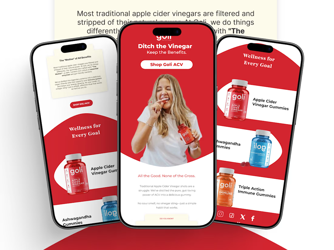
People invest in premium supplements. Your emails should reflect that.
Designed this email concept to help supplement brands educate, build trust, and drive more clicks with clean, high-converting design.
Built for Shopify & Klaviyo.
#EmailDesign #EmailMarketing #Supplements #Wellness #Klaviyo #Shopify #Contra


The network for creativity
Join 1.25M professional creatives like you
Connect with clients, get discovered, and run your business 100% commission-free
Creatives on Contra have earned over $150M and we are just getting started











Related posts

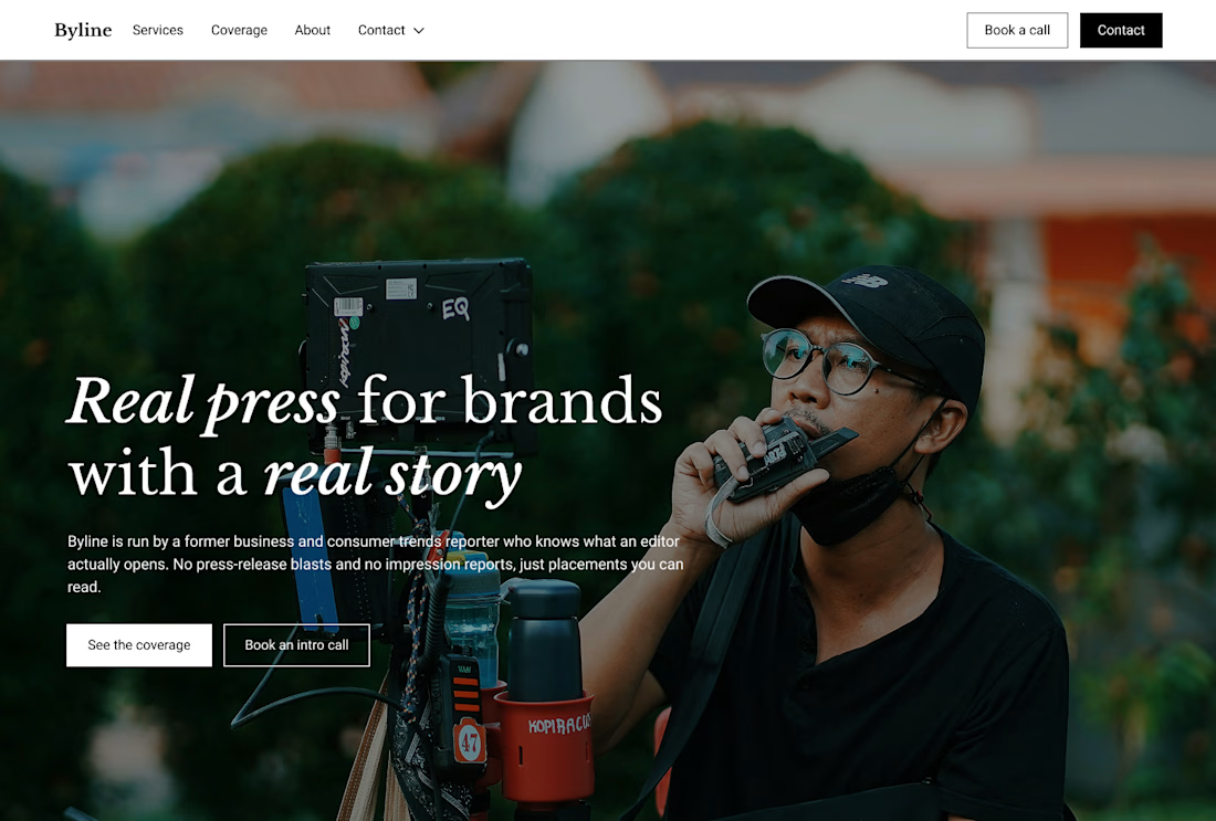
Built this in Framer as a concept project. Goal was to make it feel run by ex-journalists. Choices: editorial serif (Libre Baskerville), a dark photo with one color accent, and copy that positions against blast-style PR.
Where I’m unsure: text legibility over the photo and whether the two CTAs compete. What would you change?


That's great design it feels professional I like how the background mixed with interface ❤️❤️
Great job Cheree🎉🎉

Same design. Which palette? 👀
You picked your favorite preview last time. This time, I’m putting the colors to the vote.
One body-care packaging concept, with the same typography and composition:
A · Rose Cream, Strawberry Sorbet + Plum Jelly
B · Lime Mousse, Coconut Cream + Plum Jelly
Which would you choose and what does it make you feel about the brand?
Both palettes use colors and matching ingredient textures from DCS 654, my library of 654 dessert-inspired colors.
Take a closer look: dcs.mariya.design
7 voted
44%
9 voted
56%
16 votes
Closed
B is absolutely stunning 🎉🎉🎉🎉
Great job Mariya❤️

Project Title:
Dunkin’ Product Web Concept
Project Description:
A playful web design concept created to explore bold product visuals, strong composition, and interactive brand presentation. The goal was to turn a simple product idea into a more engaging digital experience while keeping the layout clean, clear, and visually memorable.
This concept reflects how I approach web design in general — understanding the brand, building a strong visual direction, and creating an experience that works around the product, service, or idea being presented.
Role: Web Designer / Creative Developer
Focus: Visual Direction, Layout, Product Presentation, Web Interaction
