The network for creativity
Join 1.25M professional creatives like you
Connect with clients, get discovered, and run your business 100% commission-free
Creatives on Contra have earned over $150M and we are just getting started
Back to feedPost
Taste Test

Help us decide between two different page loaders
0 voted
0%
3 voted
100%
3 votes
Closed

Option 2 page loder is unique and special 🔥
great job Raaaak 🎉🎉🎉
The network for creativity
Join 1.25M professional creatives like you
Connect with clients, get discovered, and run your business 100% commission-free
Creatives on Contra have earned over $150M and we are just getting started



Related posts

Which hero would you choose — 1 or 2?
Two directions for Amber House, my real estate website template. The first pairs a closer architectural crop with an asymmetric layout. The second gives the building more breathing room, with a wide view and a centered headline.
Same template, two different first impressions. Which feels stronger to you, and why?
24 voted
59%
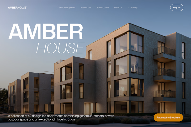
17 voted
41%
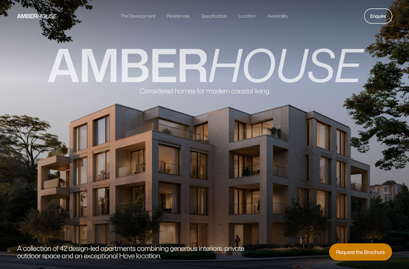
41 votes
Closed

I will go with Bold & Asymmetric!

Hello fellow designers, designing a Christmas theme app. What do you like best and why?
1 voted
14%
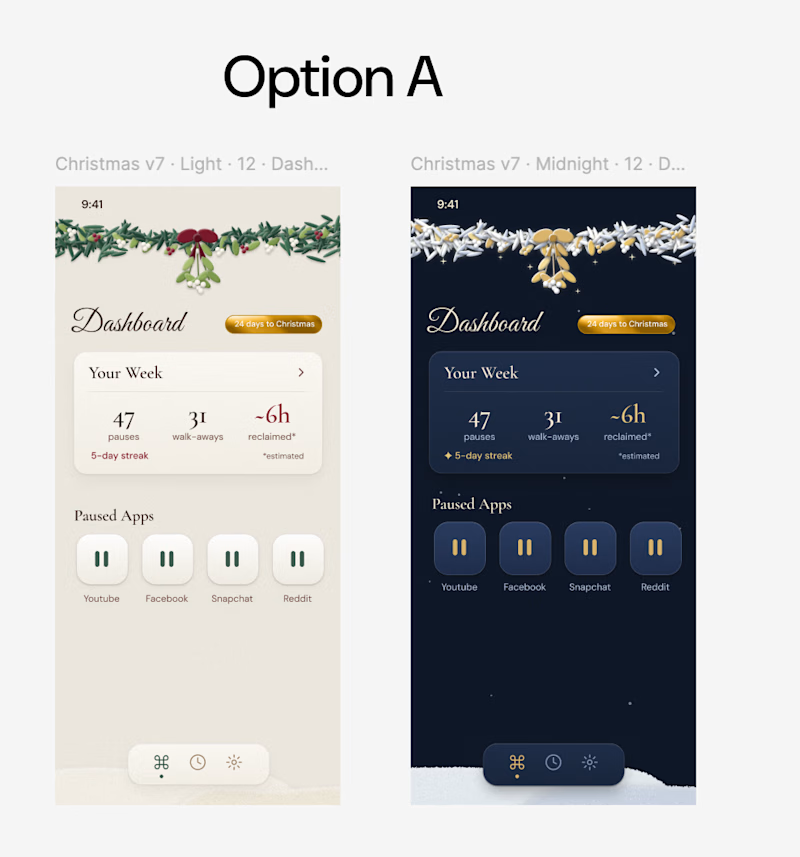
6 voted
86%
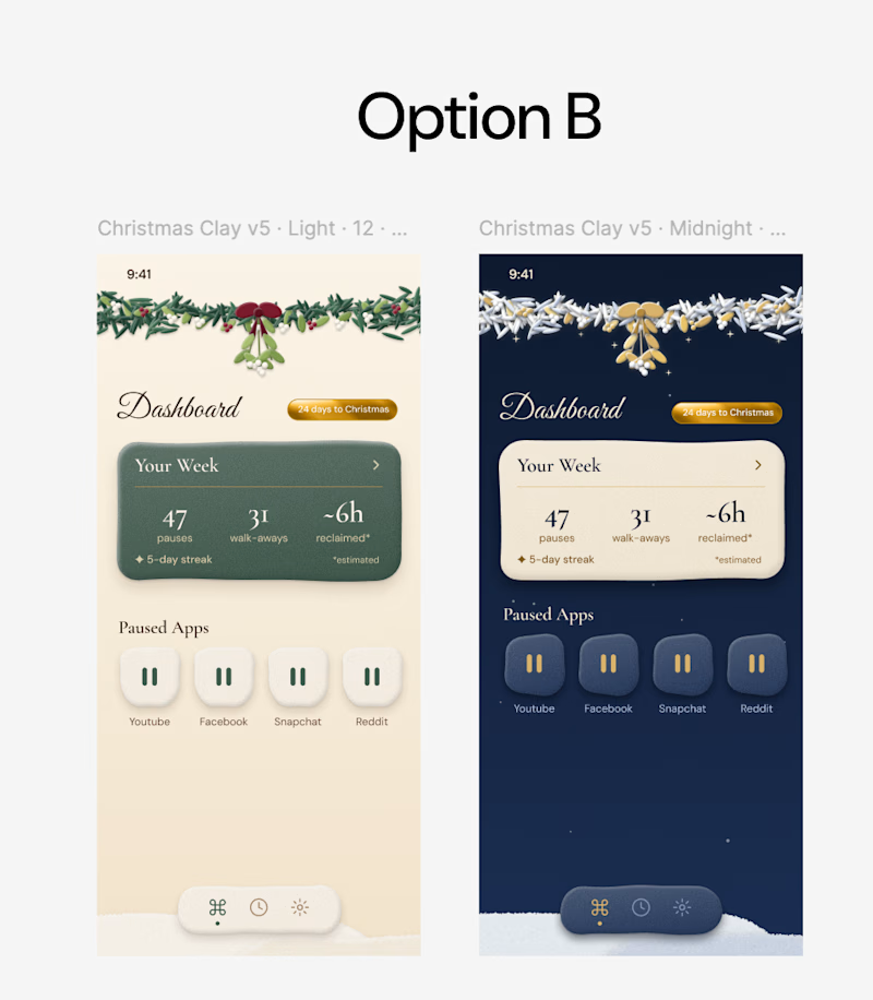
7 votes
Closed


Portfolio update: I couldn't decide on a look, so I built both.
A or B? manucabezas.com

11 voted
69%
5 voted
31%
16 votes
Closed

dev mode on dark looks 👌🏻✨