The network for creativity
Join 1.25M professional creatives like you
Connect with clients, get discovered, and run your business 100% commission-free
Creatives on Contra have earned over $150M and we are just getting started
Back to feedPost

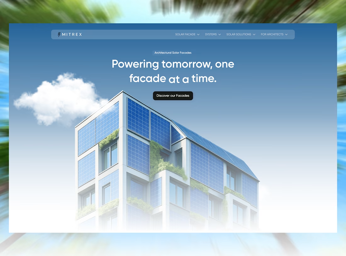
Mitrex spec redesign.
a solar company that builds actual architecture deserves a site that feels like architecture, not a supplier catalog.
The network for creativity
Join 1.25M professional creatives like you
Connect with clients, get discovered, and run your business 100% commission-free
Creatives on Contra have earned over $150M and we are just getting started











Related posts

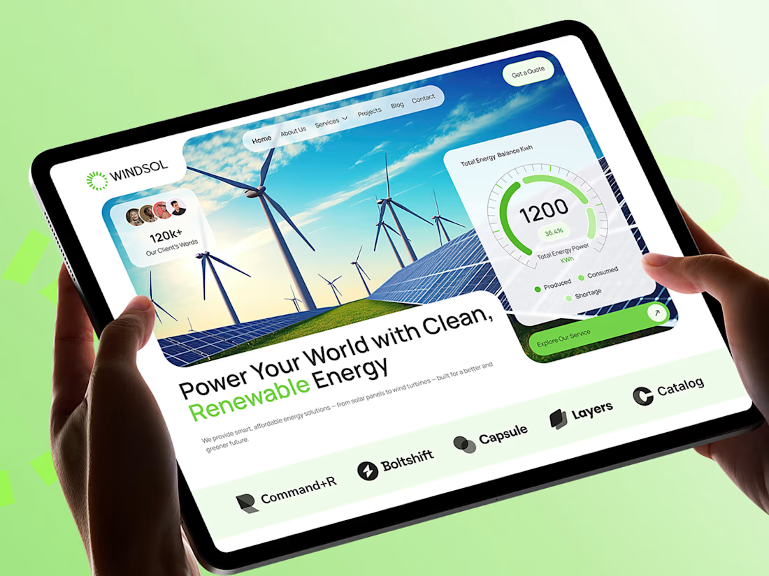
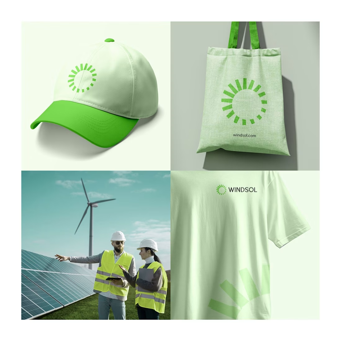
Windsol: a brand and website built to power the clean energy shift
Windsol is a renewable energy company covering solar and wind. We built the full identity and the website around one idea: clean energy should feel simple, bright and trustworthy.
The sun-ray symbol works across a cap, tote and tee, and the site turns live energy data into something people can read at a glance.
Which touchpoint do you think sells a brand best, merch or the website?



Same brand. Same palette. Two completely different proposals for a real estate developer.
A: An isotype built from blocks. Geometric, precise, the language of construction. It says we build.
B: Custom lettering with movement. Warmer, more editorial. It says we build places you’d want to live in.
36 voted
51%

35 voted
49%

71 votes
Closed

My vote is B, Milagros. Custom lettering with movement has real editorial warmth, which suits a developer selling places people actually want to live in.

A premium landing page concept for a luxury sauna brand, focused on warm visuals, refined typography, and a smooth interactive experience.


Great landing page 🎉🎉🔥🔥