The network for creativity
Join 1.25M professional creatives like you
Connect with clients, get discovered, and run your business 100% commission-free
Creatives on Contra have earned over $150M and we are just getting started
Back to feedPost
Taste Test


Same studio. Same job. Why does one form get finished and the other get closed?
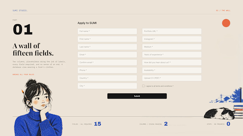
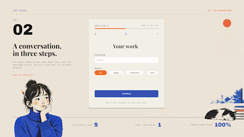
Nobody abandons your product. They abandon your form. Left is what usually ships: two columns, placeholders instead of labels, fifteen required fields, no end in sight. Right is the same ask, rebuilt. What we changed:
One column, always. Zigzag reading kills momentum.
Labels on top, not inside. Placeholders vanish the second you type.
Chunk it. Three fields across three steps beat one wall of fifteen.
Show progress. People finish what they can see the end of.
A form isn't a database view. It's a conversation with a slightly nervous person. Ask for a first look, not a life story.
Which field makes you close a form on sight?
8 votes
Ends in 1d

The network for creativity
Join 1.25M professional creatives like you
Connect with clients, get discovered, and run your business 100% commission-free
Creatives on Contra have earned over $150M and we are just getting started







Related posts
Why does a dashboard full of numbers still feel calm?
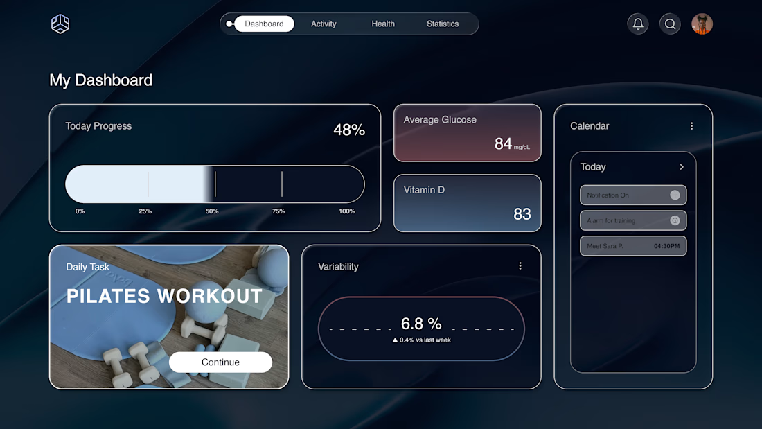
Bento grids are everywhere, and done right it's not a trend, it's information design. Each cell = one number, one meaning. The grid does the hierarchy for you.
Our three rules for a bento that works:
One idea per cell. Progress, glucose, one task. If a card needs two sentences, it needs two cards.
Mix the scale. One hero cell, a few mediums, one tiny stat, same gap everywhere.
One warm cell. A single card runs warm against the cool, dark screen; it carries the eye, and the rest stay quiet. No neon needed. Grids are calm. Content is loud. That's the whole trick.

Love the three rules. How do you handle this grid when it collapses to mobile without losing the hierarchy?


I like 2 more

I’m testing two different creative directions and would love your honest opinion.
Version A focuses on a bright, minimal gallery experience with circular visual experiments.
Version B explores a darker, more cinematic product direction for Montairé with hardware-focused visuals.
Which one feels cooler, more premium, and more memorable — A or B?
I’d also love feedback on the typography, layout, animation, and overall art direction.
10 voted
53%
9 voted
47%
19 votes
Closed

I’d lean toward Version B. The darker direction gives the hardware more presence and makes the whole experience feel more intentional and engineered. Version A is visually interesting, but B gives Montairé a much clearer identity at first glance.