The network for creativity
Join 1.25M professional creatives like you
Connect with clients, get discovered, and run your business 100% commission-free
Creatives on Contra have earned over $150M and we are just getting started
Back to feedPost


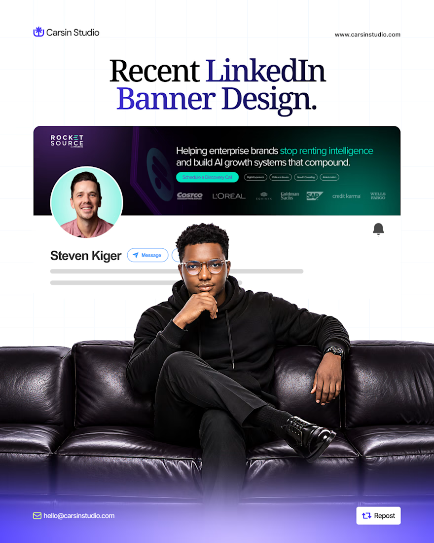
One LinkedIn banner mistake I see often: trying to explain everything you do in one design.
Your banner has limited space. Use it to communicate three things clearly: - - Who you help
What you help them with
The result they can expect.
Everything else is secondary. A clear message will do more for your profile than adding more text.
The network for creativity
Join 1.25M professional creatives like you
Connect with clients, get discovered, and run your business 100% commission-free
Creatives on Contra have earned over $150M and we are just getting started

Challenges
View all


Related posts

Web designers, honest question: what's the first message you send a local business that's never heard of you?
Mine used to be "do you need a new website?" Almost nobody answered.
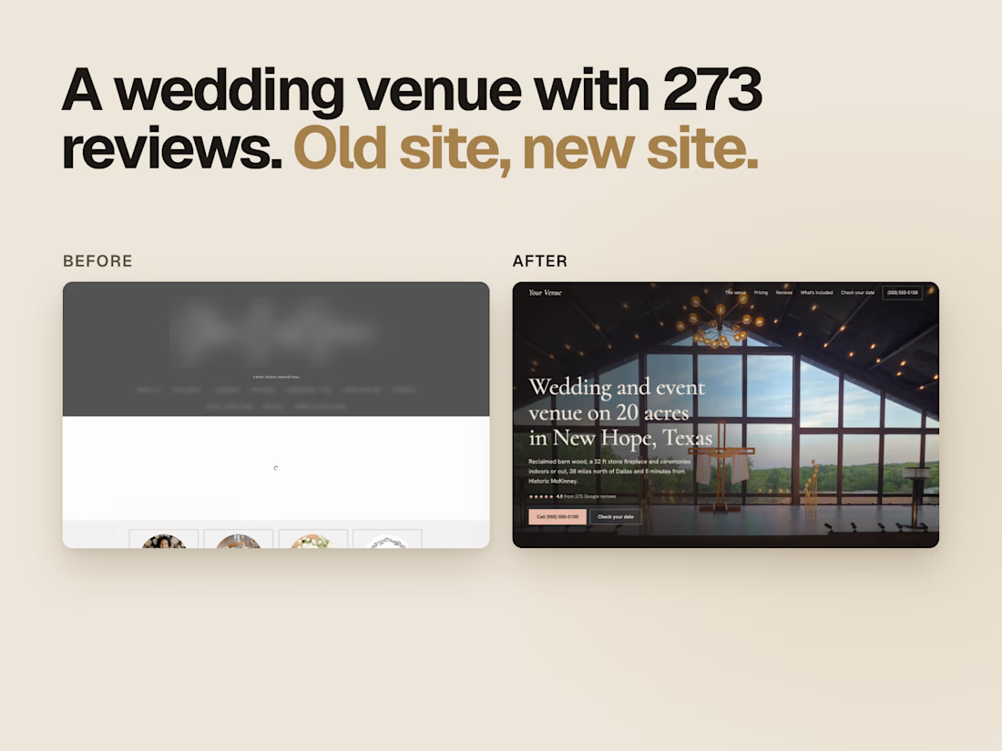
Now I build their new homepage first and send them the link. This wedding venue has 273 Google reviews, and its homepage was a grey banner with an empty page under it.
What's working for you?

Sending the homepage first makes sense.

A useful way to evaluate a brand identity: place the business card, packaging, and social posts side by side.
Do they feel like they belong to the same business—even when the logo isn’t prominent?
That’s what I look for in a visual system. Typography creates hierarchy. Color builds recognition. Patterns and layout give the brand a character that can carry across different formats.
For business owners reviewing a new identity, ask your designer to show how it works in the places your customers will actually encounter it. Those applications can reveal more than a logo presentation alone.
Which touchpoint is hardest to keep consistent in your brand?

That's great visuals and motion graphics Great job Mohammed

Modern Web Banner Design - Crafting Brands That Stand Out