The network for creativity
Join 1.25M professional creatives like you
Connect with clients, get discovered, and run your business 100% commission-free
Creatives on Contra have earned over $150M and we are just getting started
Back to feedPost

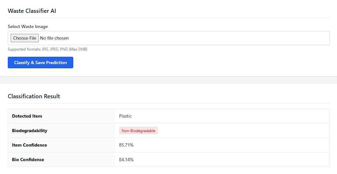
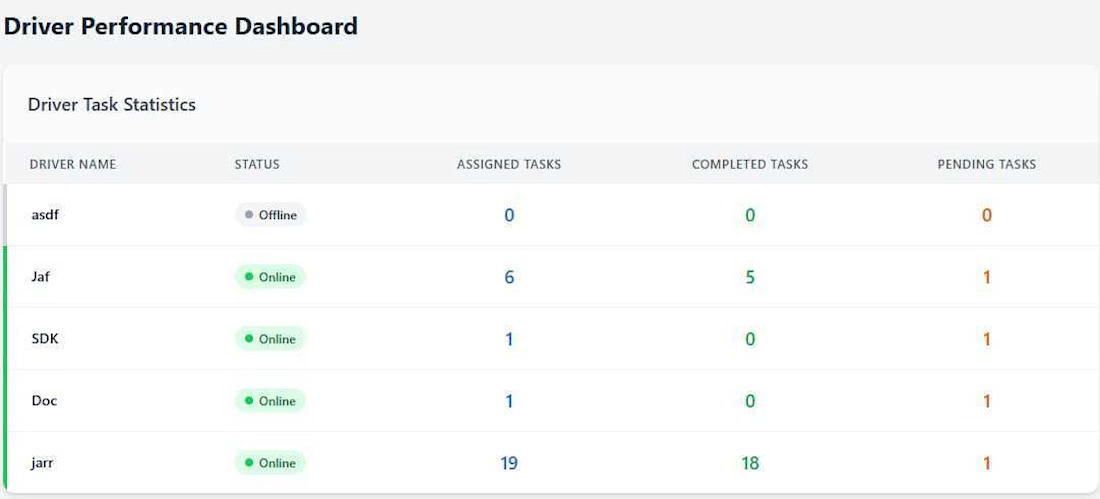
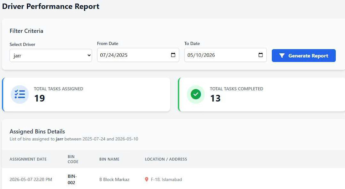
Developed a Laravel-based Admin Dashboard for an IoT-Based Smart Waste Management System to monitor and manage smart waste bins in real time. The dashboard enables administrators to track bin status, monitor fill levels, assign collection tasks to drivers, and visualize bin locations on an interactive map.
The system integrates IoT devices with the Laravel backend through REST APIs, providing real-time updates and improving waste collection efficiency. It also includes driver management, task assignment, activity monitoring, and analytics to support effective decision-making and operational management.
Key Features
• Real-Time Smart Bin Monitoring
• Interactive Map Integration
• Driver Management
• Collection Task Assignment
• Waste Collection Status Tracking
• User & Role Management
• Dashboard Analytics
• REST API Integration
• Secure Authentication & Authorization
• Responsive Admin Interface
Technologies Used
Laravel, PHP, MySQL, JavaScript, Leaflet Maps, REST APIs, HTML5, CSS3, Bootstrap, Git.


The network for creativity
Join 1.25M professional creatives like you
Connect with clients, get discovered, and run your business 100% commission-free
Creatives on Contra have earned over $150M and we are just getting started











Related posts


Lovely cohesive work, Alex. The motion is spot on!

I built this speculative mineral cabinet to simulate ultraviolet fluorescence and light-wavelength transitions directly in the browser inside a clean interactive UI.
Users can flip the cabinet lamp between 5500K daylight and 365nm longwave UV to watch dull, grey stones instantly catch fire. The system catalogs seven fictional specimens from Verdigrite to Duskbloom mapping out their host lattices, trace metal activators, emission wavelengths (from 416nm cold violet to 640nm rose pink), and seam localities. If you switch the lamp back to daylight, the borrowed photon energy cuts off immediately, while specimens like Sporewort hold a brief half-second phosphorescent linger before going dark.
Everything runs on the client side using JavaScript, CSS, and HTML5. The stone visuals, wavelength states, and spectrum plots render locally in the browser without relying on heavy external assets or server calls. The page updates the crystal glow, the three step photon excitation breakdown, and the spectral chart in one pass. I even included a control specimen called Nullstone with zero trace activators. So when someone flips on the UV lamp, it stays completely dark and inert instead of faking a glow.
The ragebaiting part was to format and structure out the mineralogy lore and wavelength data so it felt clean and fast. Putting the activator traces, nanometer readings, and locality codes right beside each stone makes it easy to read the numbers while looking at the crystal glow. No distractions. Showing the emission spectrum chart at the bottom also helps visitors see where every specimen sits on the visible band before cutting the lamp.😊


SES AI is a battery technology company accelerating the energy transition through AI-powered material discovery, battery development, manufacturing, and management.
SES AI approached us with a website redesign driven by its new “All-in on AI” strategy. As AI became central to the company’s work across safety, manufacturing, and science, the existing website still focused primarily on its battery-hardware side. We redesigned the experience to clearly communicate the three AI pillars, while making the website simpler, more direct, and easier to navigate.


This looks insane. The robotic arm with the battery cell is such a strong visual. Love how clean you kept it despite it being AI heavy.