The network for creativity
Join 1.25M professional creatives like you
Connect with clients, get discovered, and run your business 100% commission-free
Creatives on Contra have earned over $150M and we are just getting started
Back to feedPost

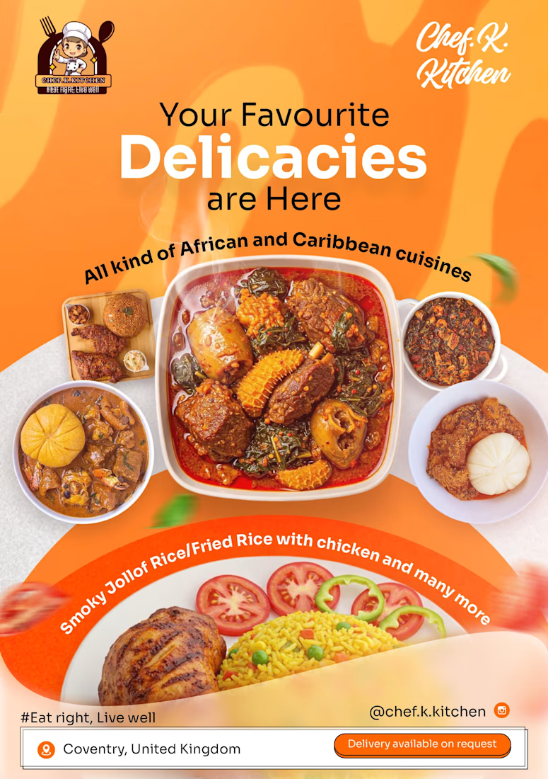
So I designed this flyer for a client of mine, then I decided to give it more life using kling AI. what do you feel about the design and the motion added to it?


The network for creativity
Join 1.25M professional creatives like you
Connect with clients, get discovered, and run your business 100% commission-free
Creatives on Contra have earned over $150M and we are just getting started











Related posts

Pakeging Design Brand Design Product Design

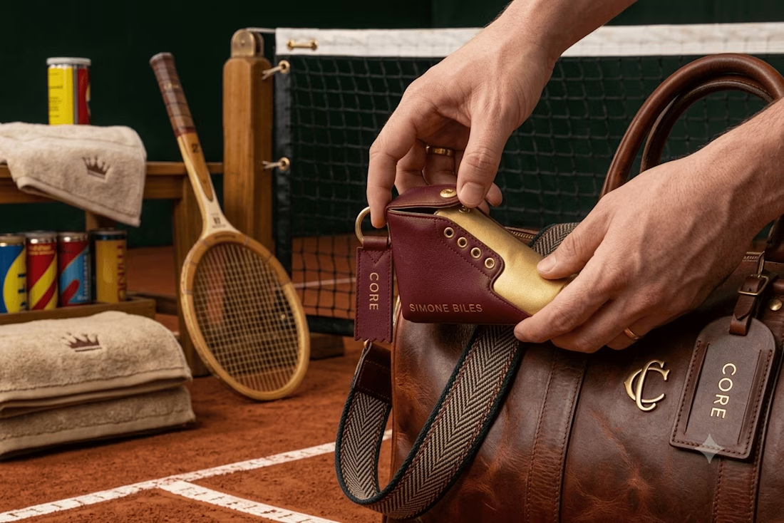
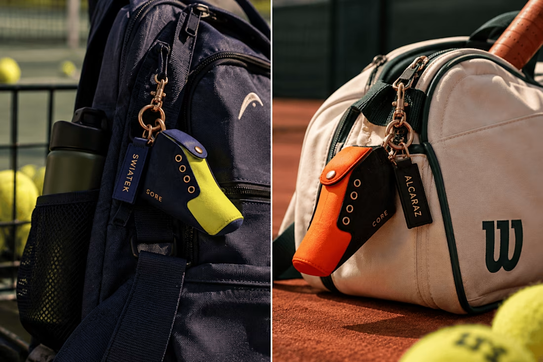
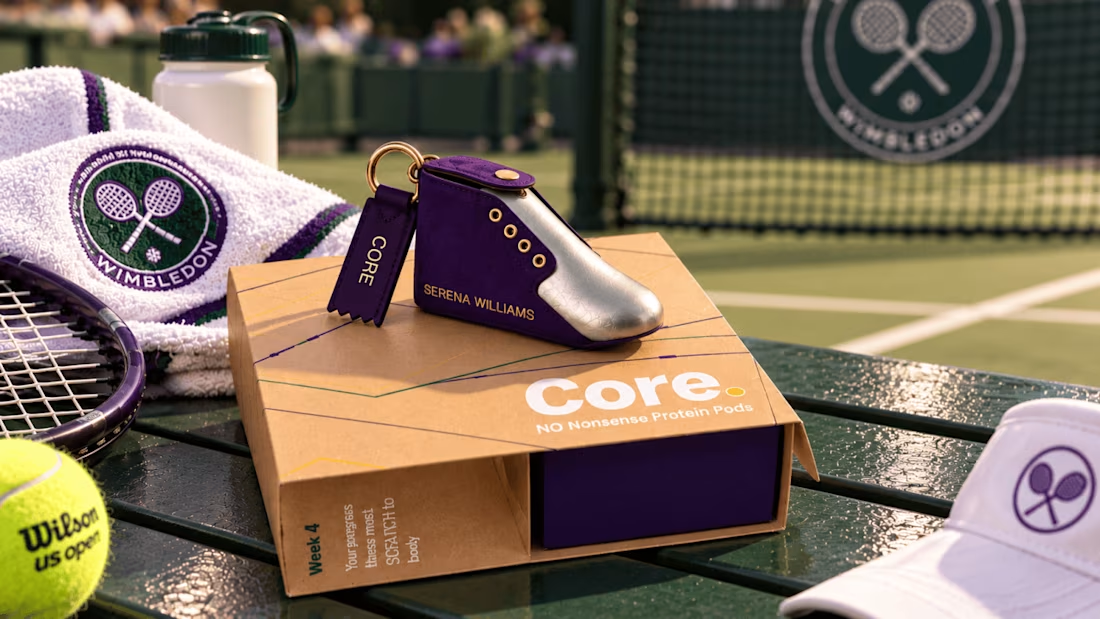

Did any of these images make you stop for a second?
That was the whole point.
A strong visual does not stop the scroll only because it is “beautiful”.
It usually stops the scroll because something feels slightly unexpected. Not random. Not weird for the sake of being weird. Just enough visual tension to make the brain pause.
A few mechanics I used in this set:
• Unexpected color logic
Snow-white animals, a burgundy horse, a white crow. Familiar subjects, unfamiliar treatment.
• Controlled surrealism
Floating fish, whales in the sky, animals appearing where they normally shouldn’t.
• Scale distortion
A giant rabbit turns a simple fashion scene into something instantly less predictable.
• Unusual perspective
Top-down herds, extreme low angles, fisheye-like shots. The same subject feels completely different when the camera stops behaving normally.
• Context collision
A white horse on a burgundy sofa in an open landscape. Two worlds that should not meet, but somehow work visually.
• Shape and overlap
Sometimes the strongest part is not the subject itself, but how two forms create one memorable silhouette.
The goal is not to make the image strange.
The goal is to make it readable enough to understand fast, but unexpected enough to stop for a moment.
That’s where AI becomes interesting for creative direction.
Not as a shortcut to “nice images”, but as a way to test visual mechanics, campaign worlds and attention patterns much faster.
Which one would stop you first?
#AICreative #CreativeDirection #VisualDesign


Elegant floral happy anniversary invitation card design | custom anniversary invite for couple | watercolor butterfly pink roses theme | printable Canva design | order now
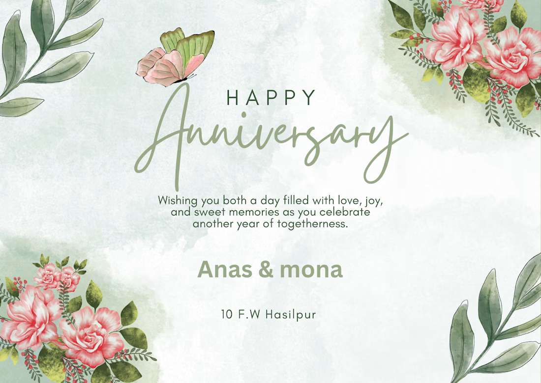


the butterfly up top in that sage green and pink is such a soft touch