The network for creativity
Join 1.25M professional creatives like you
Connect with clients, get discovered, and run your business 100% commission-free
Creatives on Contra have earned over $150M and we are just getting started
Back to feedPost

Modern Webflow & React Website for a Public Safety Tech Platform🚀


The network for creativity
Join 1.25M professional creatives like you
Connect with clients, get discovered, and run your business 100% commission-free
Creatives on Contra have earned over $150M and we are just getting started







Related posts

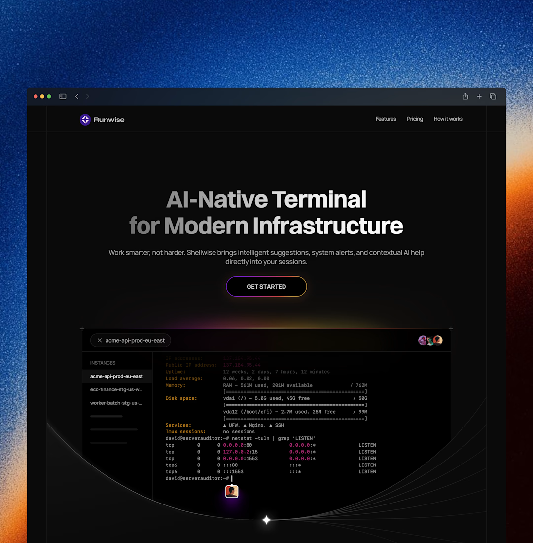
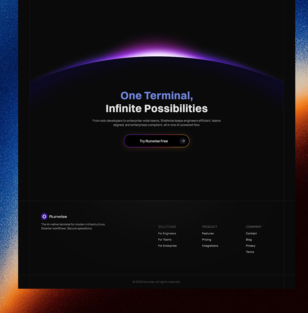
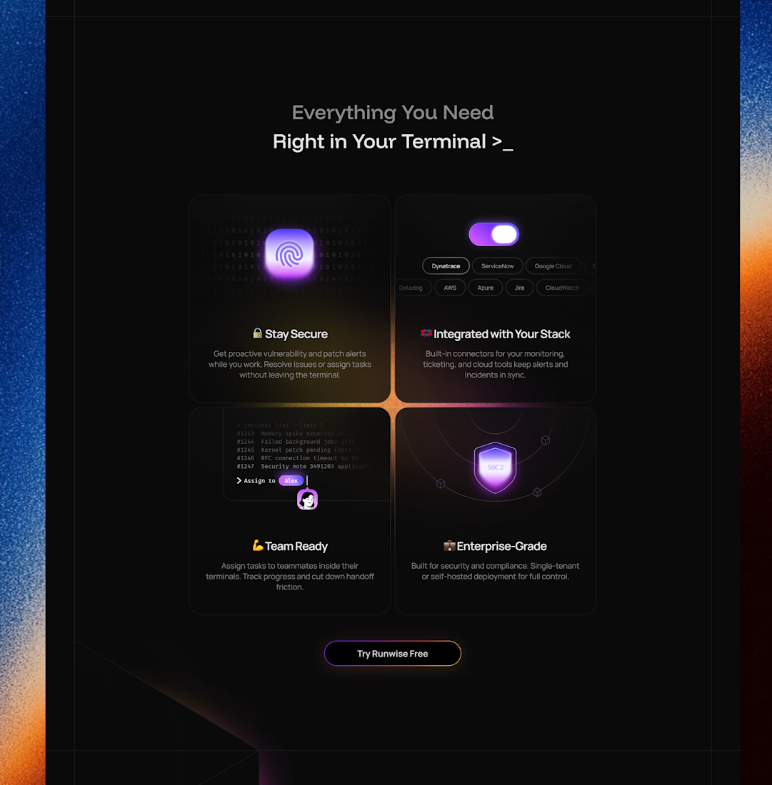
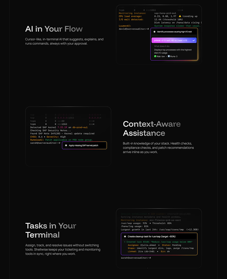
Landing page for an AI-native terminal platform




Some more experimental futuristic typography story design for Bar LOQA.


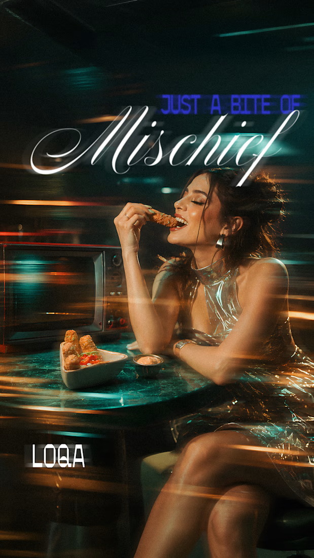
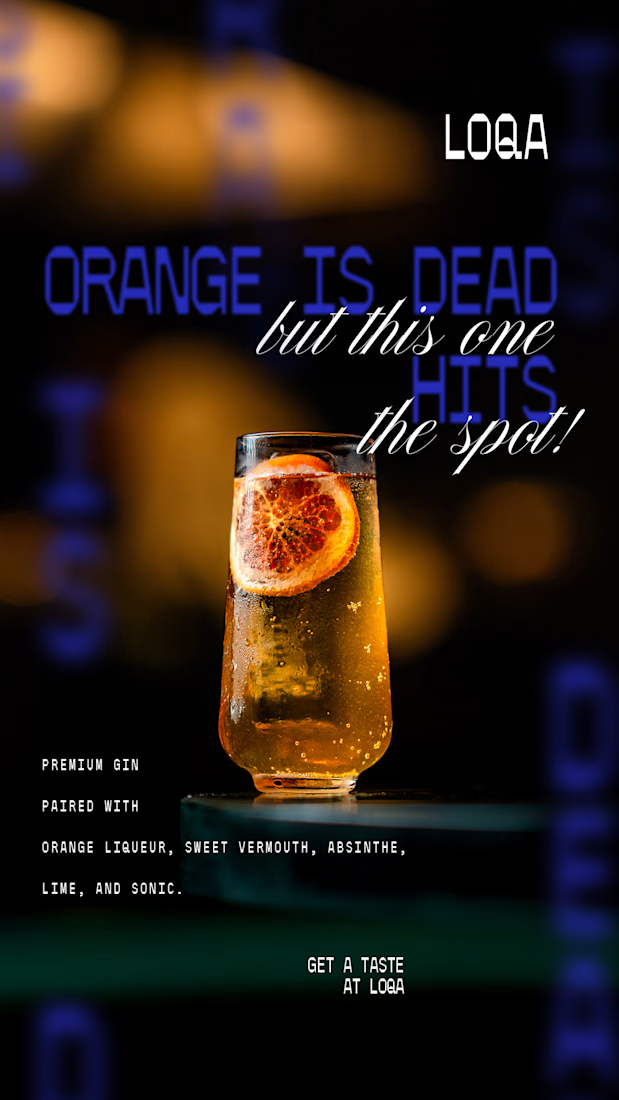
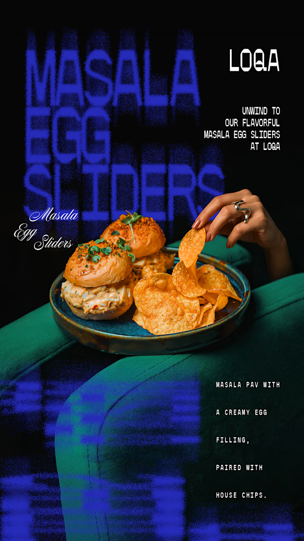
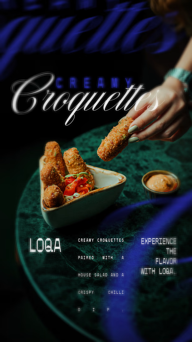

The script lettering over the cocktail sits in the glow without fighting the photo, while the sliders frame gets a much lighter touch. Do you place the type first and crop the image around it, or the other way round?

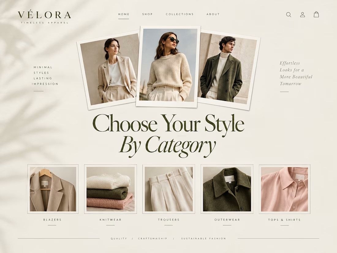
E-commerce isn't just about listing products—it’s about creating a premium visual ritual.


visual ritual is a nice way to put it