The network for creativity
Join 1.25M professional creatives like you
Connect with clients, get discovered, and run your business 100% commission-free
Creatives on Contra have earned over $150M and we are just getting started
Back to feedPost

Beam Coffee Bar – Brand Identity & Storefront Design
Services: Brand Identity, Packaging Design, Custom Iconography, Storefront Design, Merchandise
About the Project
Beam Coffee Bar is a modern, neighborhood coffee spot that doesn't take itself too seriously, but takes its coffee very seriously. The goal was to create an approachable, highly recognizable, and uplifting brand identity that brings a pop of color and personality to the daily coffee routine.
The Challenge
The third-wave coffee scene is often dominated by ultra-minimalist, moody, or hyper-industrial aesthetics. The challenge for Beam was to break the mold by designing a visual identity that feels incredibly fresh, playful, and inviting, while still communicating the high quality of their espresso and baked goods.
The Solution & Design Choices
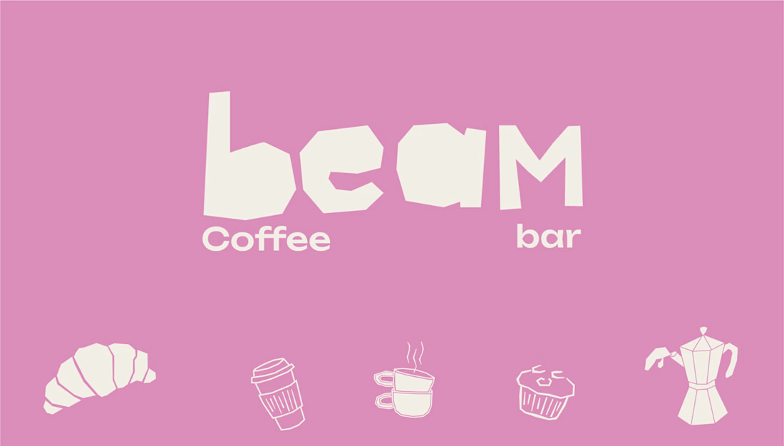
Logo & Typography: The custom "beam" wordmark features chunky, irregular, "cut-out" style lettering. This organic, slightly imperfect typography gives the brand a human touch and a playful, laid-back energy.
Color Palette: I moved away from traditional coffee tones and introduced a signature, vibrant pastel pink paired with off-white and a deep, dark roast brown. This high-contrast palette makes the brand instantly recognizable and highly "Instagrammable."
Custom Iconography: To add charm across all touchpoints, I developed a set of quirky, hand-drawn line art icons featuring a croissant, a muffin, stacked coffee cups, a moka pot, and a stylized character enjoying a brew.
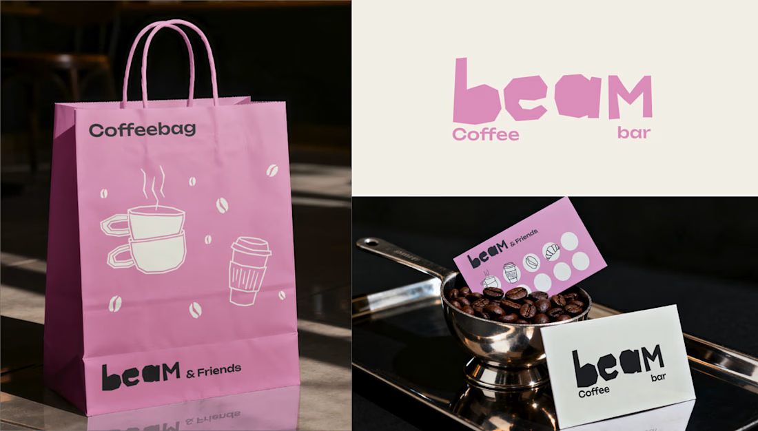
Packaging & Merchandise: The playful aesthetic was rolled out across various physical items, including pink "Snackbags" for pastries, custom coffee cups with personalized name spaces ("This is your Cappuccino, Laura"), branded receipts, and "beam & Friends" punch cards for community loyalty.
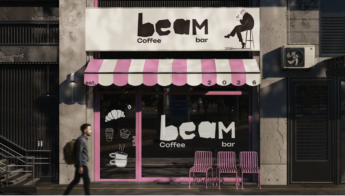
Storefront Design: The brand comes to life on the street level with a striking pink-and-white striped awning, crisp window decals featuring the custom iconography, and a clean, brightly lit shop sign that makes the café an unmissable local landmark.
Deliverables
Primary Logo & Typography System
Custom Illustration & Iconography Library
Packaging Design (Cups, Snack bags, Receipts)
Merchandise & Loyalty Cards ("beam & Friends")
Physical Storefront Branding (Awning, Signage, Window Decals)
Looking for a brand identity that stands out in a crowded market? Let's collaborate and bring your vision to life.


The network for creativity
Join 1.25M professional creatives like you
Connect with clients, get discovered, and run your business 100% commission-free
Creatives on Contra have earned over $150M and we are just getting started

Challenges
View all


Related posts

I just joined Contra and I’m still figuring out how things work around here, so I thought I’d introduce myself instead of quietly lurking.
I’m Mariya, founder, strategist and lead designer behind Mariya Design. I’ve worked internationally since 2015, and today I run a boutique branding studio focused on brand identity systems for premium and luxury-led brands.
Most of my work sits somewhere between identity, packaging and the wider system around them. I’m particularly interested in what happens after the logo: how typography, color, packaging, digital applications and brand rules actually hold together as the business grows.
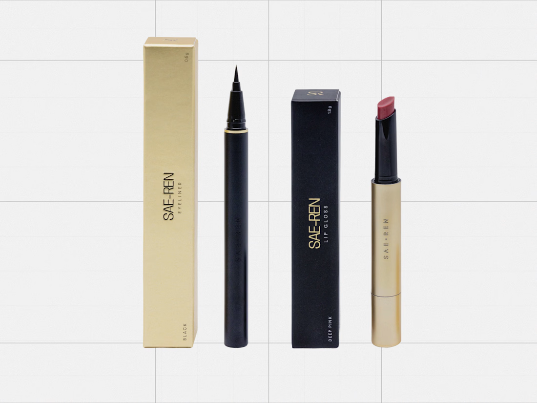
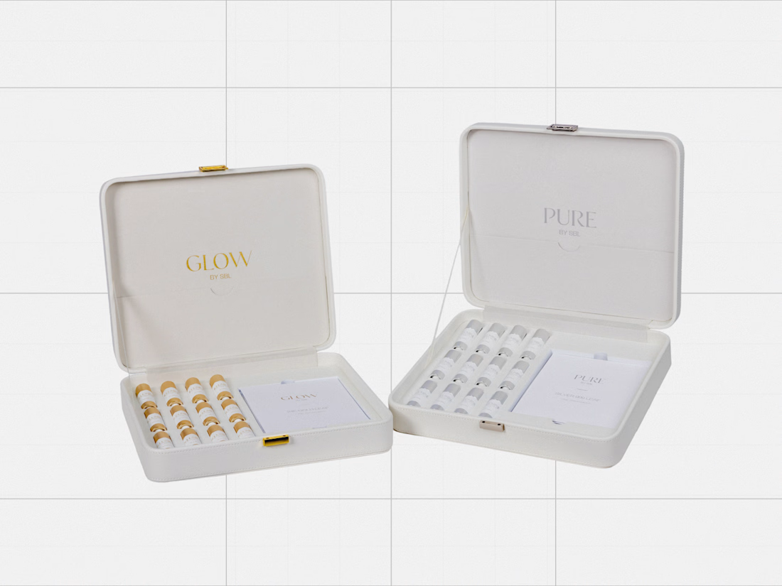
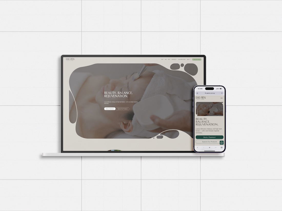
One project I’ve been revisiting recently is SAE-REN, a premium beauty and wellness identity system. I’m currently rebuilding some of my case-study presentation system, so it felt like a good one to share here first.
And since I’m genuinely new to Contra, I’d love to hear from people who have been active here for a while:
What actually helped you become part of the community here?
Was it sharing work regularly, joining conversations, applying to opportunities, or something else entirely?
Any early mistakes worth avoiding are welcome too.



great designs..

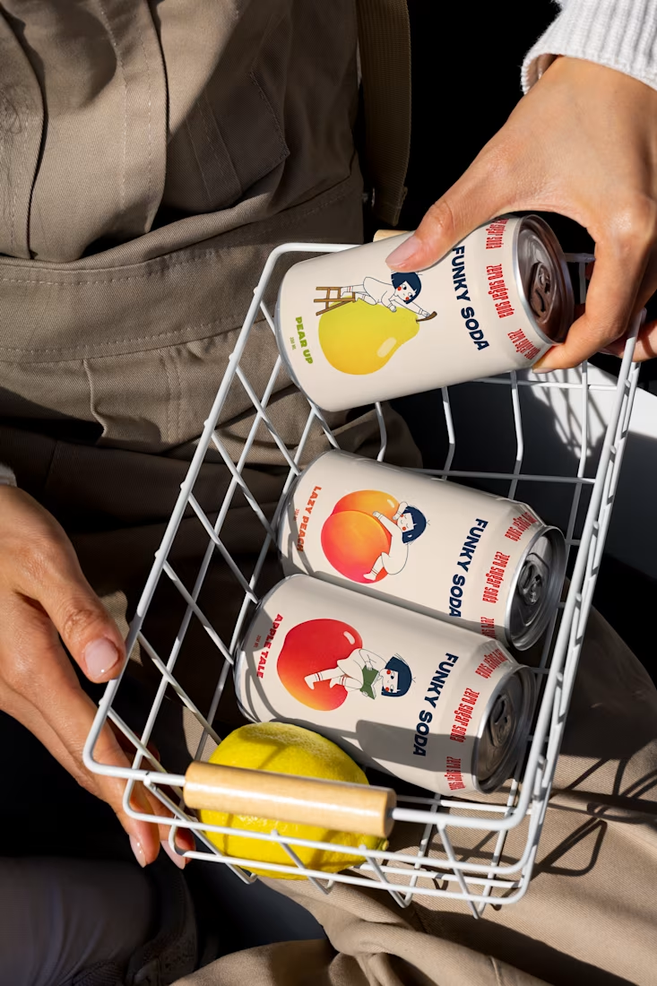

Pro Design :)

Everyone wants their brand to look "premium" but almost nobody can define what that actually means.
In crowded industries like digital marketing, premium is the absence of noise. Every unnecessary element is removed until what's left earns trust on sight and can be immediately recognized.
Designing Nyxora meant understanding that trade-off and building for legacy.
The identity needed to feel current enough to compete with the top agencies out there, but grounded enough that a client would hand over a real budget without hesitation.
The result is an identity built on purpose, one designed to earn trust before it earns attention.
Case study: https://rb.gy/hy6hs1


Nice