The network for creativity
Join 1.25M professional creatives like you
Connect with clients, get discovered, and run your business 100% commission-free
Creatives on Contra have earned over $150M and we are just getting started
Back to feedPost


Your iOS app needs a personality.
Not a mascot. Not animations everywhere.
Just ONE thing that's uniquely yours:
- A distinctive sound
- A custom transition
- A particular shade of blue
- A way you write error messages
Apple calls this "signature moments."
What's yours?

Signature moments is such a good way to put it. That one thing you feel even when you close the app ❤️
Exactly that!
there’s more to how it feels besides pretty pixels

This is such an underrated principle. Most apps chase visual novelty, but memorability often comes from small, consistent signature cues rather than loud design.
This!!
Exactly. Distinctiveness often comes from repetition, not decoration. The small cues compound into brand memory over time.
The network for creativity
Join 1.25M professional creatives like you
Connect with clients, get discovered, and run your business 100% commission-free
Creatives on Contra have earned over $150M and we are just getting started

Challenges
View all


Related posts

one of my favourite things about running a one-person studio is that nothing gets lost in translation.
the idea behind the brand is the same idea that shapes the website and the product.
no handovers, no starting from scratch, no trying to explain the vision to someone new.
a little look at how that came together for goals, from the first moodboard to the app ↓
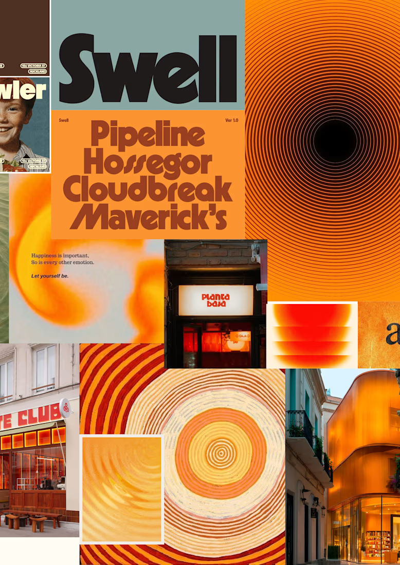
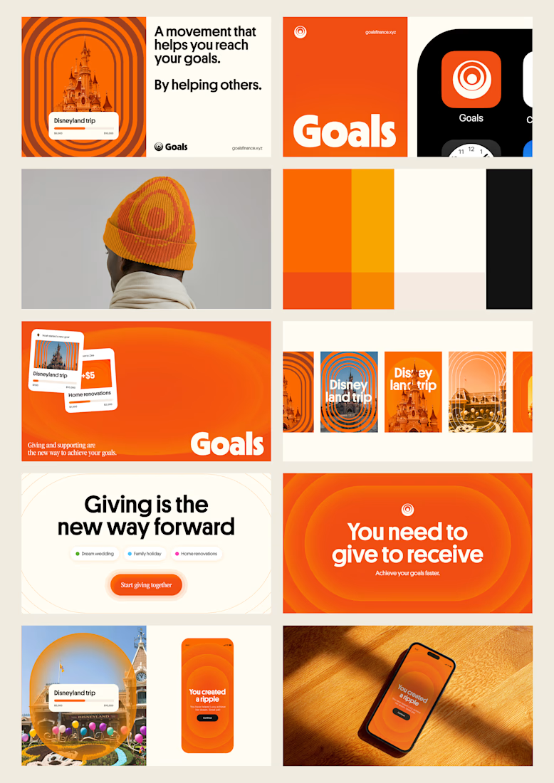
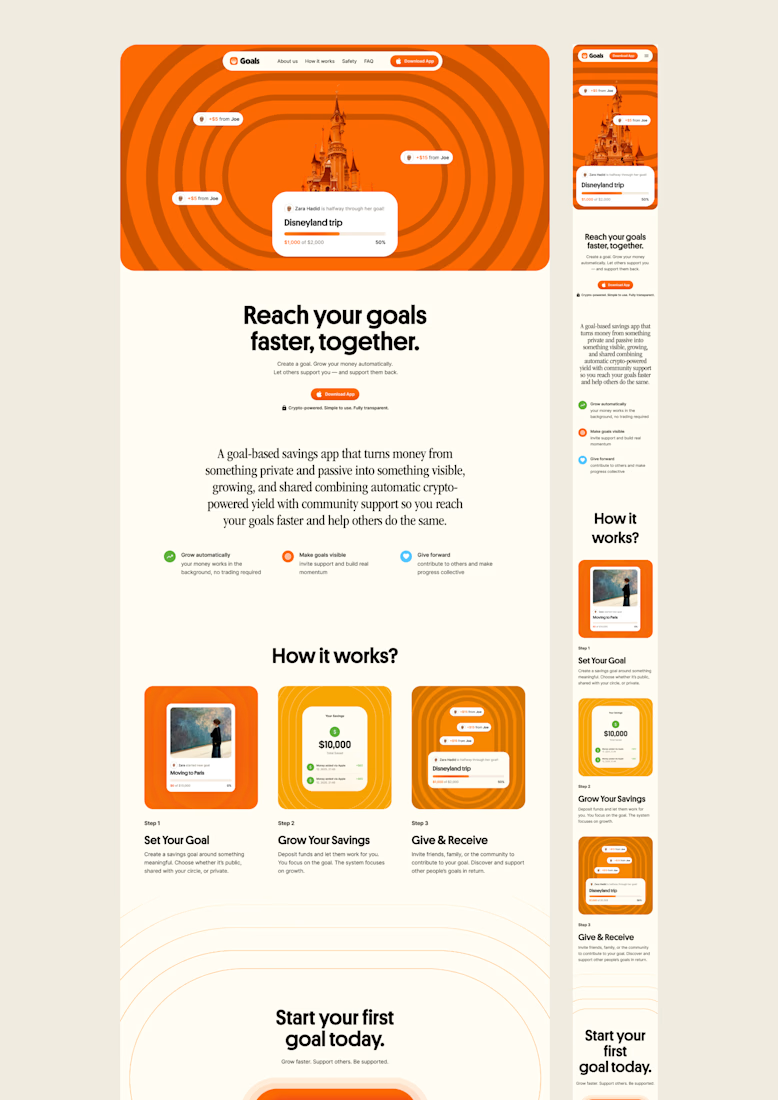
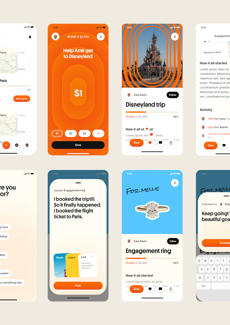

Love it!

A generative ambient station of drones, rain, and distant thunder.
I built this project to test A generative ambient station of drones, rain, and distant thunder. The core engineering challenge was sustaining uncompromised 60 FPS rendering using Web Audio API while handling continuous user interaction without framework overhead.
WHAT I WAS TESTING:
I focused on two core engineering benchmarks:
Continuous algorithmic generative music that never repeats, with sub-bass drone layers
Atmospheric rain, vinyl static, and distant thunder audio synthesis
THE TECHNICAL SIDE:
Built entirely with native Web Audio AudioNodes. Oscillators tuned to just-intonation intervals modulate lowpass filters, while brownian noise generates random rain and thunder rumbles.
Everything executes in the browser using Web Audio API, Generative Ambient Synthesis, Binaural Noise Engine. No third-party frameworks, no heavy runtime bundles, and zero external tracking.
WHAT I LEARNED:
Audio clipping easily occurs when multiple generative sound layers peak concurrently. Implementing a master dynamics compressor node preserved acoustic clarity.
Finding the sweet spot between mathematical precision and frame budget took careful profiling, but the result runs at a steady 60 FPS even on modest hardware.
TRY IT YOURSELF:
The live build is deployed on my JSFiddle. Open it in your browser, test the controls, and observe the render response times.
If you are building high-performance 3D, physics, or creative web systems and want to collaborate, reach out here on Contra.


Emergency SOS App | Mobile UI/UX Design
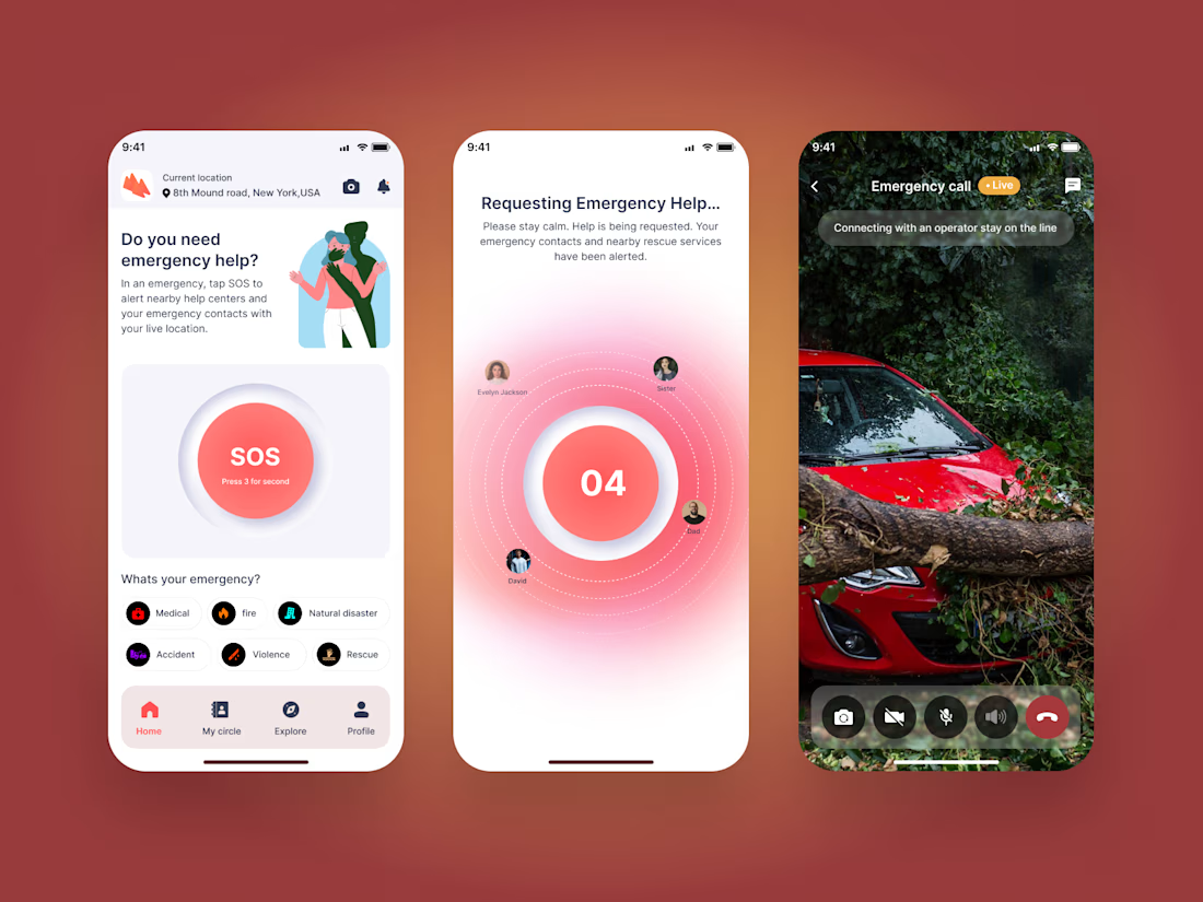
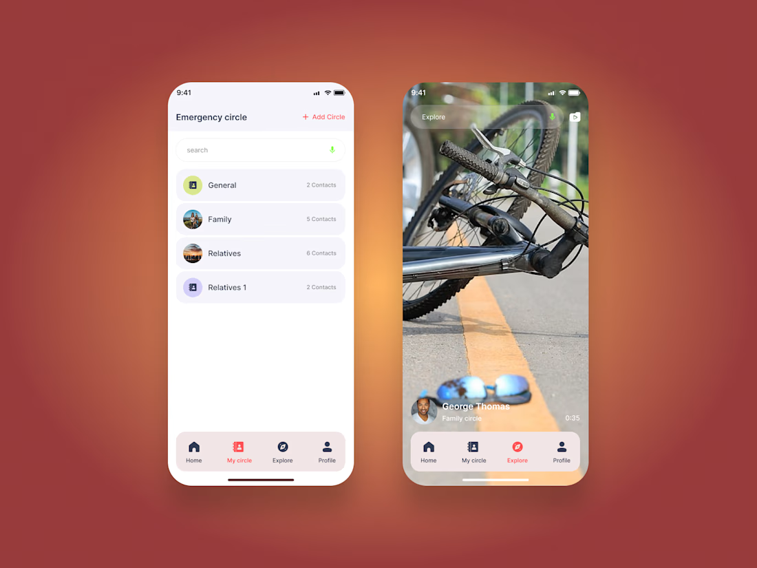
A modern emergency assistance mobile app designed to help users quickly access emergency support and stay connected with their trusted contacts.
The experience includes emergency circles, SOS activation, emergency categories, location-based assistance, live emergency communication, and real-time support flows.
Designed in Figma with a focus on clear navigation, accessibility, and a calm interface for high-pressure situations.
Tool: Figma
Focus: Mobile UI/UX, Emergency App, Safety App, Interaction Design, Product Design



Great UI and UX design 🎉🎉