The network for creativity
Join 1.25M professional creatives like you
Connect with clients, get discovered, and run your business 100% commission-free
Creatives on Contra have earned over $150M and we are just getting started
Back to feedPost


Social Media Content — Sakena Coaching Brand🙌






The network for creativity
Join 1.25M professional creatives like you
Connect with clients, get discovered, and run your business 100% commission-free
Creatives on Contra have earned over $150M and we are just getting started

Challenges
View all


Related posts

200 reactions look great, but what do they tell us?
As a content and social media manager, I look beyond the engagement count: are we reaching the people we want to reach and getting the response we’re aiming for?
If the goal is to generate product interest, I’d rather see 20 people asking about the product than 200 simply liking the video.
Both can be valuable, but the goal determines which matters more.
Which audience would you rather build?
3 voted
27%
8 voted
73%
11 votes
Closed

This creative is 🔥 — and your stratagy is really awsome that show how you make the intrests of your's clint and engage them for long term work.

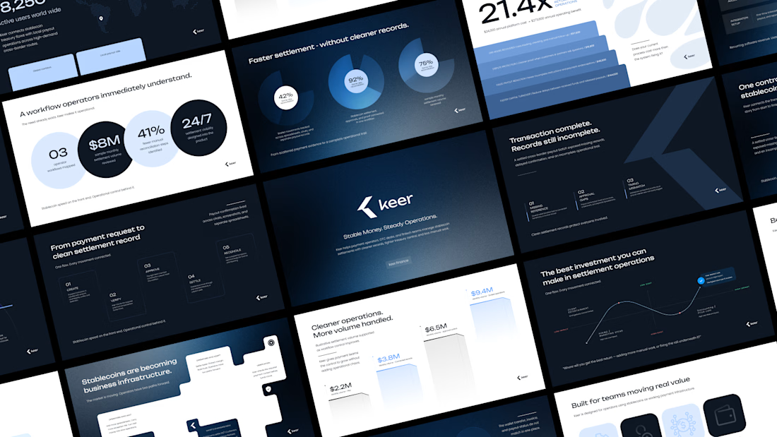
Minimalism isn't a style choice. It's a discipline.
Anyone can strip a slide down to one line and call it clean. The harder part is knowing what to keep, and why every element that stays has a reason to be there.
This deck runs on that principle. Dark base because contrast is the fastest way to direct attention. One accent color because more than one is a decision you haven't made yet. Grid-locked layouts because when the structure holds, the content doesn't have to fight for space.
I design across industries. Tech, finance, healthcare, consumer brands. But there's something about high-stakes products, the ones where a single presentation can move serious money, that pushes the design thinking further.
This is one of those.
I didn't design this to look like a fintech deck. I designed it to look like a decision has already been made, and the slides are just showing you why.
Does the vibe land for you?
Full case study Keer





minimalism is a discipline,, 100% agree

Built a custom internal workspace that runs an entire marketing team from one dashboard — tasks, targets, reports, and a unified social inbox, all in a single place instead of scattered across five different apps.
Engineered it as a secure multi-user system: two-factor authentication with authenticator-app support, backup codes, and admin-controlled access — not just a UI, but proper auth architecture built to protect real business data.
Handled it end to end: scoping, backend logic, frontend, deployment, delivery.
Stack: Full-stack · Backend · REST APIs · Authentication (2FA) · Dashboard
Open to similar internal tools, SaaS dashboards & team-management systems.

