The network for creativity
Join 1.25M professional creatives like you
Connect with clients, get discovered, and run your business 100% commission-free
Creatives on Contra have earned over $150M and we are just getting started
Back to feedPost

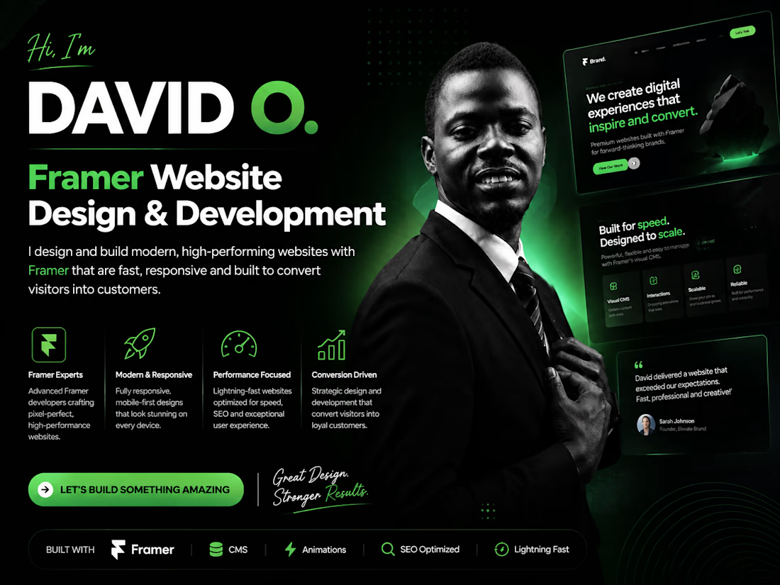
Your website doesn't need more sections. It needs more clarity.
I've seen landing pages with:
10+ sections
Multiple CTAs
Long paragraphs
Too many animations
And way too much information.
The result?
Visitors don't know where to look.
A better approach:
1. Make the value proposition obvious.
2. Give the page a clear visual flow.
3. Use fewer, stronger CTAs.
4. Remove anything that doesn't support the goal.
5. Let the design breathe.
Good web design isn't about how much you can fit on a page.
It's about how quickly someone understands it.


The network for creativity
Join 1.25M professional creatives like you
Connect with clients, get discovered, and run your business 100% commission-free
Creatives on Contra have earned over $150M and we are just getting started

Challenges
View all


Related posts

New website for Beer Zombies Brewing Co. 🍺🧟♂️
Designed to be bold, vibrant, and disruptive. This was a fun build because the BZ brand already has such a strong visual identity and personality. Oversized typography, aggressive motion, interactive effects, and a healthy dose of zombie aesthetics. 🤘
www.beerzombies.com


The oversized type and aggressive motion fit the beer-brand attitude perfectly, especially how the green palette carries from the hero into the product details.

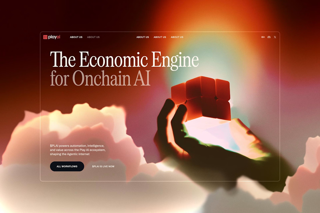


Would you stop to look at these homes?
That’s what I enjoy about this design.
It makes browsing feel natural, even when you’re just there to check out the website.
Developed in Webflow.


Beautiful!