The network for creativity
Join 1.25M professional creatives like you
Connect with clients, get discovered, and run your business 100% commission-free
Creatives on Contra have earned over $150M and we are just getting started
Back to feedPost
Zesty — Energy Drink Branding, Character Design & 3D Lifestyle Visuals 🌟
Rebranding energy with a dose of retro nostalgia.
Zesty is a concept energy drink brand that blends 1930s rubber-hose character illustrations with a modern streetwear aesthetic. Instead of doomscrolling, I designed a complete visual identity system—from 2D character design and packaging wrap layouts to full product renders and editorial lifestyle campaign assets.
Let me know your thoughts.. 💭👀
visualbrandingvisualbrandingdesignconceptdesignAI Video ProductionBrand DesignCreative Design Adobe PhotoshopGoogle FlowMidjourney


Tooba, that little lightning character has so much personality 💛

Thanks Thayline 🌟
The network for creativity
Join 1.25M professional creatives like you
Connect with clients, get discovered, and run your business 100% commission-free
Creatives on Contra have earned over $150M and we are just getting started











Related posts

A natural and premium packaging concept inspired by the purity of wildflower honey and the beauty of nature. The design combines warm honey tones, textured paper, bold typography, and a clean label layout to create an authentic, handcrafted feel.

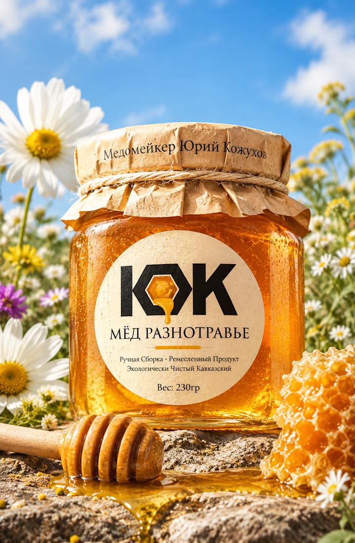

The honey drop sitting inside the O of the wordmark is a delightful detail, Umar. Textured paper plus that bold type really sells the handcrafted feel. This would stand out beautifully on a shelf.




Clean and confident work! The green gradient with the mark feels very modern for fintech - trustworthy but not boring. The app screens look really polished. Curious how you landed on this mark, does it represent growth / movement?

Pulse Athletics... Branding & App design✨
Check it out
#app #sport #productdesign #uiuxdesign #uidesigner #uxdesigner #pulse #branding #brandidentity #brandstrategy #brandguidelines #logo #homepage

That's really stunning app design🔥🔥🔥
Great job Ziva🎉🎉🎉


