The network for creativity
Join 1.25M professional creatives like you
Connect with clients, get discovered, and run your business 100% commission-free
Creatives on Contra have earned over $150M and we are just getting started
Back to feedPost
Engineered an interactive commerce platform for autonomous multi-channel retail.
Built with high-conversion frontend craftsmanship:
• Bespoke warm-linen editorial palette with tactile state micro-interactions
• Dynamic live telemetry console with real-time budget calibration sliders
• Reactive 4-step autonomous pipeline with live event stream toasts
• 60 FPS performance, fluid responsive architecture & clean component hierarchy
Stack: React • TypeScript • Tailwind CSS


The warm-linen editorial palette is the detail that gets me. Most autonomous commerce pitches look like cold dashboards, this one actually feels like a place you'd shop. The live telemetry console with the budget sliders sounds genuinely fun to play with. Was the 60 FPS...

Appreciate it, Timothy! That warm-linen feel was intentional—we wanted to steer clear of the sterile dark-mode SaaS trope and make it feel like tactile editorial print.
On the 60 FPS side: the architecture actually made it surprisingly smooth. Instead of running heavy canvas or...

The budget sliders update live, which makes the pitch feel tangible. Nice React work.
Thanks Rafee! That was the goal, static numbers never hit the same way as actually seeing the math shift in real time. Appreciate the feedback!
The network for creativity
Join 1.25M professional creatives like you
Connect with clients, get discovered, and run your business 100% commission-free
Creatives on Contra have earned over $150M and we are just getting started











Related posts


This UI was really great nice job Piotr🔥🔥🔥

An interaction study for Mare’s collection feed, exploring how to make groups legible within a dense, mixed-format archive.
The layout preserves image proportions and integrates collection labels into the packing system. On hover, image-derived gradients establish the collection boundary, while subtle displacement creates space around the active group without changing its position or scale.
The motion studies isolate assembly, packing, colour and proximity, using real collection content to examine timing, spatial continuity and hover behaviour.


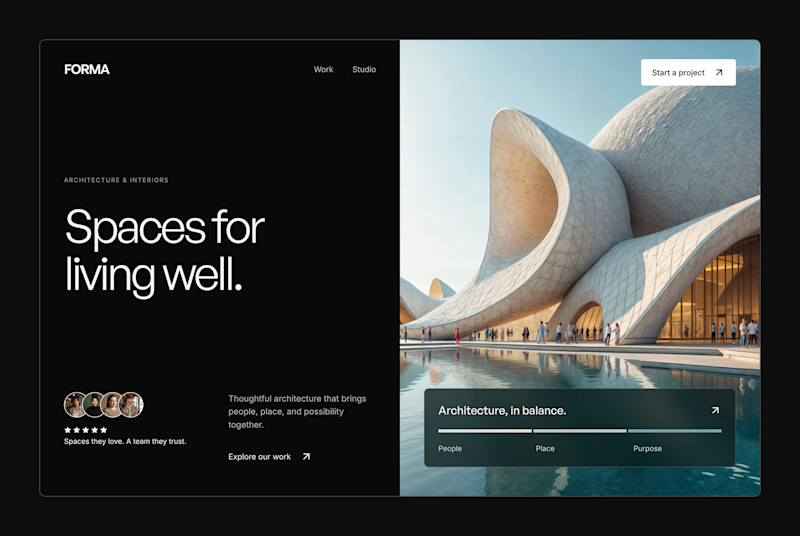
Design Exploration: Hero Section of Architecture Website. Which one do you think much better?


12 voted
43%
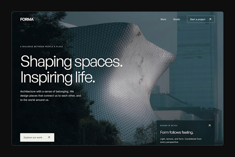
16 voted
57%
28 votes
Closed

