The network for creativity
Join 1.25M professional creatives like you
Connect with clients, get discovered, and run your business 100% commission-free
Creatives on Contra have earned over $150M and we are just getting started
Back to feedPost

The challenge: colors + a logo ≠ a brand.
Most products stop there. The focus here was building a brand that carries through the entire experience — so even without the brand image or name, it still feels unmistakably "it".
⚙️ Brand → Assets → Design System → Web Design
👉 Case study: Here
The network for creativity
Join 1.25M professional creatives like you
Connect with clients, get discovered, and run your business 100% commission-free
Creatives on Contra have earned over $150M and we are just getting started





Related posts


Which brand showreel preview design would you choose - Silver & Ropes or Purple Stones? ⚡
Lynksen is cooking something fire...
and we need your expert eyes on this one 🔥😎
Vote and tell why! 👇


12 voted
24%
37 voted
76%
49 votes
Closed

Going with Purple Stones. It feels more distinctive and memorable for a showreel, Silver & Ropes is clean but a bit safer.

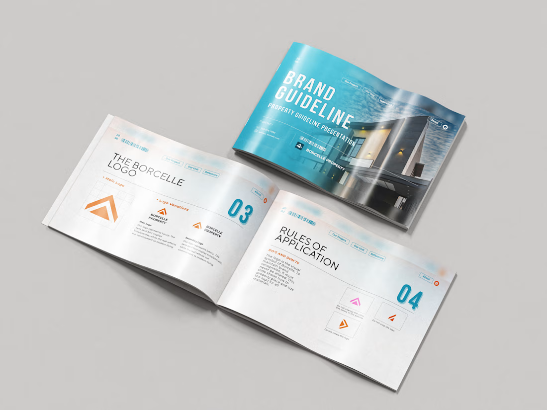
Just wrapped a brand identity concept for Haven Ridge Properties, a real estate developer selling to first-time buyers and investors.
The challenge: feel premium without feeling cold.
The answer was two ideas shelter and growth.
The mark is a roofline that doubles as an upward arrow: home and long term value in one symbol.
What's inside the guidelines:
• Primary and secondary logo lockups
• Logo usage rules
• Typography system
• Colour palette with clear roles
• Imagery direction
• Digital and print applications
Which detail stands out most to you?
#branding #brandidentity #logodesign #brandguidelines #realestate

Your competitors are a reference point, not a creative brief!!
For Nazariya Living, we started by studying the visual language of the premium carpet and home décor category. From logo styles to typography and overall aesthetics, we mapped the conventions that had become familiar across the market.
But understanding the category was only the starting point.
We wanted to build something that didn't just fit into the market, but brought a distinct point of view to it.
An identity rooted in storytelling, archival references and a visual language of its own.
Understand the category. Challenge the convention. Build something worth remembering.
That's how we approach branding for all of our clients.
Are you looking to build a brand that stands apart rather than blend in? Let's talk.



Challenge the convention is easy to say. Ignoring the carpet aisle's beige bible takes nerve.