The network for creativity
Join 1.25M professional creatives like you
Connect with clients, get discovered, and run your business 100% commission-free
Creatives on Contra have earned over $150M and we are just getting started
Back to feedPost

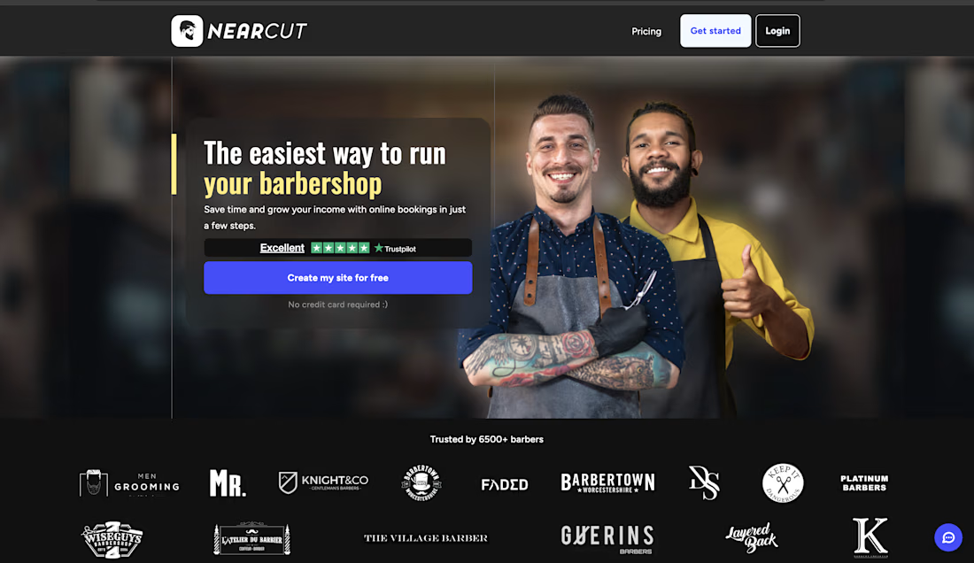
Built Nearcut a full SaaS platform trusted by 6,500+ barbers across the UK. The system handles online booking, branded barber websites, automated cancellation filling, no-show payment protection, Google review automation, and custom App Store apps per business.
Delivered end-to-end using Next.js and Node.js with a CMS backend, scheduling API, payment integration, and automated notification system. Live product serving thousands of real users with 2,000+ weekly appointments managed on a single account.


The network for creativity
Join 1.25M professional creatives like you
Connect with clients, get discovered, and run your business 100% commission-free
Creatives on Contra have earned over $150M and we are just getting started











Related posts

Designing a fragrance website with 2 sections that feels as premium as the product.
Built a fragrance experience where the product takes center stage.
I wanted the website to feel as refined as the fragrances themselves minimal layout, strong typography, immersive product visuals, and subtle interactions that make exploring each scent feel premium.
The goal wasn’t to fill the page with elements, but to give every product enough space to create its own presence.
Built with Next.js, with a focus on responsive design, smooth interactions, and a polished browsing experience.


The product imagery is doing most of the work here. Did you use art-directed mobile crops, or keep one image with a different object position? That can preserve label detail without loading the full desktop asset.

Building a Modern Restaurant Management Dashboard with Lovable (Light ☀️ vs. Dark 🌙)
I’ve been working on the dashboard interface for ReserveTable (Eat Pro Japan), focusing on giving restaurant managers and users a clean, modern, and intuitive interface to manage bookings, tables, and analytics.
Using Lovable, I was able to rapidly prototype and construct a modern UI system complete with smooth component transitions and native theme switching.
✨ Key Design & Tech Highlights:
⚡ Built with Lovable: Leveraged AI-powered design-to-code workflows to assemble clean component hierarchies, responsive search/filter bars, and sleek cards rapidly.
🌗 Seamless Light & Dark Mode: Designed a flexible color system using modern CSS variables / Tailwind tokens so the entire interface gracefully shifts between an elegant light aesthetic and a moody, dark dining ambience.
🎯 Contextual UI Elements: Styled input controls, select menus, and primary CTA buttons to maintain legibility and contrast across both light and dark themes.


For reservation and table states, the same semantic color tokens need to stay clear in light and dark mode. Did you define status tokens once and map both themes to them, or tune those colors per component?

Genuine update: I have immediate bandwidth and am actively looking for paid client projects right now 🤝
I am a frontend developer & UI designer obsessed with crafting fast, cinematic, and responsive web experiences (like this lunar concept built in React + Vite).
What I can build for you:
• High-converting landing pages & MVP frontend (React, Vite, CSS)
• Complete website redesigns & modern UI/UX
• Interactive micro-animations & smooth responsive layouts
Why work with me right now:
→ 100% dedicated attention (fast 24-48h updates)
→ Extremely flexible on budget & pricing (focused on delivering value & building strong testimonials)
→ Ready to start immediately
If you or anyone in your network needs a website built or revamped, please DM me or leave a comment below. I am ready to get to work! 📩
#webdesign #frontend #freelance #reactjs #uiux #buildinpublic
For the lunar concept, how are you handling motion on smaller screens—fewer parallax layers or shorter scroll travel? That choice affects both frame rate and readability.