The network for creativity
Join 1.25M professional creatives like you
Connect with clients, get discovered, and run your business 100% commission-free
Creatives on Contra have earned over $150M and we are just getting started
Back to feedPost


The network for creativity
Join 1.25M professional creatives like you
Connect with clients, get discovered, and run your business 100% commission-free
Creatives on Contra have earned over $150M and we are just getting started
Challenges
View all


Related posts

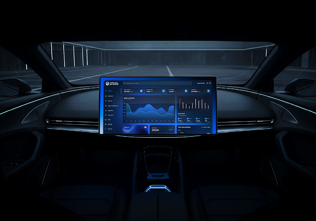
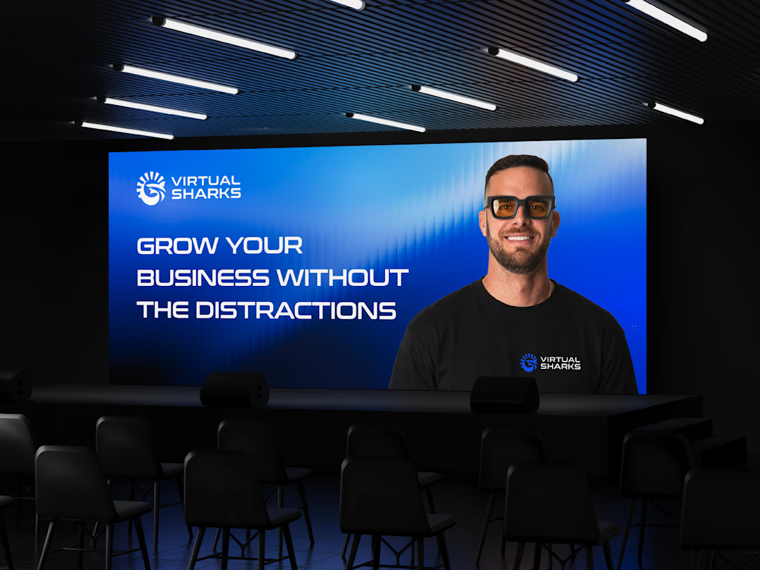
Returning to foundational assets is always a valuable exercise in brand scalability. Currently, I am preparing and structuring the master delivery files for a new sub-brand—built upon a visual identity system I originally designed a couple of years ago. Designing adaptable brand frameworks from day one is what allows a business to expand seamlessly over time while maintaining complete visual coherence. Looking forward to sharing the final execution soon.



What if an image grid could behave like liquid?
Just finished Chromatic Grid, a new experiment exploring how a traditional image gallery can become something more sculptural and interactive.
A few things I explored:
→ An hourglass-shaped 3D image grid.
→ Scroll-driven stretching and twisting.
→ Liquid distortions that respond to cursor movement.
→ Fluid reveals and color-to-B&W transitions.
The challenge was making everything feel like one continuous material rather than separate effects.
Built with Three.js, WebGL, GLSL & ChatGPT.
Would love to hear what you think!


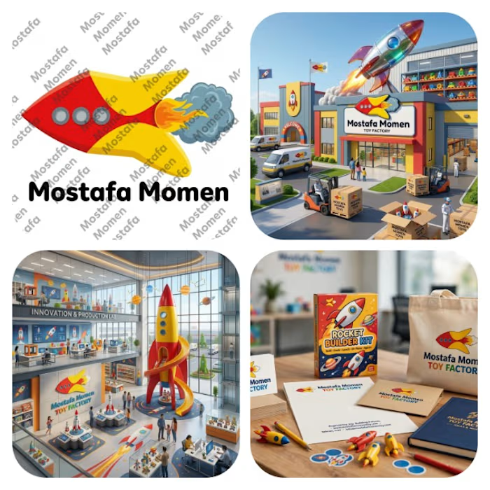
That's my modern minimalist joyful logo that's my case study for it Everything has its joy and kids toys has its own I design this logo because I want to try something different
This logo is mix between vibrant pure yellow and red colors with bold curvy cartoony rocket with cartoony fire and smoke
this logo focus on emotion fun and joy it help to solve the problem of (building trust, showing professionalism & value of brand, memorization, recognition) specially creating attention to attract kids and potential clients