The network for creativity
Join 1.25M professional creatives like you
Connect with clients, get discovered, and run your business 100% commission-free
Creatives on Contra have earned over $150M and we are just getting started
Back to feedPost
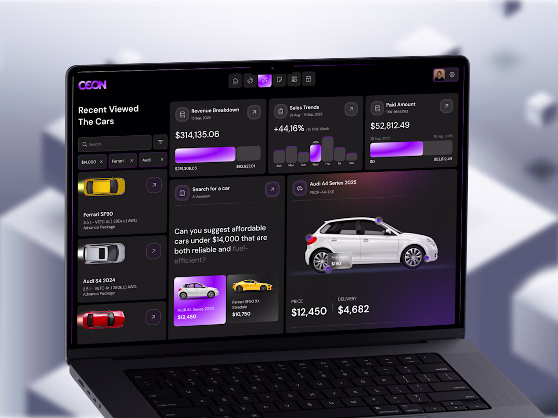
Turning data into decisions - not just dashboards.
Most dashboards look good at first glance.
But when you actually try to use them… it gets confusing fast.
So I explored a different approach.
Instead of adding more charts and numbers,
I focused on making the experience easier to think through.
This automotive analytics concept is built around a simple idea:
help users understand what’s going on — and what to do next.
Here’s what I focused on:
Showing revenue and sales insights clearly, without clutter
Adding an AI-assisted search to make finding the right car easier
Keeping comparisons simple (price, delivery, key details)
Using visual hierarchy to guide attention naturally
Designing a dark UI that feels comfortable for long sessions
The goal wasn’t just to make it look modern.
It was to reduce mental effort and make actions feel obvious.
Because in real products, people don’t need more data.
They need clarity.
And from a business side, this matters more than most people think:
Clear interfaces convert better
Less confusion means fewer drop-offs
Faster decisions = better user experience
And overall, the product just feels more premium
If your product already has data but still feels hard to use,
it’s probably not a data problem.
It’s a clarity problem.
And that’s exactly where good design makes the difference.
The network for creativity
Join 1.25M professional creatives like you
Connect with clients, get discovered, and run your business 100% commission-free
Creatives on Contra have earned over $150M and we are just getting started
Related posts
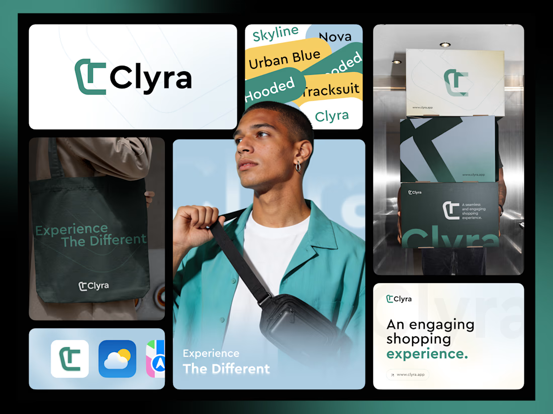
Most brands look good in one place.
Few work everywhere.
Clyra is designed as a complete branding system - not just a logo.
Built with:
• A clean, scalable identity
• A balanced color system
• Real-world applications (packaging, lifestyle)
• A structured bento layout for clarity
The goal wasn’t just aesthetics - it was consistency across every touchpoint.
Because that’s what makes a brand feel real.
If you’re launching or refreshing a fashion or eCommerce brand, I help you create a clear, scalable identity system that works across logo, color, typography, packaging, and digital touchpoints.
📩 Book a project with us today and let’s turn your idea into a brand people remember.
ecommercebrandingfashionecommercefashionbrandingUI DesignUser ResearchUX DesignAdobe IllustratorAdobe PhotoshopFigma
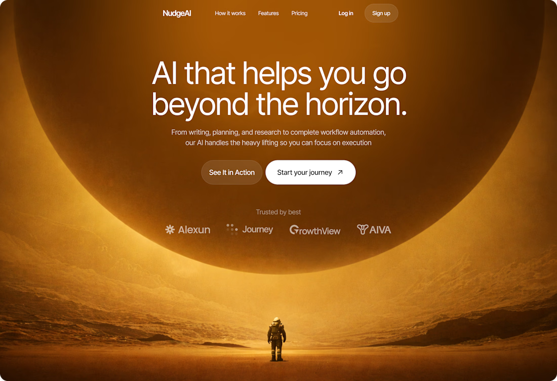
Bind blowing
Designed this hero section for NudgeAI, an AI productivity platform that helps users go beyond the horizon. 🚀
The brief called for something cinematic and immersive, so I leaned into a deep amber cosmic aesthetic, a lone astronaut, a massive planetary backdrop, and clean type that commands attention without competing with the visual.
Every element was intentional: the frosted CTAs, the warm glow, the "trusted by" strip keeping credibility subtle but present.
👉 I'm currently open to gigs and contracts, UI design, App designs, landing pages, brand visuals, you name it. Let's build something great together.
Nice!
Live Events Mobile App Discovery, Booking & Split Bill Flow
This is the discovery and booking flow for a live events mobile app built around one feature that separates it from every other event app out there.
The split bill.
Not a separate screen. Not an afterthought. Built directly into the booking flow so anyone in the group can pay their share instantly no awkward follow-ups, no separate payment apps, no "I'll send you later" moments.
The UI was structured entirely in Figma from component architecture to the full prototype while Jitter handled the micro-interactions and transitions that make the flow feel connected rather than just functional.
The rest of the flow matches that same clarity. Location-aware event discovery. Popular and ongoing event sections. A detail screen with host contact, ticket tier selection, and total amount visible before the final tap.
Every screen answers the next question before the user asks it. Every transition earns its place.
That's what makes a booking flow feel finished not just designed.
See the full case study 👉 https://www.behance.net/gallery/247306827/Instant-Event-APP-UI-UX-Mobile-App-Orbix-Studio
Trending
Runway
AI video generation is exploding. What are you dreaming up in Runway?
Contra University
Learn from expert creatives how to earn more using next-gen AI tools.
creativeaiflow
Creative AI workflows are evolving. What tools do you use, and what are their strengths and weaknesses?
portfolioreview
The best portfolios tell a story, not just show a grid. Share yours for feedback.
freelancerlife
Freelancer life is wins, pivots, and everything in between. What’s yours right now?