The network for creativity
Join 1.25M professional creatives like you
Connect with clients, get discovered, and run your business 100% commission-free
Creatives on Contra have earned over $150M and we are just getting started
Back to feedPost

Instagram Grid Design
Designed a cohesive Instagram grid for a fine jewellery brand, balancing product-focused close-ups with lifestyle and editorial-style shots to create a feed that feels curated rather than transactional. Each post carries a distinct visual theme — from "Eternal Radiance" to "Treasures in Green" — giving the grid a storytelling rhythm rather than a flat product catalogue feel.
The approach leaned into moody, dark backdrops for hero pieces to let the stones and craftsmanship stand out, paired with lighter, textured tones for hand-modeled and process shots (like the "sketch to sparkle" concept piece) to show range without breaking visual consistency. The result is a grid that reads as luxury and heritage-driven, appropriate for a brand built on fine craftsmanship, while staying scroll-stopping enough for Instagram's fast-paced feed.
Deliverables: Grid layout planning, caption theming, visual consistency direction, content sequencing.


The network for creativity
Join 1.25M professional creatives like you
Connect with clients, get discovered, and run your business 100% commission-free
Creatives on Contra have earned over $150M and we are just getting started




Related posts

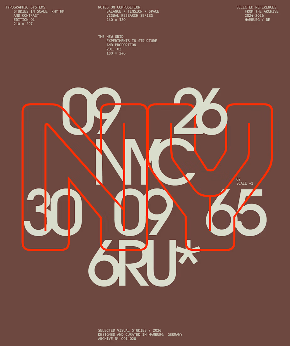
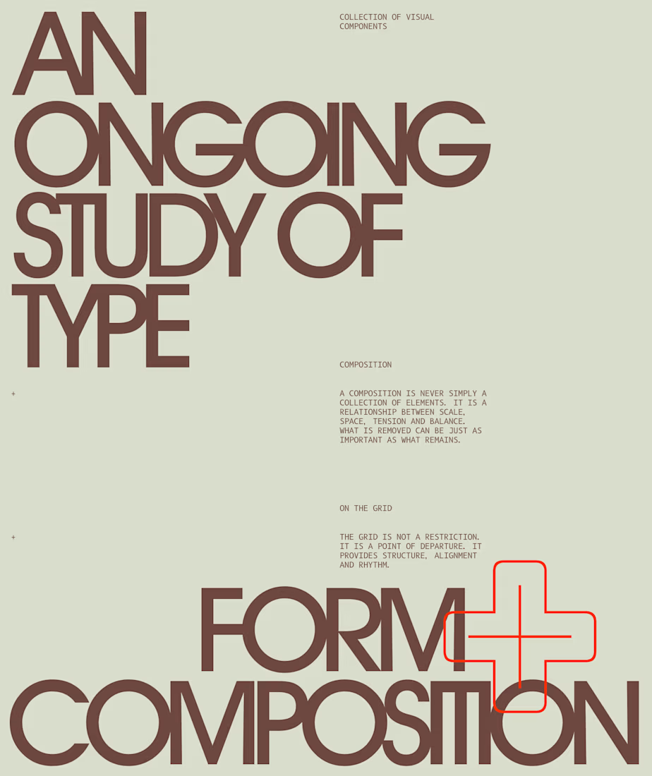
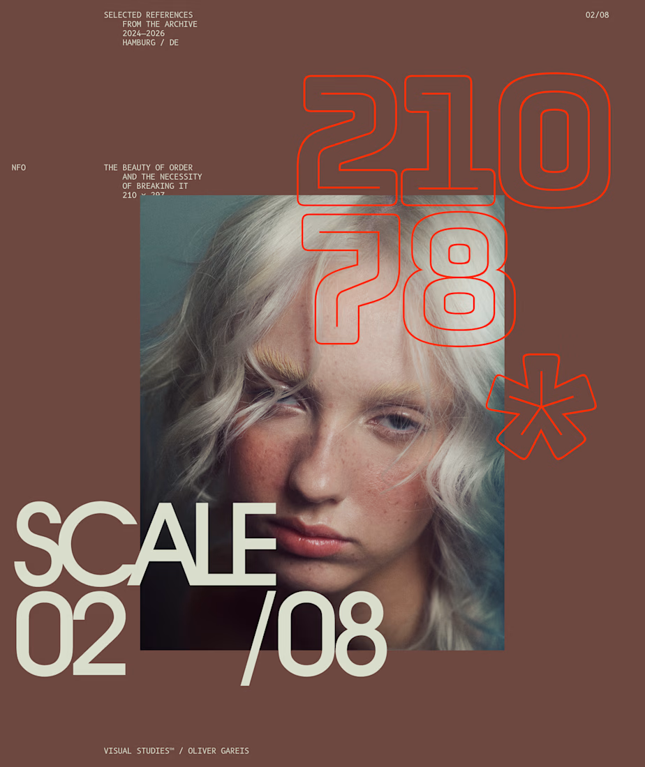
I designed these typographic layouts as part of my ongoing visual series on scale, grid and rhythm
↳ Master typography & layout - The foundation of timeless web design. Join 350+ designers inside my 13-hour online course https://typomonday.com/course


Beautiful wo

Fresh visuals that make you feel the crunch! 🍎✨
Designed this commercial Apple Juice Ad Poster focusing on bold typography, natural product reflections, and rich color contrast to make the product pop right off the screen.
Need scroll-stopping social media ads or product posters for your brand? Let’s create something refreshing together! 📩 DM to book your project.
#GraphicDesign #PosterDesign #ProductPoster #CanvaTutorial #BeverageDesign #SocialMediaAds #CommercialDesign #CanvaDesign #AppleJuice #AdvertisingDesign #FreelanceDesigner #CreativeDirection
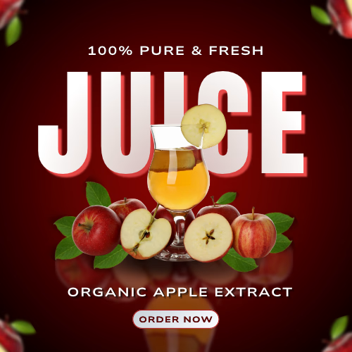

The glass and apple slice overlapping the JUICE letters give it real depth. Is the ORDER NOW button small on purpose, or would you try it a bit bigger?

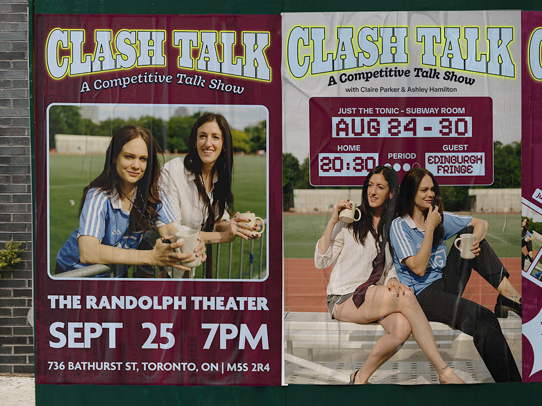
Over the last few months, I've worked with the podcast Good Noticings, and I’m excited to share some of what we’ve made together.
I designed a set of social media templates that give the show a consistent, recognizable look across every post. I also created the design for their new touring show, Clash Talks, including the posters and social assets that took it to the Edinburgh Comedy Festival.
It was a fun mix of building a flexible system for day-to-day content and creating something bolder and more theatrical for a live event. Seeing the work out in the world, from the feed to the festival, was a highlight.
And on top of all that, it's been such a JOY to work with two amazing women I was already such a fan of.