The network for creativity
Join 1.25M professional creatives like you
Connect with clients, get discovered, and run your business 100% commission-free
Creatives on Contra have earned over $150M and we are just getting started
Back to feedPost

Description:
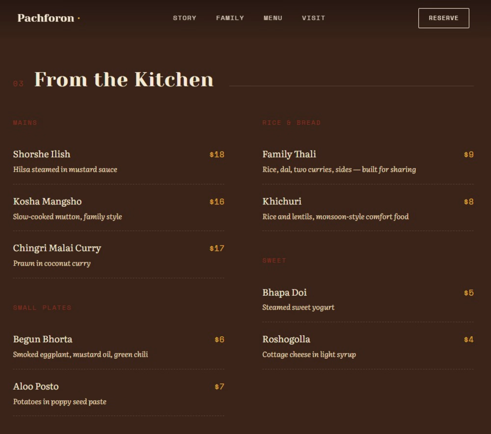
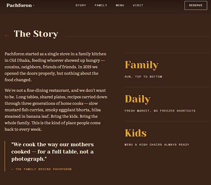
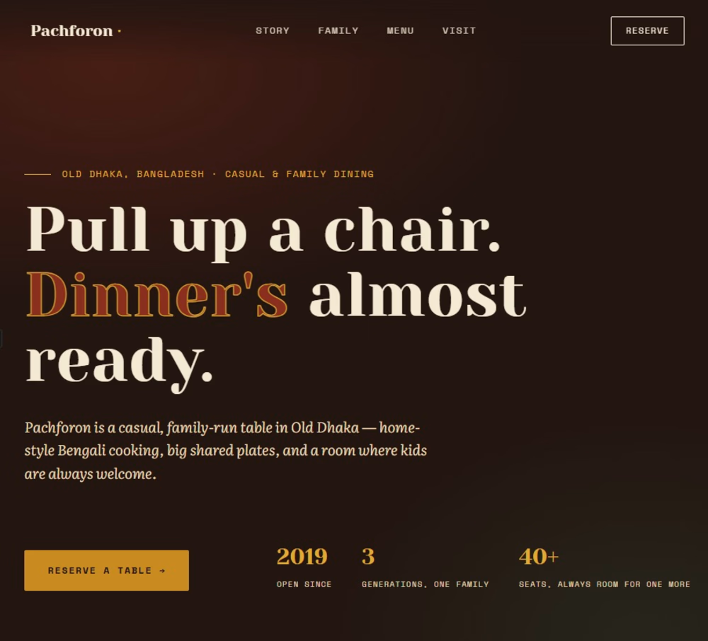
A modern, warm, and responsive landing page design for a Bengali restaurant named Pachforon. It includes an attractive hero section, story overview, a structured menu with pricing, and family-friendly dining highlights.


The network for creativity
Join 1.25M professional creatives like you
Connect with clients, get discovered, and run your business 100% commission-free
Creatives on Contra have earned over $150M and we are just getting started

Challenges
View all


Related posts



This one is for teams that hand everyday work to AI agents. In one view you can see what got automated, how much time it saved, how each agent is doing, and you can ask the AI assistant anything.
In the video, I ask "Who might churn this week?" and Lyra replies with three at risk accounts and check in emails ready to send.
My goal was calm and minimal, with lots of white space, while the screen still feels alive.
What would you add or remove? I'd love your feedback.


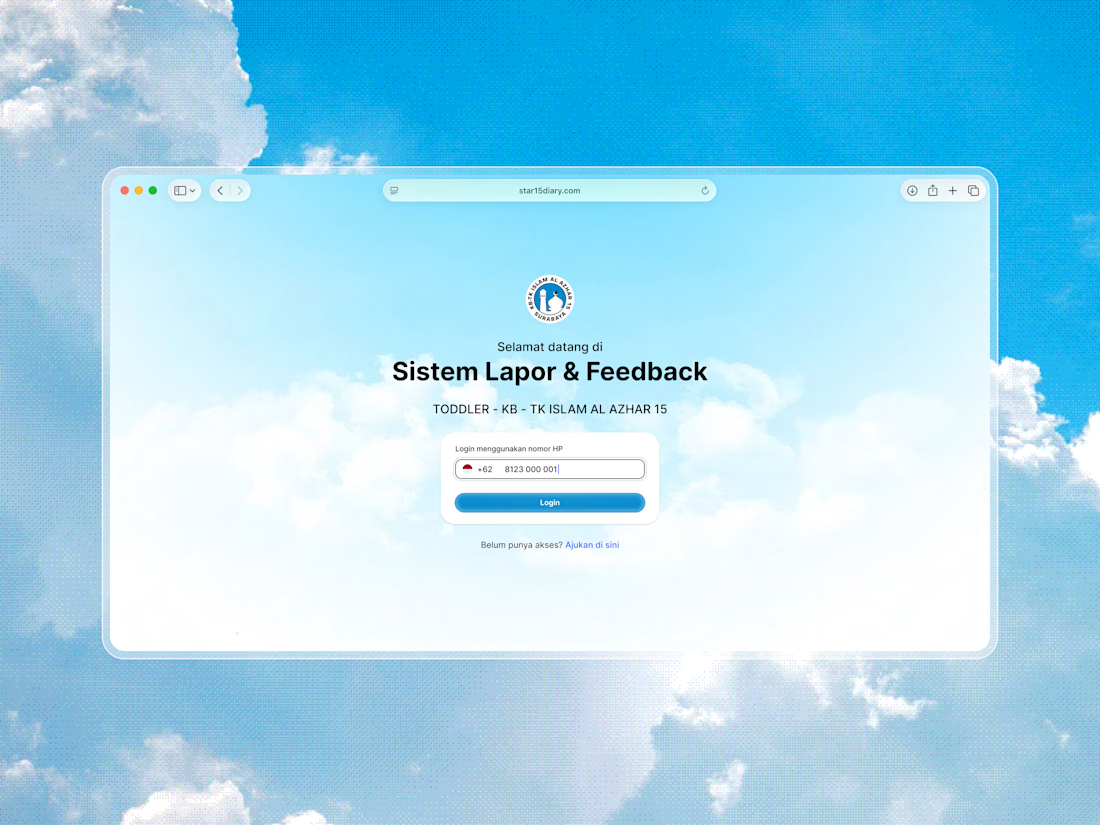
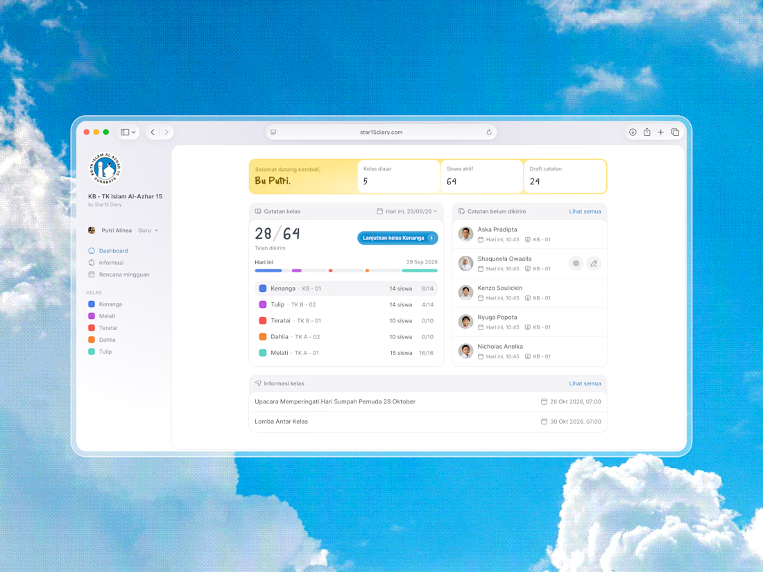
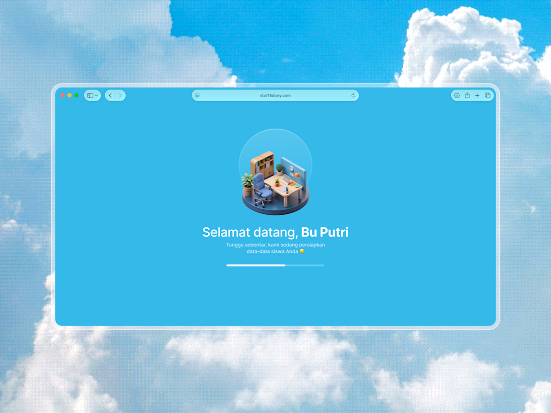
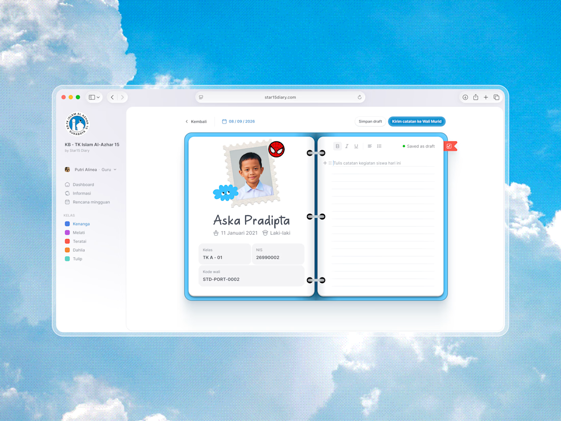
Around a month ago, I got a custom project from one of the larger kindergarten schools in Indonesia.
The scope was pretty focused: a notes and reporting system for teachers to keep parents updated on their children.
I tried to keep the experience as minimal as possible, so teachers can get things done without feeling overwhelmed, while still adding small moments of delight where they actually matter.
Would love to hear what you think.

Brilliant execution!