The network for creativity
Join 1.25M professional creatives like you
Connect with clients, get discovered, and run your business 100% commission-free
Creatives on Contra have earned over $150M and we are just getting started
Back to feedPost

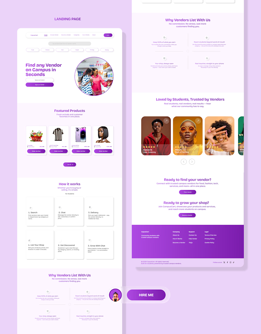
Most marketplace apps take a cut of every sale. I designed one that doesn't.
The problem
Every university campus has amazing small vendors — food sellers, tailors, phone repairers, thrift hustlers, printers. But almost none of them are easy to find.
They rely on word-of-mouth, scattered social pages, or just being "that one guy everyone knows." Students, meanwhile, waste real time and energy hunting for things that should take seconds.
The business decision that shaped everything
Instead of building a traditional marketplace that takes a commission on every sale — which means payment infrastructure, dispute handling, and real liability — vendors pay a simple flat subscription fee to be listed and discovered. Students browse and contact vendors for free.
The transaction happens off-platform, the way it already does today (chat, call, meet-up).
That one decision changed almost every design choice after it — from the CTA hierarchy, to the copy, to the fact that a "no commission" message shows up multiple times across the page.
The design concept
Rather than defaulting to a generic marketplace or SaaS-blue look, I grounded the entire visual system in something every student already trusts: the campus noticeboard flyer.
You know the ones — tear-off tabs with a phone number, pinned outside lecture halls, torn off one at a time.
That became the product's signature interaction — every vendor card ends with a dashed "tear-tab" that lifts slightly when tapped, as if being peeled away.
Small detail, but it's the thing that makes the product feel designed for this specific use case, not assembled from a generic template.
Designing for two very different users
Students want to find something fast, without creating an account.
Vendors need to quickly understand what a monthly fee gets them and trust it's worth more than just posting in a WhatsApp group for free.
Rather than build two disconnected experiences, I used the same design system throughout but shifted register where needed — the "Why Vendors List With Us" section deliberately flips to a dark background, a quiet visual signal that says "this part is speaking to you" without needing a label.
The result is a landing page that does two jobs at once, without feeling like two different products stitched together.
This project reinforced something I keep relearning: the best design decisions usually trace back to a business or user constraint, not an aesthetic preference.
The "no commission" model wasn't just a feature — it became the whole design language.
Would genuinely love feedback from this community — designers, founders, anyone who's built for a two-sided audience. What would you have approached differently? 👇
Full case study dropping on my portfolio soon.
hashtag#UIDesign hashtag#ProductDesign hashtag#UXDesign hashtag#DesignProcess hashtag#StartupDesign hashtag#Marketplace hashtag#DesignThinking hashtag#Fintech hashtag#TechForGood

The network for creativity
Join 1.25M professional creatives like you
Connect with clients, get discovered, and run your business 100% commission-free
Creatives on Contra have earned over $150M and we are just getting started





Related posts


Professional work

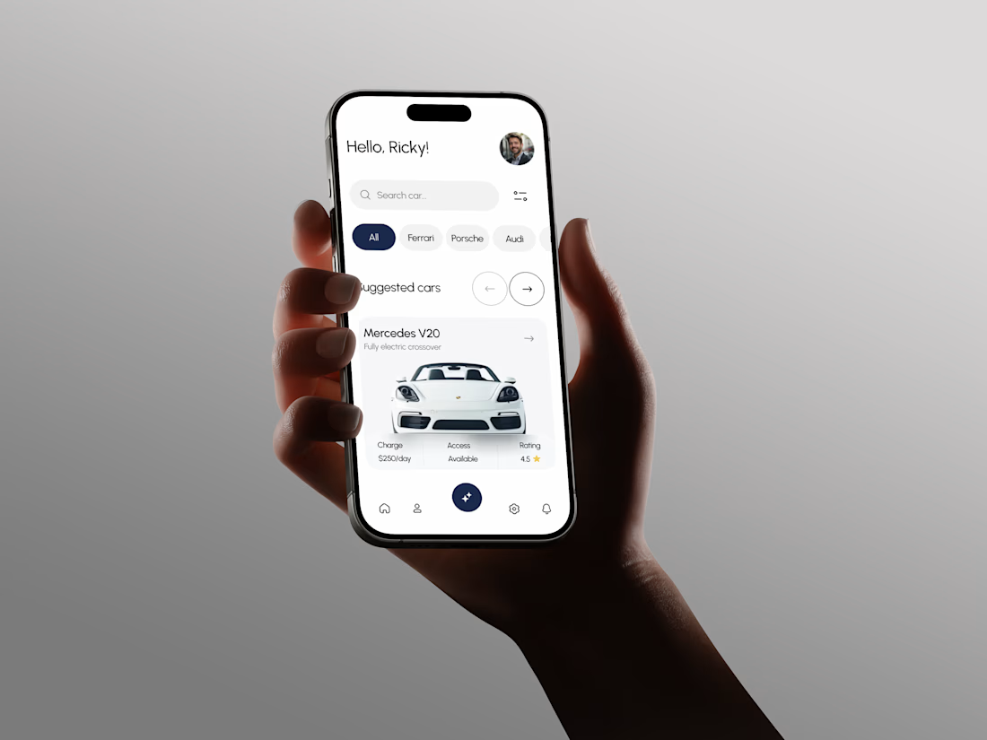
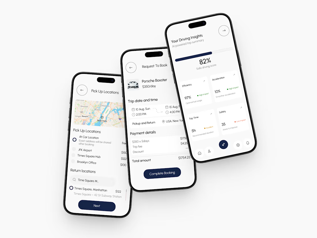
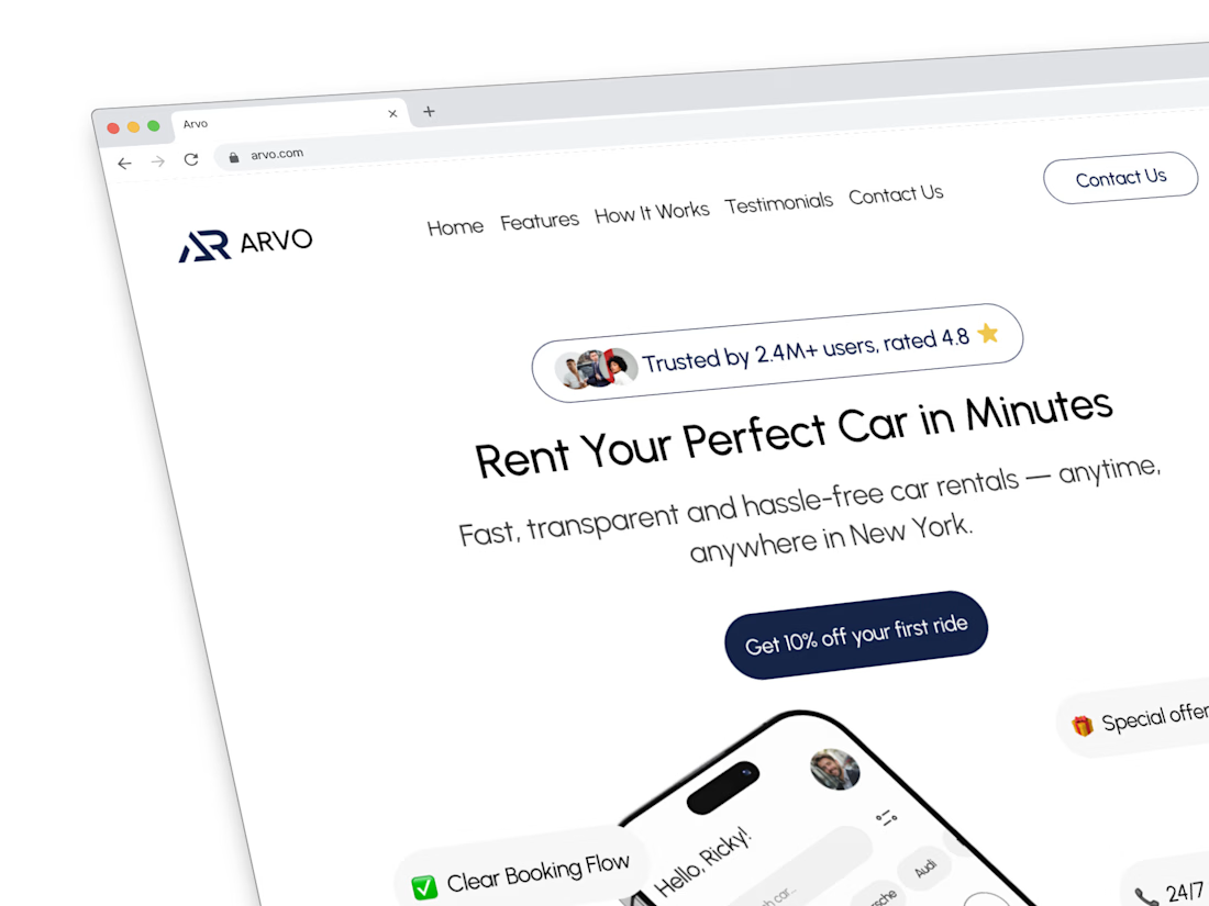
A few things we’ve been working on this month.
Different industries, different problems, but the same goal: making complex products feel simple, clear, and trustworthy.
Fintech → Investment Banking → Geospatial AI
More projects are still in progress.
Full case studies coming soon.






This is the kind of work I enjoy seeing — simple, focused, and actually thought through.


Does an AI brand still need to look like an AI brand?
Lupr helps small and growing businesses adopt AI without the complexity, so the identity needed to do the same.
We built a clean, approachable system around movement, connection and continuous improvement, without leaning on the usual futuristic tech clichés.
The idea was simple: make AI feel like useful business infrastructure, not something you need to be an expert to understand.
As AI becomes part of everyday business, do you think brands still need to visibly signal “AI”?
Full case study below 👇


Great design it feels alive 🎉🎉❤️❤️


