The network for creativity
Join 1.25M professional creatives like you
Connect with clients, get discovered, and run your business 100% commission-free
Creatives on Contra have earned over $150M and we are just getting started
Back to feedPost

What Makes a Website Actually Work? It Starts with Structure.
Most websites look decent. But very few websites convert, and the difference almost always comes down to design structure.
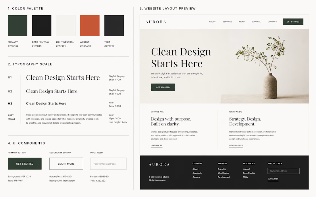
Before picking colors or fonts, every great website needs a solid foundation. Here's what that looks like:
Visual Hierarchy Your visitor's eye should travel in a clear path from the headline, to the value proposition, to the call-to-action. If everything fights for attention, nothing wins.
Typography System One heading font. One body font. Consistent sizing scale. Good typography doesn't just look clean it builds trust before the user reads a single word.
Color Architecture A strong website uses 3 colors maximum a primary, a neutral, and one accent. Color should guide behavior, not decorate the page.
Whitespace as a Design Tool Empty space isn't wasted space. It reduces cognitive load and makes your content breathe. The best brands use whitespace intentionally think Apple, Aesop, Muji.
Navigation Clarity If a visitor can't find what they need in 3 seconds, they leave. Navigation should be simple, minimal, and predictable.
CTA Placement Every page has one job. Your call-to-action should appear where the user is ready to act not just at the bottom, and not five times on the same page.
Mobile-First Thinking Over 60% of web traffic is mobile. A design that isn't built mobile-first isn't really built at all.
I design websites built around these principles minimal, intentional, and focused on results. If you're looking for a designer who thinks before they style, let's talk.
The network for creativity
Join 1.25M professional creatives like you
Connect with clients, get discovered, and run your business 100% commission-free
Creatives on Contra have earned over $150M and we are just getting started





Related posts


Very nice

Personal Portfolio Website Design
A bold and visually expressive personal portfolio website crafted for creative professionals to build a memorable online presence, showcase their best work, and stand out with confidence.


Excellent work. I would like to hire you.

Every esports brand reaches for neon and a mascot.
RESPAWN ARENA reaches for a scoreboard.
Case study on the stadium-grade identity — typography, system, the whole build — dropping soon.