The network for creativity
Join 1.25M professional creatives like you
Connect with clients, get discovered, and run your business 100% commission-free
Creatives on Contra have earned over $150M and we are just getting started


The network for creativity
Join 1.25M professional creatives like you
Connect with clients, get discovered, and run your business 100% commission-free
Creatives on Contra have earned over $150M and we are just getting started





Related posts



I built growth into the letter.
Meet nuvopay, a payments app for Gen Z and young professionals.
The brief: secure, modern, friendly. Never a stiff bank.
The idea: three rising bars that form a bold "N". Growth and forward motion in one mark. No padlocks, no shields, no coins.
The wordmark is lowercase Poppins SemiBold, round and easy, so it feels like an app and not an institution.
Navy for trust. Teal for growth. Clean white space for calm.
Which do you notice first, the bars or the N?
#logodesign #brandidentity #fintech #branding #graphicdesigner #logodesigner #designportfolio #nuvopay
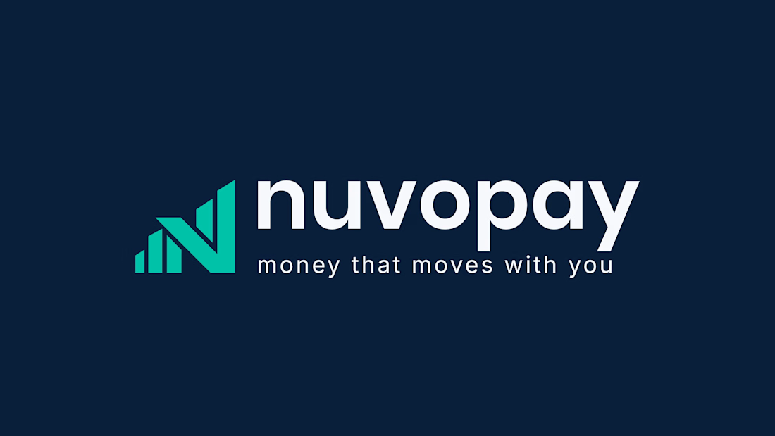

The choice to skip traditional security icons like shields or padlocks is a smart move for a Gen Z audience. It signals that the app relies on modern, invisible security rather than looking like a nervous bank.

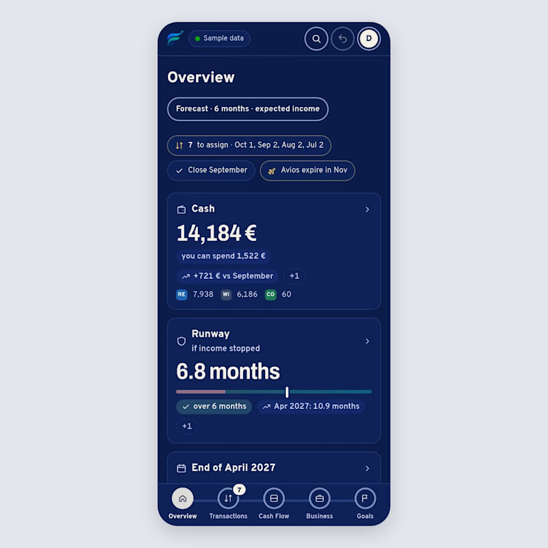
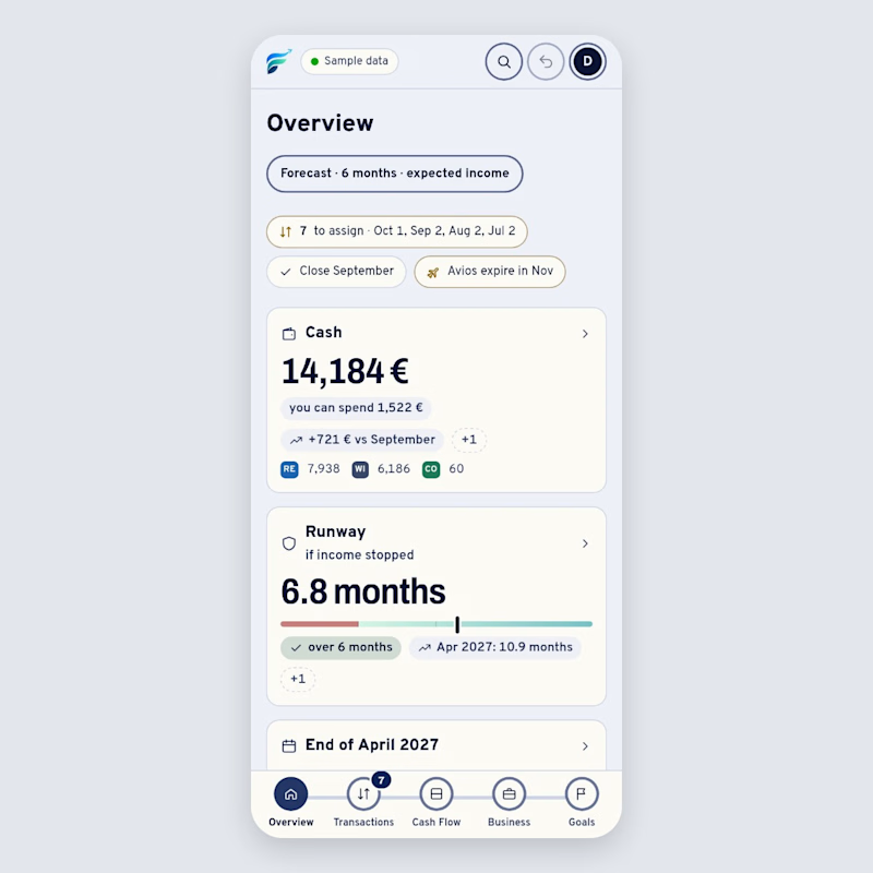
Same screen, two themes: the overview of Flusso, a money dashboard I'm building. People open it every day, so I want the default to feel calm. Which theme would you open every morning, and why? 👇
0 voted
0%
1 voted
100%
1 vote
Closed

Great visual hierarchy.