The network for creativity
Join 1.25M professional creatives like you
Connect with clients, get discovered, and run your business 100% commission-free
Creatives on Contra have earned over $150M and we are just getting started
Back to feedPost

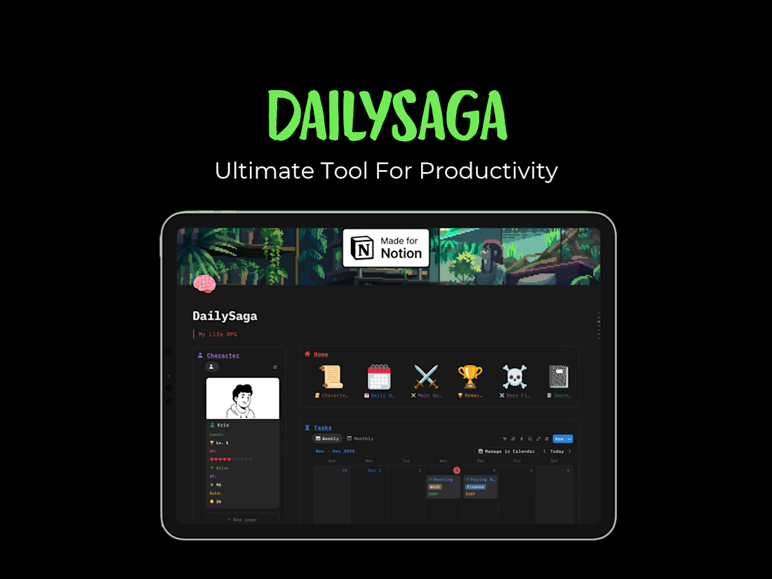
Meet DailySaga: A gamified Life OS built entirely in Notion. 🎮
Most productivity systems feel like chores, so I built DailySaga—a comprehensive Life OS designed to make daily execution feel like leveling up a character.
From complex task databases to habit-driven character sheets, it packs deep sub-page architecture into a clean, unified dashboard that doesn't compromise on functionality.

The network for creativity
Join 1.25M professional creatives like you
Connect with clients, get discovered, and run your business 100% commission-free
Creatives on Contra have earned over $150M and we are just getting started



Related posts

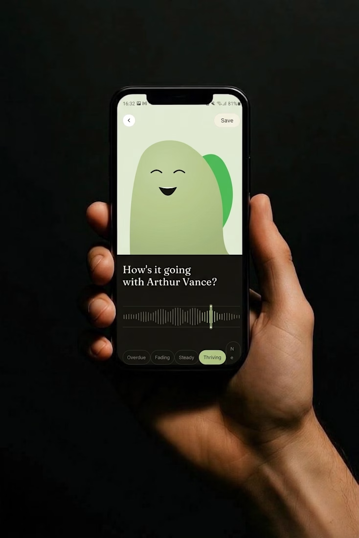
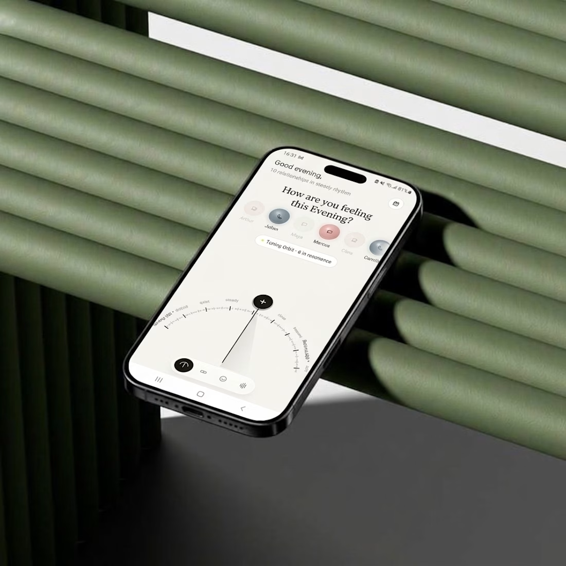
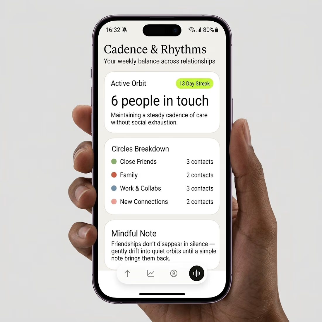
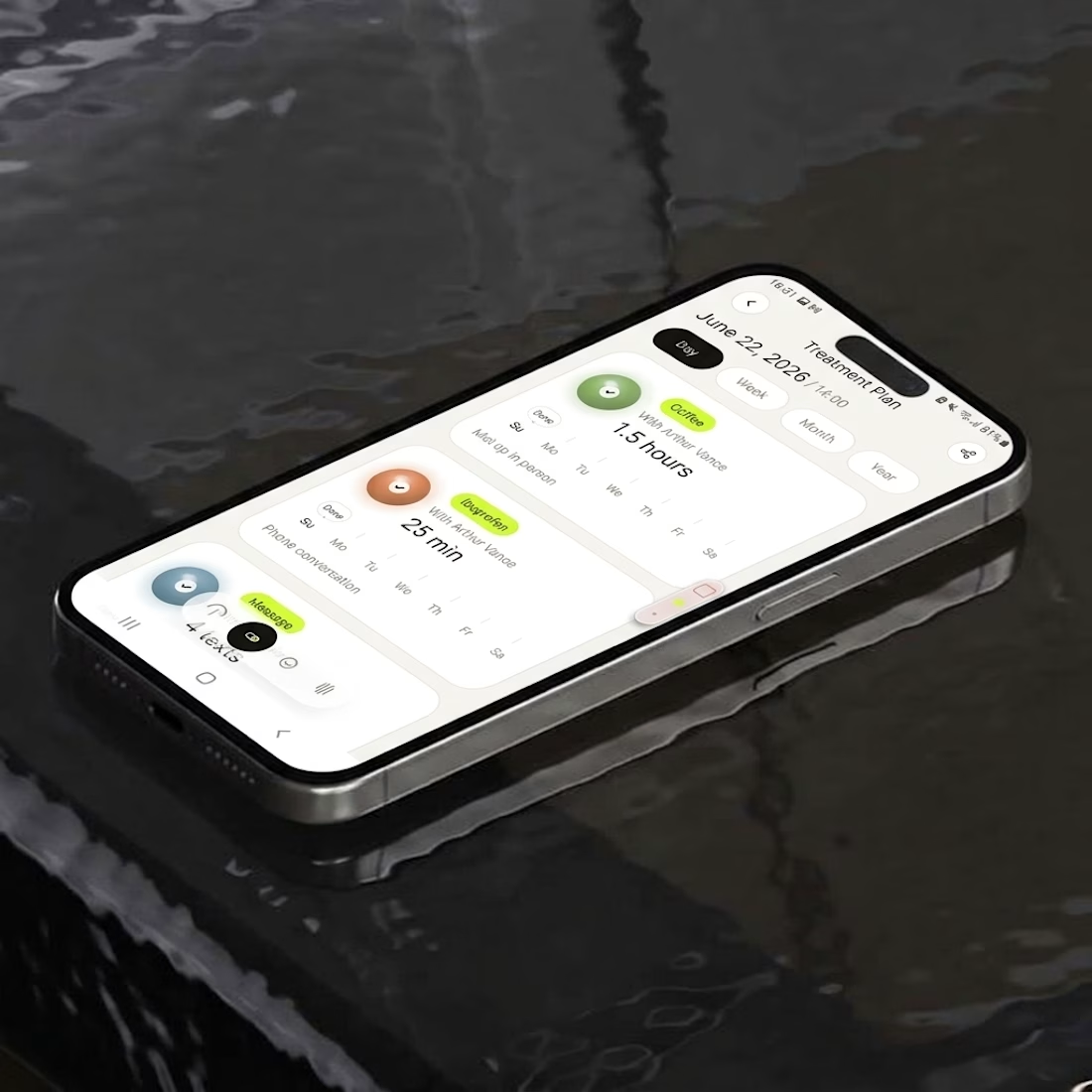
What if your contacts looked less like a phone book and more like a night sky?
Friday app, a day late: Parallax.
Every person is a glowing orb placed by how recently and how often you talk.
Turn a dial to filter by frequency, scrub a word to log how it’s really going.

What if the edges of your screen were the most useful part of it?
Meet EDGE — a macOS concept that turns unused screen space into instant controls for brightness, volume, and apps.
Designed and built with AI. A little less reaching, a lot more fluid. ⚡


Do the edges work in fullscreen?


Which homepage would make you more likely to explore the platform?
HackStack features bold typography, teal gradients, and a centered layout focused on AI tools and automation. DataVistaHQ uses purple accents, a split layout, and a prominent dashboard preview to introduce its business intelligence platform.
I would like your perspective on the visual design, clarity, and first impression. Which approach communicates its value more effectively and makes you want to take the next step?
Vote for your preferred design and share what influenced your choice: the colors, headline, layout, dashboard preview, or overall presentation.
#WebDesign #AIWebsites #UIUXDesign #SaaSDesign #TransformedDesign


2 voted
17%

10 voted
83%

12 votes
Closed

Visually, I lean toward DataVistaHQ, but the cognitive load is really high. The value proposition and the stats feel like they're competing for attention.
On the other hand, HackStack has a much better visual hierarchy. The value proposition and CTA group immediately give me a...