The network for creativity
Join 1.25M professional creatives like you
Connect with clients, get discovered, and run your business 100% commission-free
Creatives on Contra have earned over $150M and we are just getting started
Back to feedPost
Appreciate the perspective, @Bhavin Hirpara I come at this from the other side, as a developer building the very tools that some fear "replace humans." The reality is nuanced; it's both true and untrue simultaneously.
For instance, I recently built a essay grading system for an ed-tech platform that handles grading, plagiarism checks, collaboration detection, and instant feedback. Consequently, they did cut back on human assessors
The takeaway is the necessity of mastering multiple skills within your niche to offer end-to-end business value. A holistic designer is secure; "just-a-logo" designer may be vulnerable. Do you see the distinction?
Here is my litmus test for this: If you are still the one designing the blueprint/workflow, defining the desired outcomes, and orchestrating the task sequence, you don't need to worry.

Hi, I’m a web designer running a small web agency.
Lately, a lot of designers (including me) feel a bit uneasy about AI.
It’s getting better at layouts, copy, even code — so the question keeps coming up:
Should web designers really be scared?
My take:
AI can speed things up, but it...

True! Its the same with being a clerk before the rise of computers!


Haha Correct!
The network for creativity
Join 1.25M professional creatives like you
Connect with clients, get discovered, and run your business 100% commission-free
Creatives on Contra have earned over $150M and we are just getting started











Related posts

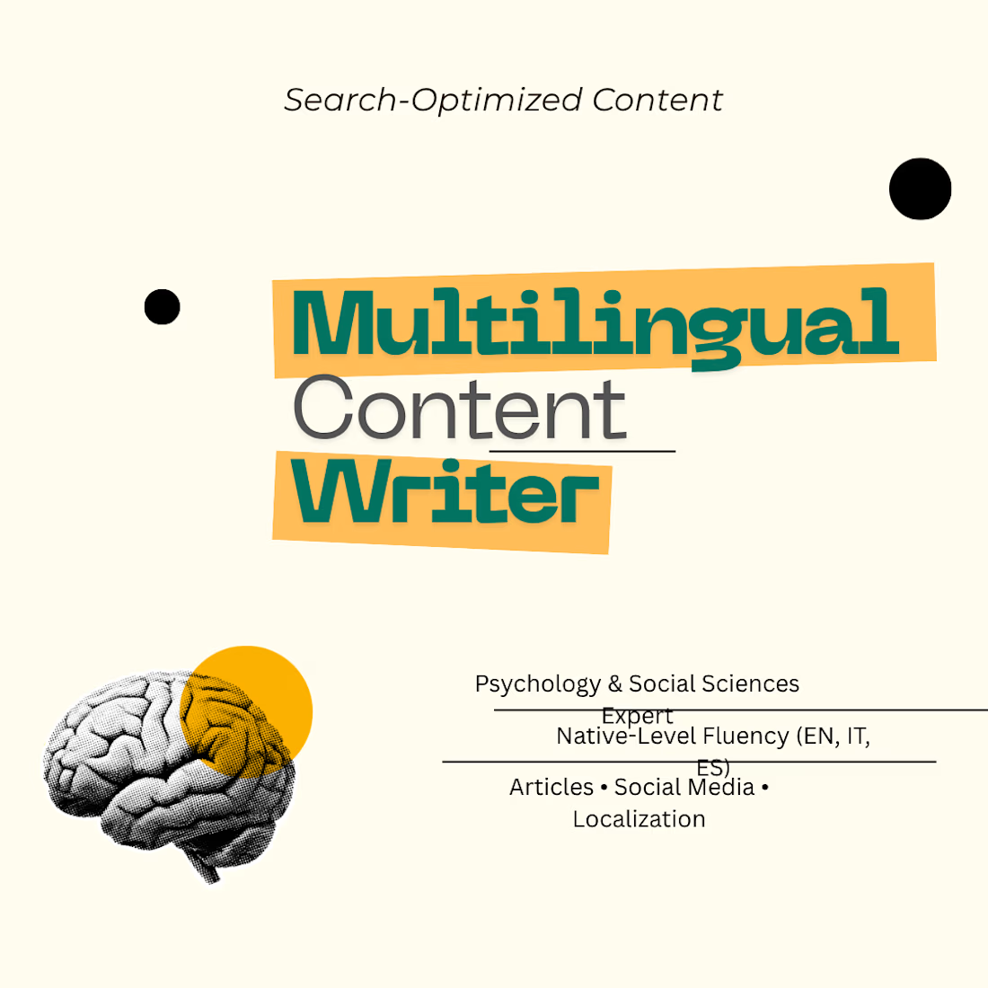
Bridging psychology and UX writing to design research-backed, high-converting content blueprints—zero AI, purely human.



Exploring a darker side of SaaS design. 🖤
Building a new SaaS experience with a bold dark theme, clean interfaces, and a visual language that feels as powerful as the product itself. More than just aesthetics every detail is designed with purpose.


I designed the brand identity for FGD Psychological Services and built its website from scratch in under 3 days. I built the website on Next.js with a fully functional CMS, a custom booking system, Google Meet integration, a Telegram notification bot, and more.
Everything was built with AI; what do you think?. You can read the full case study here. NGL, this is the best time to be a designer 😍

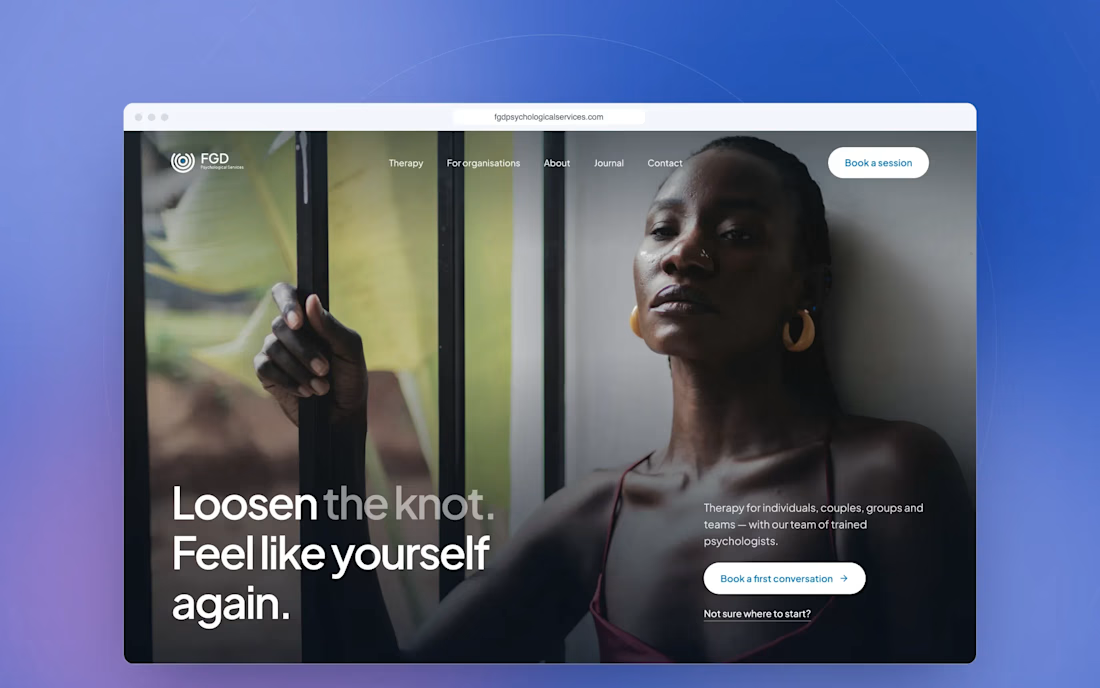

Building all of this in under 3 days is impressive! AI is opening up so many exciting possibilities for designers.