The network for creativity
Join 1.25M professional creatives like you
Connect with clients, get discovered, and run your business 100% commission-free
Creatives on Contra have earned over $150M and we are just getting started
Back to feedPost

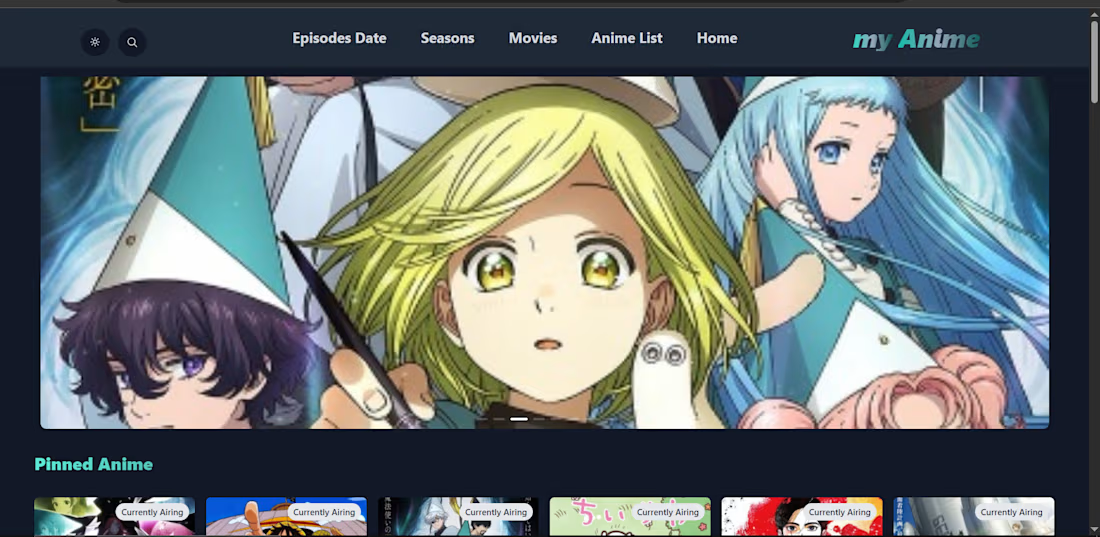
Project Title: Anime Streaming Platform
Role: Front-End Developer
Description:
Developed a modern anime browsing platform featuring dark mode support, responsive design, and an engaging user experience. Focused on performance optimization, clean UI implementation, and mobile-friendly layouts.
Key Features:
• Dark mode interface
• Responsive design
• Dynamic content display
• Optimized user experience
• Modern UI components


The network for creativity
Join 1.25M professional creatives like you
Connect with clients, get discovered, and run your business 100% commission-free
Creatives on Contra have earned over $150M and we are just getting started





Related posts

I wanted to make a photography website that felt more like an experience than a portfolio.
So I built CINÉRA — a cinematic photography studio website with a 3D gallery, interactive archive, real availability, and a complete booking flow.
You can explore the work, pick a date and time, add your shoot details, and get booked without the usual back-and-forth.
On the studio side, there’s a dashboard to manage bookings and inquiries, plus automatic booking confirmations to take a bit of the repetitive work off the photographer’s plate.
This was built for an appointment-based business challenge, and honestly, I had way too much fun making it.


$10K earned on Contra. 🎉💸
Grateful for every client who took a chance on me. This is just the beginning. More great products, more real partnerships, more milestones to hit. 🙌
Thank you to everyone who's been part of it. Onward. 🚀
#10k #contraearnings #Freelance #Webflow #Framer #Webdesign


Congratulations nice job 🎉🎉


Hero exploration for an AI Startup - Orbio.
- Editorial serif caps
- Marble statue as the hero
- A live 01 grid reacting to mouse
- Different highlight color for each division


a different highlight colour per division is such a clean system move. the live 01 grid reacting to the mouse is a nice touch too