The network for creativity
Join 1.25M professional creatives like you
Connect with clients, get discovered, and run your business 100% commission-free
Creatives on Contra have earned over $150M and we are just getting started
Back to feedPost

Another gaming product design task wrapped up. 🎮
I’ve been working more within the gaming space, particularly around poker, casino, betting, and real-money gaming products.
These products come with a different set of UX challenges. Real-time interactions, player behavior, trust, transactions, and engagement all have to work together without getting in the way of the experience.
It’s an interesting space to design in, and one I’m continuing to build deeper expertise around.
More gaming work coming.


The network for creativity
Join 1.25M professional creatives like you
Connect with clients, get discovered, and run your business 100% commission-free
Creatives on Contra have earned over $150M and we are just getting started



Related posts

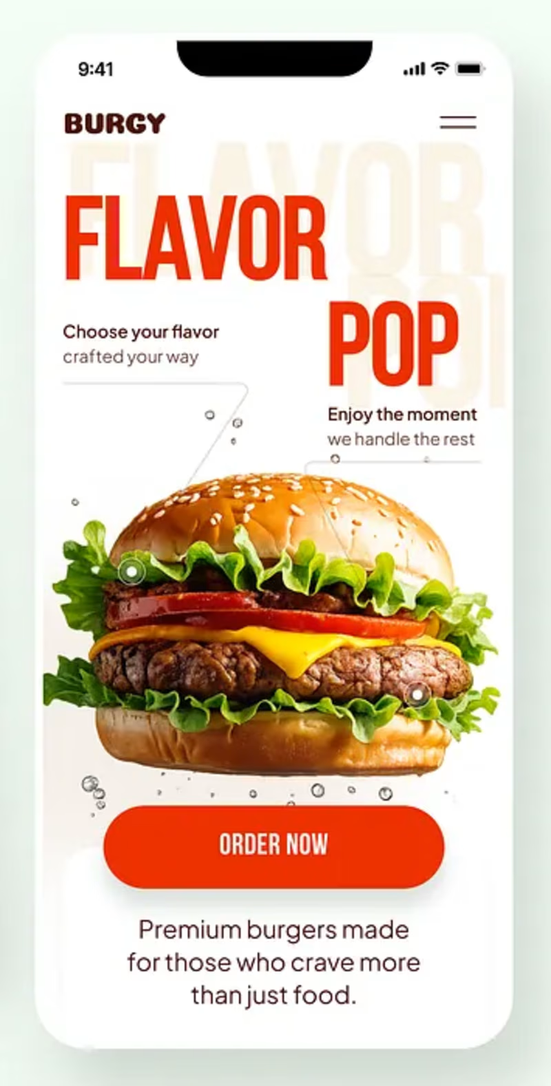
Burgy, a mobile concept for burger ordering. 🍔
Bold type, premium food visuals, and a fast path from craving to checkout.
Two color directions for the hero screen. Which one converts better?
Vote and tell me why 👇
Poll options: 🟢 Green | 🔴 Red
#UIDesign #MobileApp #FoodApp #AppDesign #UX #RestaurantApp

13 voted
43%
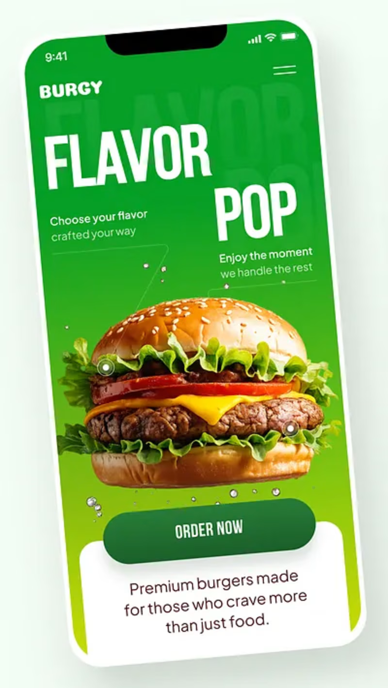
17 voted
57%
30 votes
Closed

Green for me, and I'd bet on it converting better too. The red version is loud in the way every food app is loud, while the green makes the burger the hero and the screen instantly recognizable in a feed. The green background also gives the white FLAVOR POP type far more contrast, so the message lands a beat faster.

These designs were made by the AI in my upcoming design tool for designers.
I don't know which is better, help me decide.
For those wondering where the remaining designs are, I'll drop it in my next post.
2 voted
40%
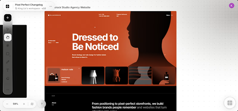
3 voted
60%
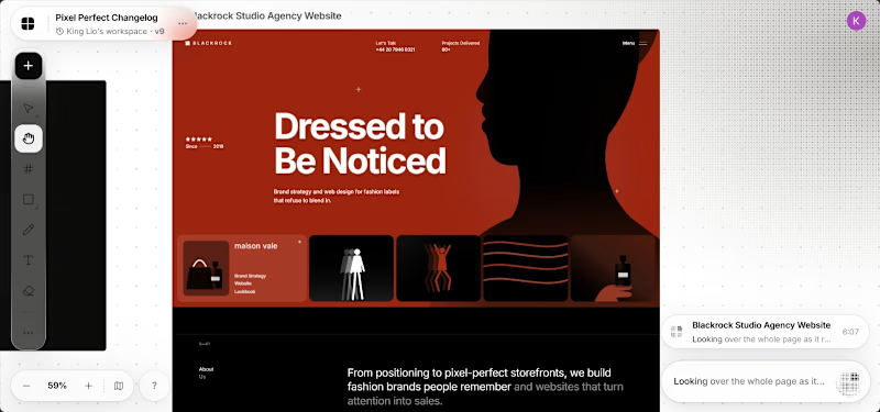
5 votes
Closed

It's the red one for me... Passed the message a lot better than the Orange


Niceee


