The network for creativity
Join 1.25M professional creatives like you
Connect with clients, get discovered, and run your business 100% commission-free
Creatives on Contra have earned over $150M and we are just getting started
Back to feedPost

Jen+Cass Portfolio: Bold Brands, Big Results (2026 Showcase)
The network for creativity
Join 1.25M professional creatives like you
Connect with clients, get discovered, and run your business 100% commission-free
Creatives on Contra have earned over $150M and we are just getting started



Related posts

Like a lot of designers, I find my portfolio one of the hardest projects. There's no deadline, and it can always get better. Anyway, I think I'm happy with this one for a while.
Take a look:
davidguba.com


portfolio looks sharp

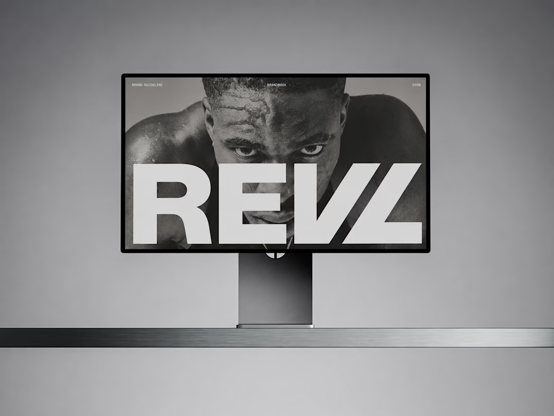
For REVL, I created a bold brand identity and presentations that position the brand as a fresh, performance-driven leader in functional fitness.


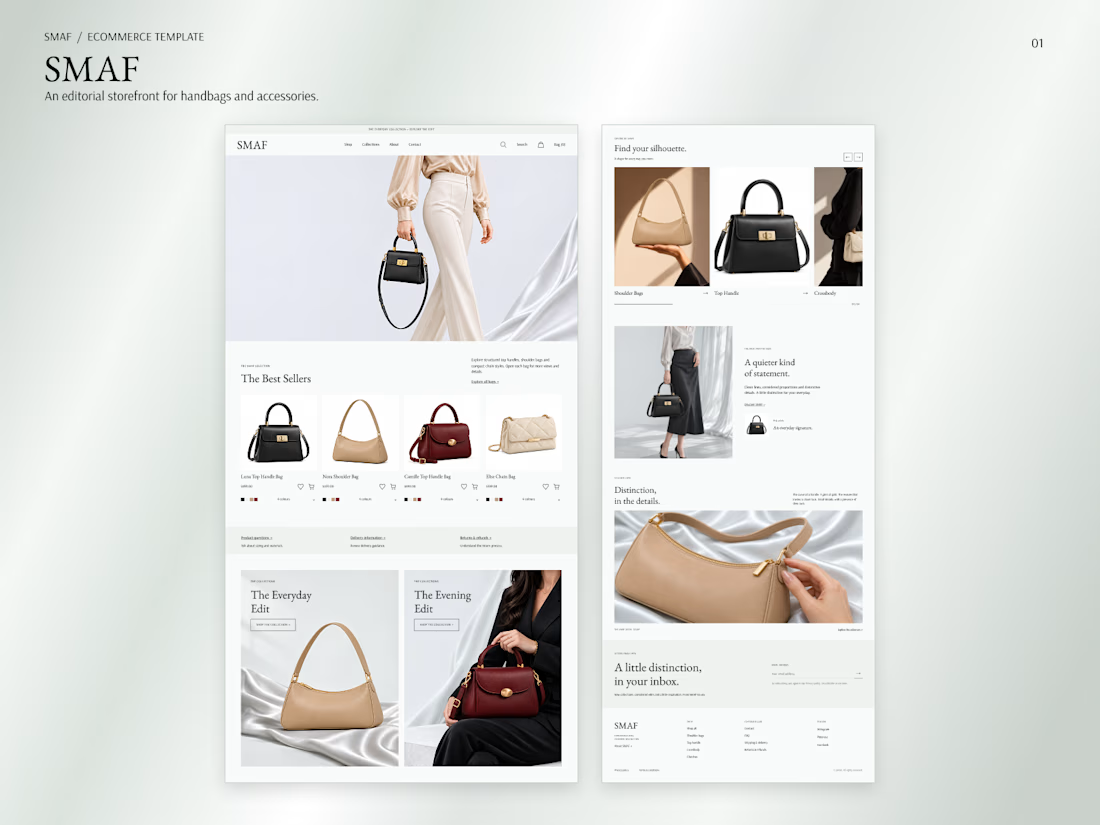
I designed SMAF, a Next.js e-commerce template for handbags. The homepage opens with a campaign image and a clear path to Shop All.
I put Best Sellers next so shoppers can see the bags and prices before getting into the brand story.

Smart UX decision! Putting top products right upfront drives instant engagement.