The network for creativity
Join 1.25M professional creatives like you
Connect with clients, get discovered, and run your business 100% commission-free
Creatives on Contra have earned over $150M and we are just getting started
Back to feedPost

Kinetic Dashboard — SaaS Front-End Experience
Kinetic Dashboard is a high-performance front-end built for modern SaaS applications, focused on usability, scalability, and real-time data-driven decision making.
This project was developed using solid engineering and product design principles, delivering a smooth, intuitive, and highly responsive user experience.
🔹 Key Features & Strengths
1. Modern data-driven UI/UX
Clean and professional interface with clear visual hierarchy, making it easy to analyze critical metrics such as performance, workflows, and operational insights.
2. Scalable architecture (SaaS-ready)
Built to scale, enabling seamless integration with multiple services, APIs, and environments (multi-region and multi-tenant ready).
3. Optimized performance
Fast rendering, reusable components, and efficient state management ensure smooth performance even with large data volumes.
4. Consistent Design System
Standardized visual patterns (colors, typography, spacing, components) for easier maintenance and long-term product evolution.
5. Executive dashboard focus
Strategic data visualization with clear KPIs, trend indicators (↑ ↓), and quick insights for decision-making.
6. User-centered experience
Intuitive navigation with a structured sidebar, visual feedback (status, alerts, progress), and quick actions like report export.
7. Compliance-ready (GDPR & UX best practices)
Includes essential components such as cookie consent and privacy-focused UX for global applications.
8. Modular and reusable components
Well-structured component system that simplifies maintenance, testing, and scalability.
💡 Technologies & Best Practices
Component-based architecture
API integrations
Fully responsive design
Clean Code principles
Accessibility and readability focus
🚀 Outcome
A robust, elegant, and production-ready SaaS dashboard, ideal for companies that need to monitor operations, workflows, and performance in real time with clarity and efficiency.
If you're looking for a professional SaaS front-end focused on performance, scalability, and user experience, Kinetic Dashboard represents the level of quality I deliver.
Link - kinetic-dashboard-hmdphc48w-heberconrado-4074s-projects.vercel.app


The network for creativity
Join 1.25M professional creatives like you
Connect with clients, get discovered, and run your business 100% commission-free
Creatives on Contra have earned over $150M and we are just getting started



Related posts

AI Analytics Dashboard
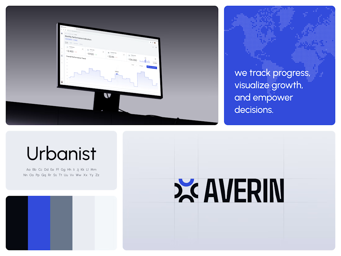
One blue runs from the logo to the chart line.
Revenue, active users, conversion rate and income sit in a row of cards above the trend chart. The cards answer where the numbers stand. The stepped line answers how they got there, holding each period's value until the next, with a tooltip on a dashed guide line for the exact figure.
The identity pairs a four-arc mark with a condensed wordmark, drawn to the same top and bottom lines on the construction grid. The top arc's blue comes back in the slogan tile, the chart line and the main button, so the brand and the product share one accent.
Designed by the Hue & Machine team.
#DashboardDesign #DataVisualization #SaaS #Analytics #AI #WebApp #BrandIdentity #UIDesign #ProductDesign #FigmaDesign



45 colours, 5 ramps, 2 typefaces, 0 bold weights 🎨
That's the whole of Penwave's design system. Every colour is read from the app's Tailwind config, and each ramp has one job: cream for the page, beige for badges, tea green for avatars, celadon for every border, muted teal for all the text.
Instrument Serif sets the headings and the post body. Inter runs the interface, 300 to 600.
In the clip the palette builds a story card, colour by colour.
Do you give every colour in your system a job, or keep a few spare? 👇


To your question: one job per colour, with a single spare accent kept for promos. Cream for the page and celadon for borders is easy to hand over to a team. Why zero bold weights?

A premium automotive website concept designed to bring innovation, performance, and digital storytelling together.
The goal was to create an immersive browsing experience that captures attention from the first interaction and makes exploring vehicles feel effortless.
The experience features:
𝐂𝐢𝐧𝐞𝐦𝐚𝐭𝐢𝐜 𝐕𝐢𝐬𝐮𝐚𝐥𝐬: High-impact automotive imagery with a bold, futuristic aesthetic.
𝐒𝐦𝐨𝐨𝐭𝐡 𝐀𝐧𝐢𝐦𝐚𝐭𝐢𝐨𝐧𝐬: Seamless scrolling and engaging transitions between sections.
𝐈𝐧𝐭𝐞𝐫𝐚𝐜𝐭𝐢𝐯𝐞 𝐔𝐈: Dynamic performance cards, vehicle specifications, and intuitive navigation.
𝐌𝐨𝐝𝐞𝐫𝐧 𝐃𝐞𝐬𝐢𝐠𝐧: Strong typography, refined layouts, and a striking black-and-orange color palette.
𝐂𝐥𝐞𝐚𝐫 𝐔𝐬𝐞𝐫 𝐉𝐨𝐮𝐫𝐧𝐞𝐲: Strategically placed calls to action that encourage visitors to explore further.
Every element is designed to balance visual appeal with functionality, turning complex automotive information into an engaging digital experience.
This project showcases how thoughtful UI/UX and motion design can transform a traditional automotive website into a memorable, premium digital experience.

Bold direction!