The network for creativity
Join 1.25M professional creatives like you
Connect with clients, get discovered, and run your business 100% commission-free
Creatives on Contra have earned over $150M and we are just getting started
Back to feedPost

Moving From Prototype to Production
Our focus wasn't to redesign the product from scratch.
The original UX already reflected how performance teams actually work, so we preserved the existing product experience while rebuilding the underlying infrastructure.
Real-Time Data Infrastructure
We replaced static datasets with a structured ingestion architecture capable of receiving information from multiple sources.
The system was designed around:
GPS and wearable data
HRV and recovery metrics
Sleep information
Wellness submissions
Training-load records
External performance systems
Each integration required validation, normalization, and error handling so inconsistent or incomplete data wouldn't compromise the platform.
Live Performance Calculations
Static calculations were replaced with dynamic processing.
The platform could evaluate:
ACWR
Training-load trends
Readiness scores
Historical performance
Rolling training windows
Individual athlete baselines
This allowed performance metrics to evolve with the athlete instead of remaining fixed to predefined values.
Intelligent Performance Insights
We replaced simulated recommendations with a data-driven inference layer.
Insights were generated based on actual athlete conditions and predefined performance rules.
For example, when training load increased significantly while recovery indicators dropped below an athlete's baseline, the system could surface an appropriate risk signal rather than displaying a generic recommendation.
Role-Based Access
Athliq required different users to work with different levels of information.
We implemented role-based access so that:
Performance Directors could monitor squad-level performance
Sport Scientists could analyze training and performance metrics
Physiotherapists could access injury and return-to-play information
Coaches could focus on readiness and daily training
Athletes could access relevant individual information
Access restrictions were enforced at the system level rather than simply being controlled through the interface.
Monitoring & Reliability
Production systems need visibility when something goes wrong.
We introduced logging and monitoring across data ingestion, calculations, and system events.
The platform could identify issues such as:
Missing data
Delayed integrations
Invalid records
Calculation anomalies
Stale data sources
Application errors
This helped prevent outdated information from being presented as current performance data.
Technology Stack
Frontend: React 19, Vite, Tailwind CSS, Recharts, React Router
Backend: Node.js, Fastify
Database: PostgreSQL, TimescaleDB
Infrastructure: Redis, Vercel, Railway / Render, Supabase Storage
Integrations: Catapult, Polar, Garmin, Google Forms, Typeform
Authentication & Security: Auth0, Row-Level Security
Monitoring: Sentry, Datadog
The Result
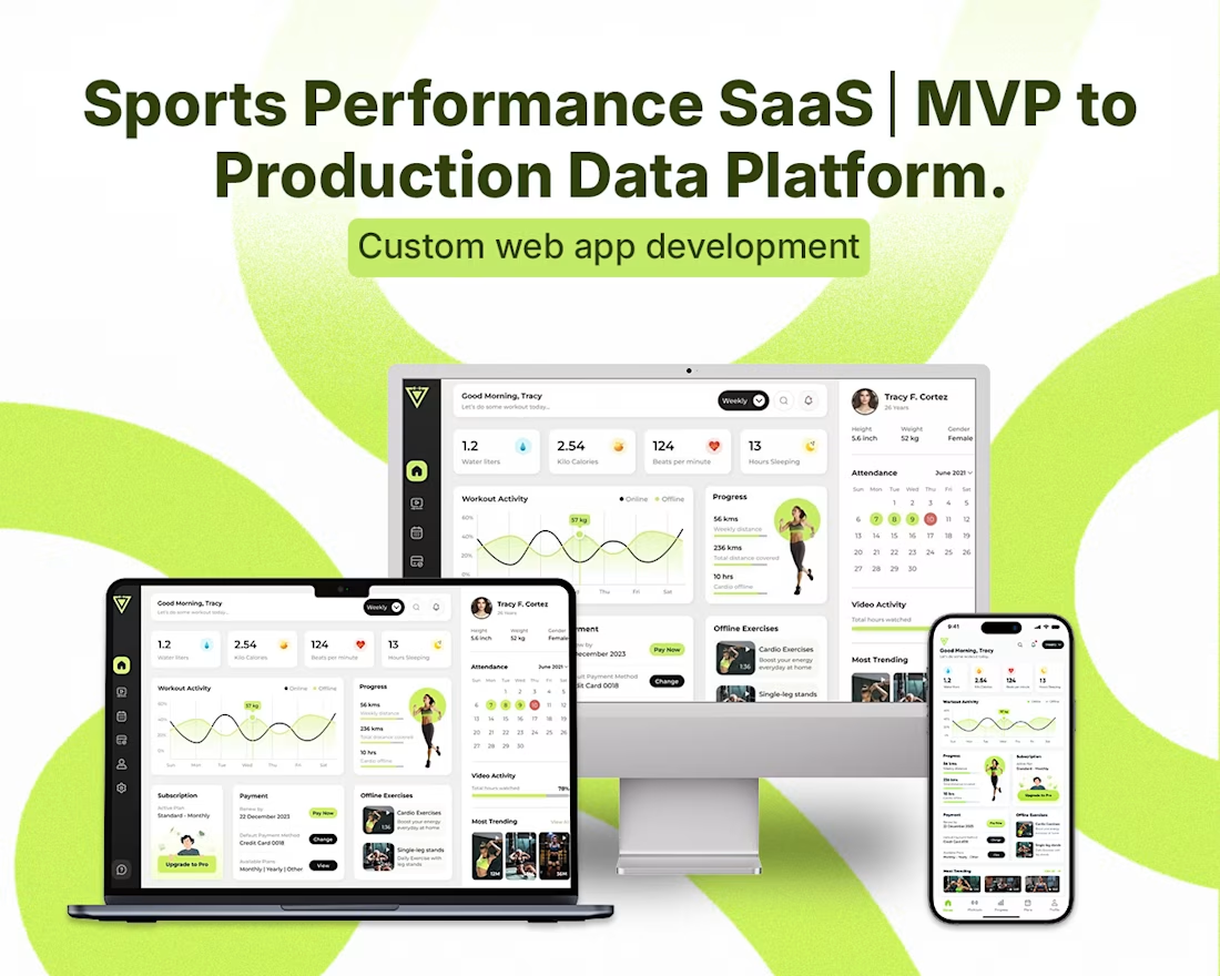
Athliq transformed a fragmented performance-monitoring workflow into a centralized platform.
Instead of moving between multiple browser tabs, spreadsheets, forms, and communication channels, performance teams could access their core athlete information through a unified dashboard.
The platform provided role-specific views, continuously updated performance information, historical context, and actionable signals from integrated data sources.
More importantly, it created a shared data layer for coaches, sport scientists, physiotherapists, and performance directors.
The product evolved from a concept-validation prototype into a production-ready performance intelligence platform.
What Made the Project Interesting
The biggest challenge wasn't simply building another analytics dashboard.
It was translating real-world sports performance workflows into reliable software infrastructure.
The original product concept came from someone deeply familiar with the domain. Our role was to preserve that domain knowledge while introducing the engineering foundations required for scalability, reliability, security, and live data processing.
The result was a system designed around the questions performance teams actually need answered—not simply around the data available to them.
Athliq Today
Athliq has evolved into a multi-role sports performance platform supporting professional and university-level performance environments.
The platform brings together data from multiple sources and transforms it into role-specific performance insights, giving teams a centralized environment for monitoring readiness, training load, recovery, and athlete progression.
From a coach's notebook and fragmented data sources to a scalable performance intelligence platform.


The network for creativity
Join 1.25M professional creatives like you
Connect with clients, get discovered, and run your business 100% commission-free
Creatives on Contra have earned over $150M and we are just getting started











Related posts

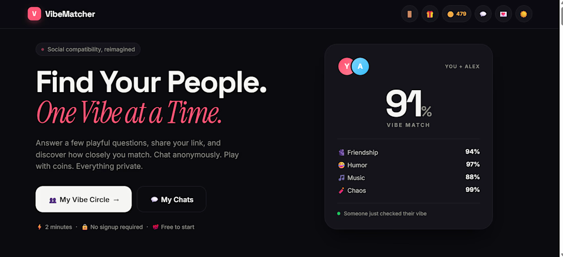
I built VibeMatcher — a fun way to discover how well your vibe matches with your friends!
What if you could compare your vibe with a friend and discover your compatibility in a fun, interactive way?
That's the idea behind VibeMatcher — a social web app I built around vibe matching and shareable results.
✨ What makes it interesting:
- Interactive vibe-matching experience
- Compatibility results and match labels
- Shareable experience designed for friends
- A modern, social-first web interface
🔗 Try it here: https://urvibematcher.vercel.app/
I'm an independent developer exploring ideas, building real products, and improving through hands-on projects.
I'm open to feedback, collaborations, and opportunities to build web apps and SaaS products for clients.
What feature would YOU add to a vibe-matching app? 👀

Sunrise Dental — Clinic Website with Online Booking
A landing page for a neighbourhood dental clinic, built around booking. Patients choose a treatment, pick a free slot and confirm in three steps, without calling. Prices are listed upfront, the hours show whether the clinic is open right now, and the layout works on any phone. Concept project.


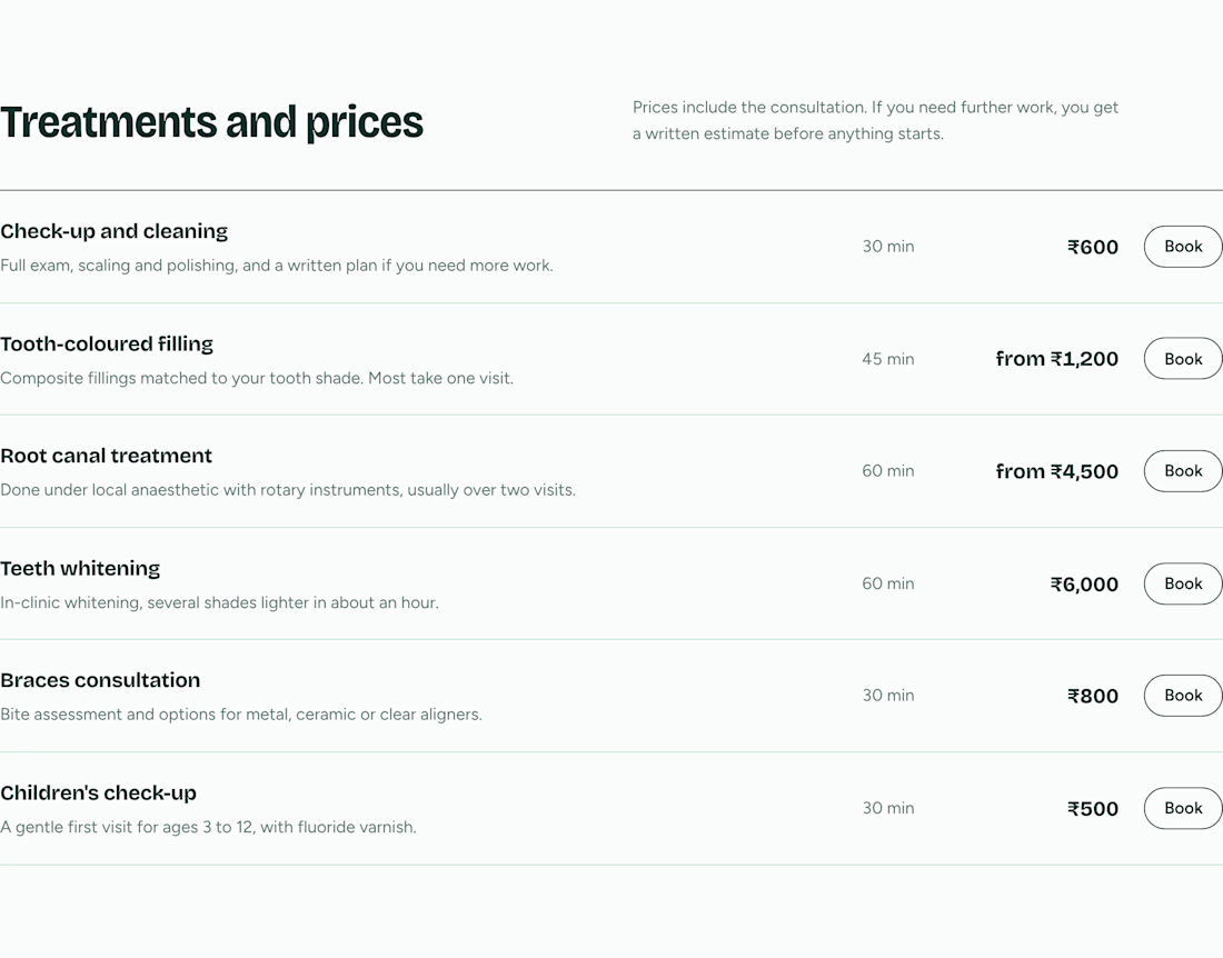
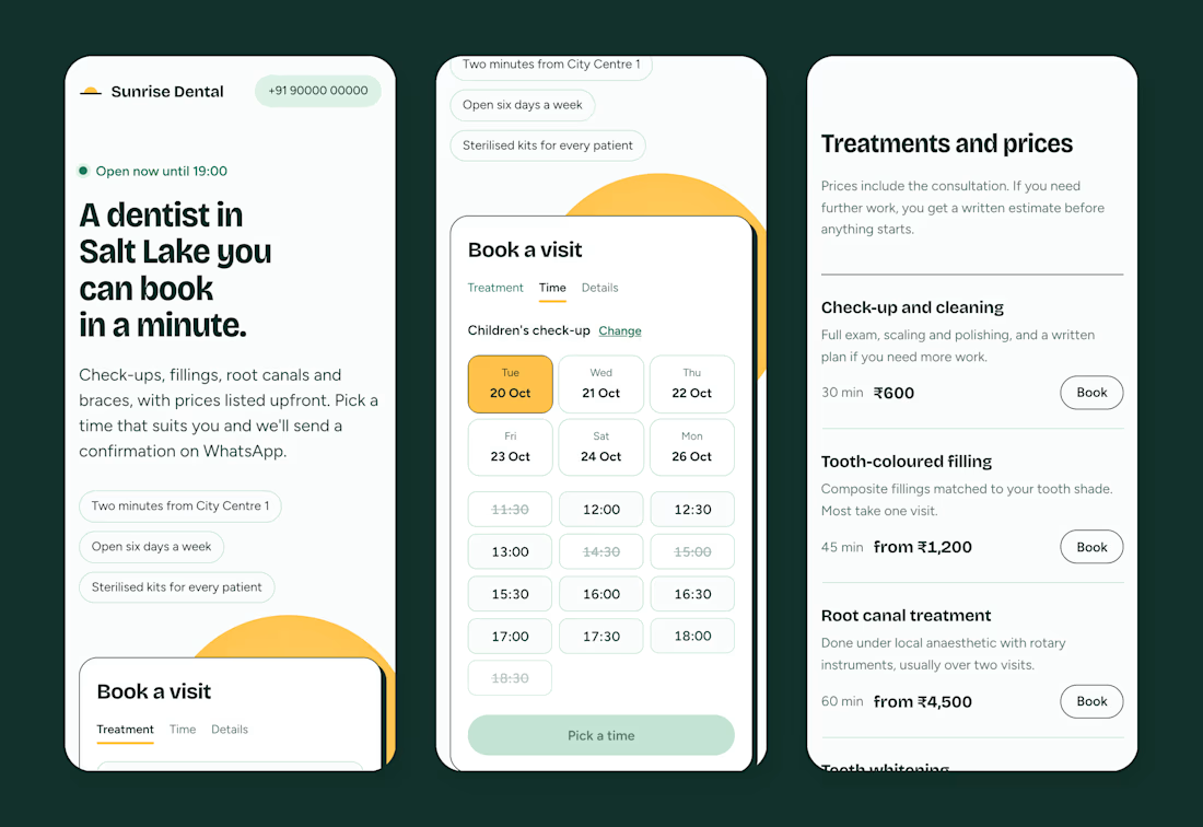
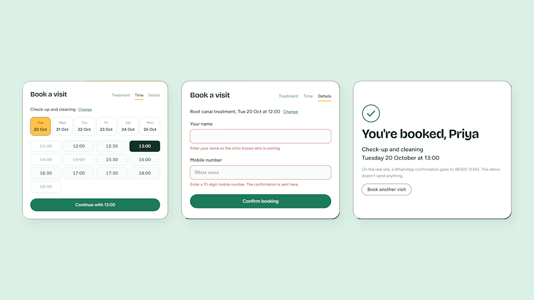
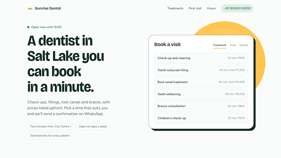

showing whether the clinic is open right now is a really useful detail, and the prices upfront too. are you planning to take it to clinics directly?

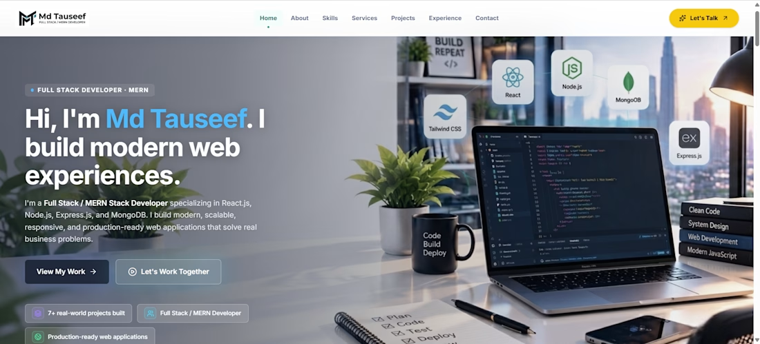
Hi, I'm Tauseef — Full-Stack Web Developer
I'm a passionate web developer focused on building modern, responsive, and user-friendly websites and web applications. I work with React.js, Tailwind CSS, JavaScript, Node.js, Express.js, and MongoDB to create digital experiences that combine clean design with practical functionality.
My work spans business websites, e-commerce platforms, school management systems, CRM applications, and service-based websites. I focus on creating professional interfaces, reusable components, responsive layouts, and well-structured application workflows.
My Projects
1. SK Agro Foods — E-commerce Website
A premium healthy-snacks e-commerce project designed around products such as makhana and sattu. The focus is on product presentation, category-based browsing, premium branding, responsive layouts, and a smooth shopping experience.
Technologies: React.js, Tailwind CSS, JavaScript.
2. Green Hub Environmental Solutions — Business Website
A professional website for environmental and regulatory compliance services, including BIS Certification, EPR Registration, FSSAI, ISO, WPC ETA, BEE, and other business compliance solutions. The project focuses on service discovery, professional branding, intuitive navigation, and responsive UI design.
Technologies: React.js, Tailwind CSS, React Router, JavaScript.
3. Force Strike Martial Arts Academy — CRM System
A CRM application designed for martial arts academy management. The project includes workflows for programs, trial bookings, student management, authentication, role-based access, and payment integration using Razorpay test mode.
Technologies: React.js, Node.js, Express.js, MongoDB, JWT, Razorpay.
4. Mayfield Global School — School Website
A school website concept focused on presenting the institution, campus, educational values, and admission information through a premium visual layout. The design includes a hero section, school information, calls to action, and responsive components.
Technologies: React.js, Tailwind CSS, JavaScript.
5. School Management CRM
A school administration application designed to manage students, parents, teachers, classes, schedules, attendance, academic progress, admissions, enrollments, memberships, and fee management.
The application focuses on organized administrative workflows, role-based access, student-parent relationships, and academic session management.
Technologies: React.js, Node.js, Express.js, MongoDB, JWT, Tailwind CSS.
My Core Skills
Frontend Development — React.js, JavaScript, Tailwind CSS
Responsive Web Design — Desktop, tablet, and mobile
Backend Development — Node.js and Express.js
Database Management — MongoDB
REST API Integration
Authentication and Role-Based Access Control
E-commerce UI and Product Catalogs
CRM and Administrative Dashboards
Payment Gateway Integration
Component-Based UI Development
My Approach
I believe a good website should look professional, work smoothly across devices, and make complex tasks simple for users. I focus on clean code, reusable components, thoughtful UI design, and practical business requirements.
I'm interested in collaborating with businesses, startups, and clients who need websites, e-commerce solutions, dashboards, or custom web applications.
Let's build something useful together.