The network for creativity
Join 1.25M professional creatives like you
Connect with clients, get discovered, and run your business 100% commission-free
Creatives on Contra have earned over $150M and we are just getting started
Back to feedPost
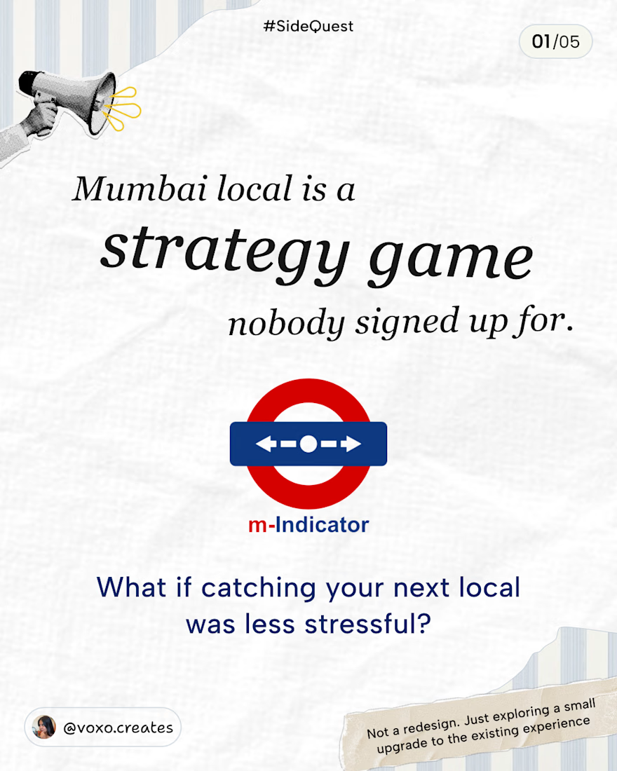
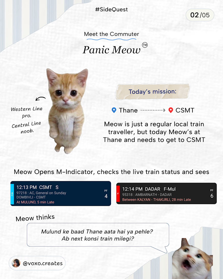
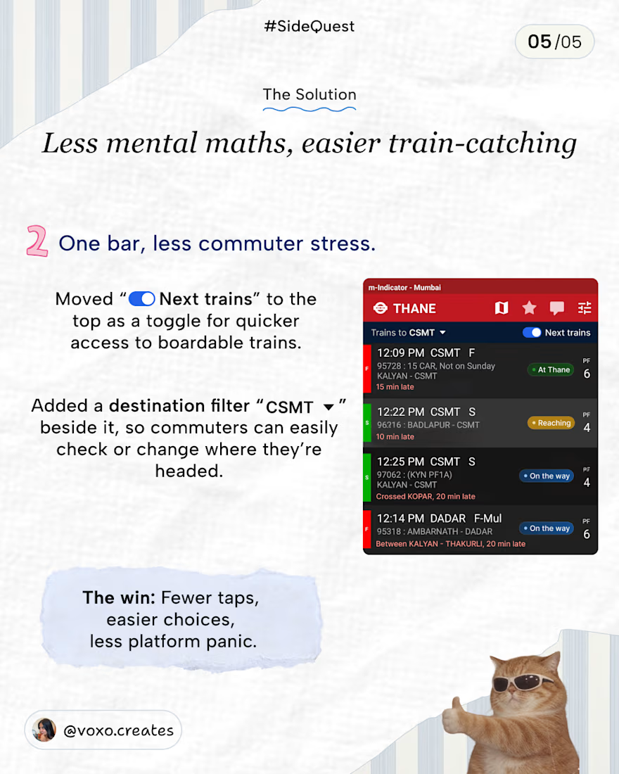
A few weeks ago, I was at Thane station, trying to figure out which train I can catch to CSMT… and let’s just say, it involved a LOT of mental maths.💀
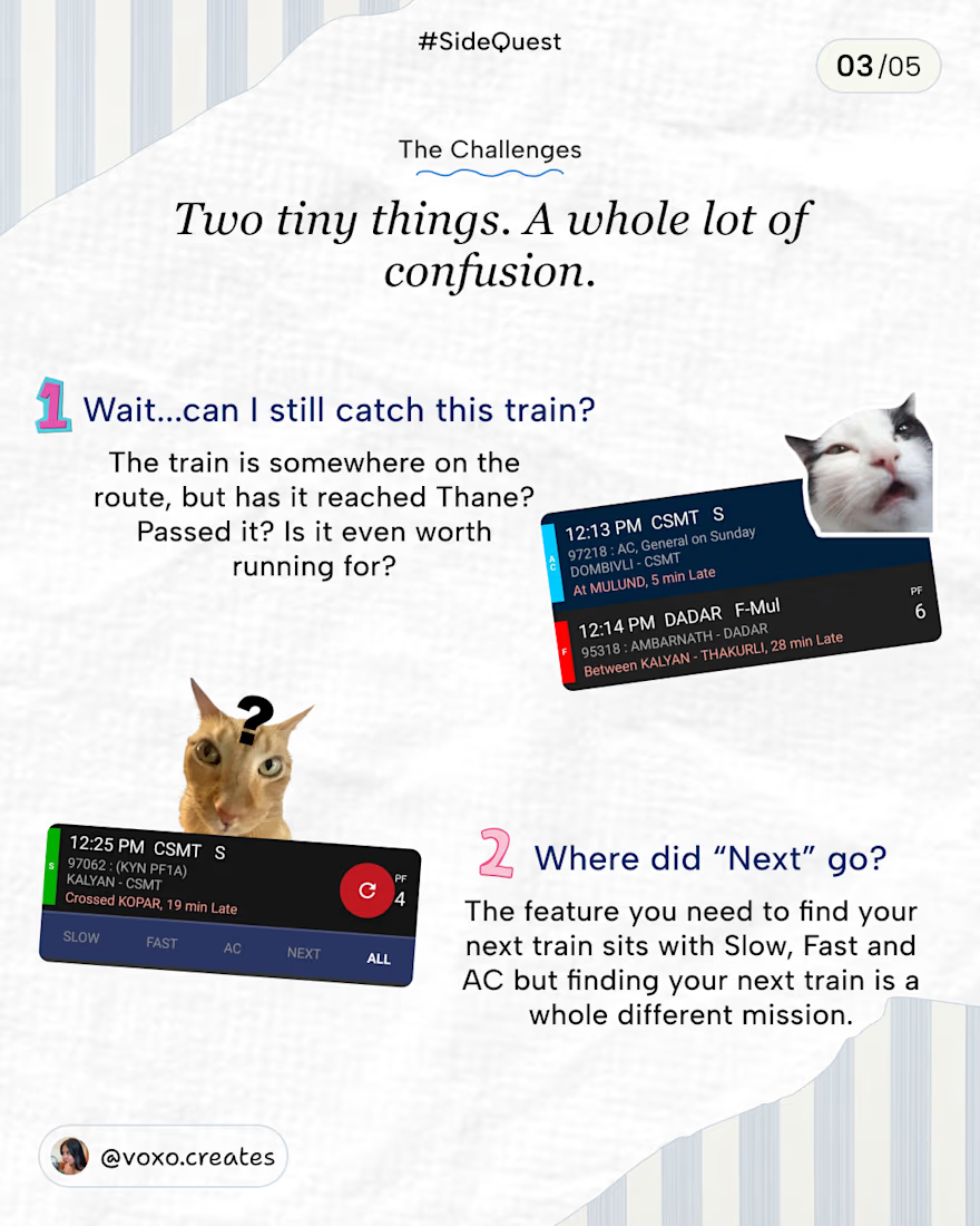
That got me thinking about a couple of small UX improvements I’d love to see in M-Indicator.
This is not a redesign or revamp of M-Indicator! I just wanted to explore how a few small changes could make the existing experience a little easier.
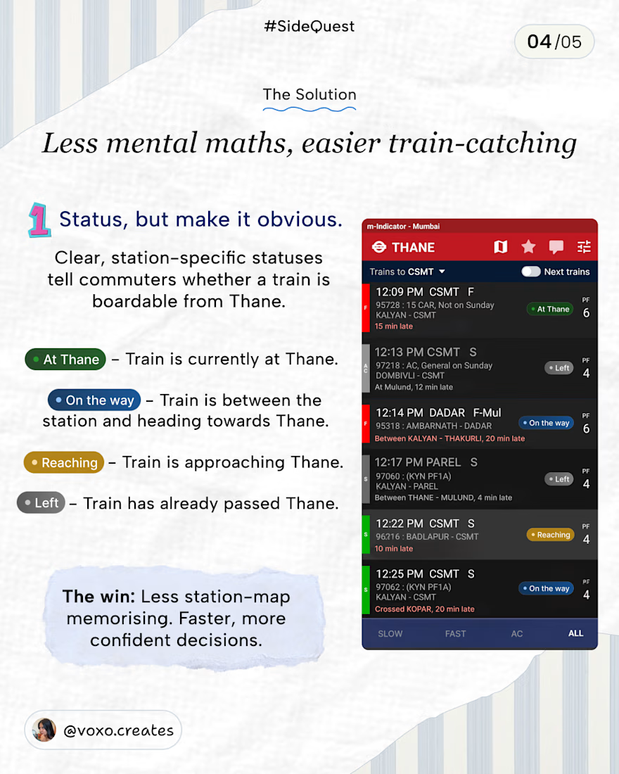
• Clearer train statuses so you know whether you can still board.
• A Next trains toggle that’s easier to access.
• A destination filter you can change anytime.
I’ve tried to account for as many edge cases as I could think of. If I’ve missed any, feel free to share!
What do you think of these improvements? 👀


Since only 4 slides are allowed to attached in a post, sharing the last slide here.
The network for creativity
Join 1.25M professional creatives like you
Connect with clients, get discovered, and run your business 100% commission-free
Creatives on Contra have earned over $150M and we are just getting started



Related posts

🚀 Just completed the UX/UI design and website redesign for Spartan SEM!
The goal was to bring their refreshed brand identity to life with a modern, conversion-focused website and a better user experience.
Really enjoyed working with the team and seeing the design go live!


This is amazing

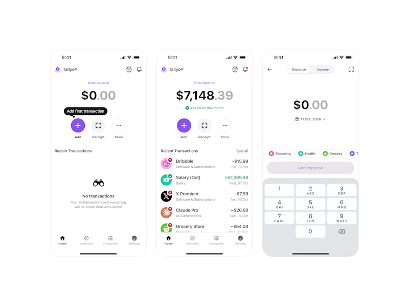
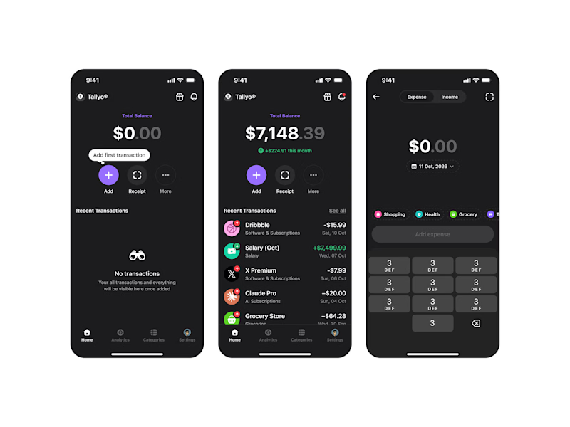

Dark!

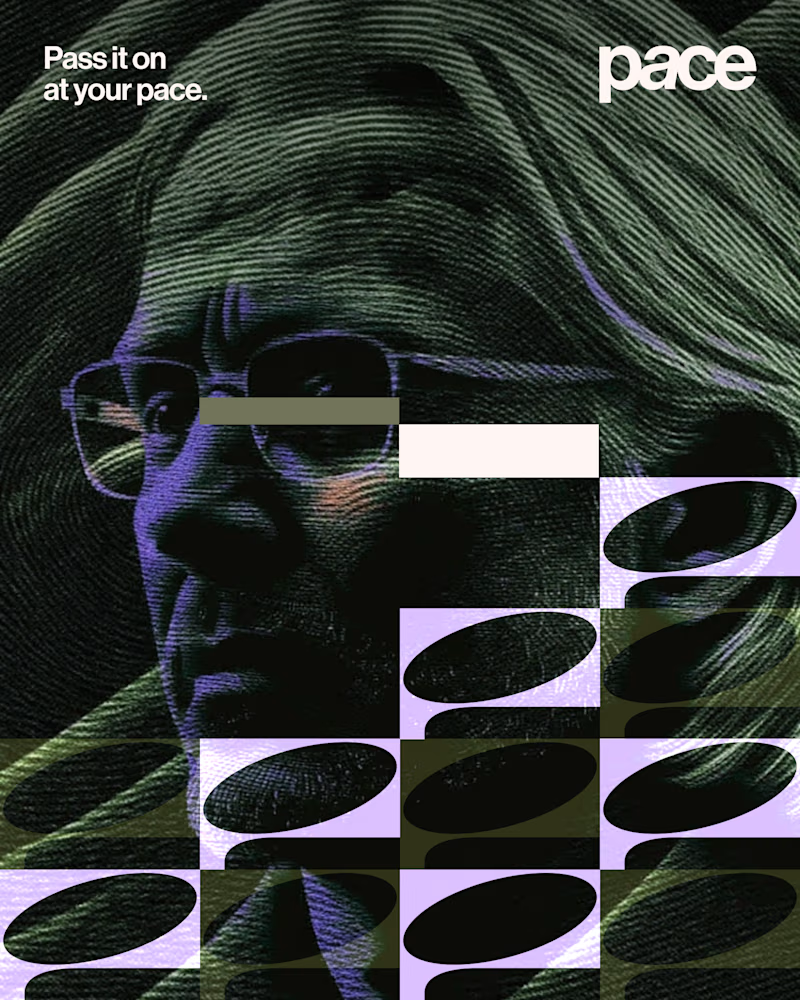
Experimental layouts for Pace. Which one do you like?
23 voted
52%
21 voted
48%
44 votes
Closed

Looks cool.