The network for creativity
Join 1.25M professional creatives like you
Connect with clients, get discovered, and run your business 100% commission-free
Creatives on Contra have earned over $150M and we are just getting started
Back to feedPost


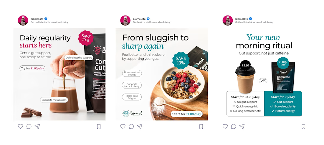

The set feels bright and approachable while still reading as a health product, which is a delicate balance. Which visual choice helped you keep the ads credible without making them feel clinical?

thankk u 😄

Nice how the copy across the three ads builds one narrative (regularity, energy, ritual) instead of just repeating the same offer. Keeps the set feeling like a campaign rather than three separate ads.


This looks clean and well thought out. How long did it take you to bring everything together?

Looks professional

Nice balance between education and conversion. The layouts stay clean even with multiple marketing elements, which is usually where ad creatives start feeling cluttered.

Great Look

love it !

goat
The network for creativity
Join 1.25M professional creatives like you
Connect with clients, get discovered, and run your business 100% commission-free
Creatives on Contra have earned over $150M and we are just getting started




Related posts


wowwwww😍


One prompt → a whole store. We designed what that should feel like 😉🛒✨
WithNation is an AI platform that builds and runs your online store for you.
⚡ We went bold: oversized type, editorial product shots and a product wall that counts up to 2000+ items as you watch.
What do you think of the concept?
Rate it 1-10 👇
creativeaiworkflowwebdesignbranddesignerBrand DesignMotion DesignWeb DesignAdobe After EffectsClaudeFigma


10/10 🔥 the moment the photo turns into that whole product wall got me, I replayed it like 3 times.

Branding work for WithNation
Love the motion, visual style and aesthetics on this one
The concept is to mix the power of creative prompting and allowing everyone to orchestrate their business from start to finish.
Build • Run • Market
The logo represents a shopping bag with the prompting input inside

