The network for creativity
Join 1.25M professional creatives like you
Connect with clients, get discovered, and run your business 100% commission-free
Creatives on Contra have earned over $150M and we are just getting started
Back to feedPost

New project successfully launched!


NEW PAID PROJECT
Malan AsankaRayse Creative
The network for creativity
Join 1.25M professional creatives like you
Connect with clients, get discovered, and run your business 100% commission-free
Creatives on Contra have earned over $150M and we are just getting started

Challenges
View all


Related posts


Done with the branding for Crosta, here's a few glimpses of the bigger project. Working on this has been so much fun 🙌


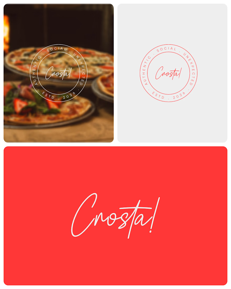
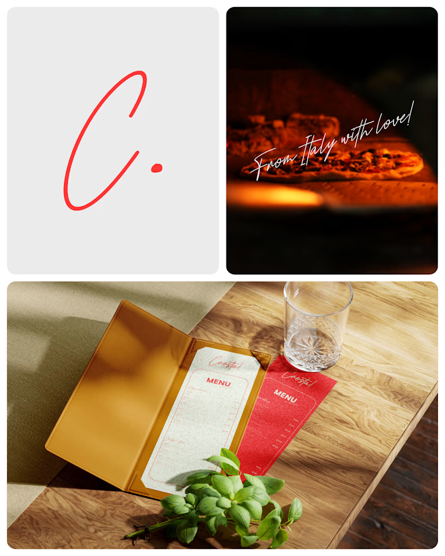

The handwritten wordmark brings a relaxed, social energy that fits the food photography really well, while the red-and-cream palette keeps the system cohesive. I’d be curious to see how the script mark holds up on smaller touchpoints like takeaway stickers or social avatars~

Still finding little moments from this project that I want to share
A few more favorites from the launch video 💜


great work..