The network for creativity
Join 1.25M professional creatives like you
Connect with clients, get discovered, and run your business 100% commission-free
Creatives on Contra have earned over $150M and we are just getting started
Back to feedPost
The faster you solve problems,
the more it looks "easy" and free.
Unstructured calls train the market to undervalue you.
Pro tip 👇
Systemize your process, provide quantified value at each step.
This way you are building on the top and don't undervalue your expertise.
The network for creativity
Join 1.25M professional creatives like you
Connect with clients, get discovered, and run your business 100% commission-free
Creatives on Contra have earned over $150M and we are just getting started
Related posts
A simple pricing upgrade flow designed to make a complex decision feel effortless.
The animation moves from plan selection to successful activation, using clear hierarchy, subtle motion, and focused interaction. The goal was to reduce friction, highlight the important information, and give users confidence before upgrading.
Designed for a UK-based SaaS product with local pricing, secure UK data hosting, and a clean subscription experience.
Would you keep this interaction minimal, or add more product details before the final confirmation?
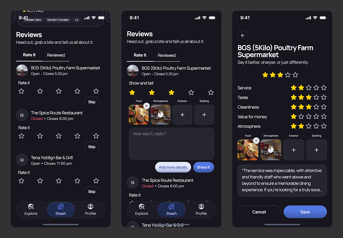
if you only had to master one ux skill as a product designer, it should be progressive disclosure.
don’t show someone a 20-field form all at once.
that’s overwhelming.
first, ask for the basics.
then, ask for the optional stuff.
only ask for details when they’re done with the basics.
pro tip: don't ask for anything you don't absolutely need.
happy friday 🙃
Trending
Claude
Claude has entered the design space. How are you using Claude Design?
Contra University
Learn from expert creatives how to earn more using next-gen AI tools.
fifaworldcup2026
The World Cup is here and the whole world's watching. How are you designing for the world stage?
creativeaiflow
Creative AI workflows are evolving. What tools do you use, and what are their strengths and weaknesses?
freelancerlife
Freelancer life is wins, pivots, and everything in between. What’s yours right now?