The network for creativity
Join 1.25M professional creatives like you
Connect with clients, get discovered, and run your business 100% commission-free
Creatives on Contra have earned over $150M and we are just getting started
Back to feedPost

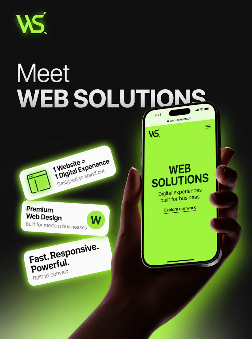
Your website is more than just a page — it’s your digital first impression.
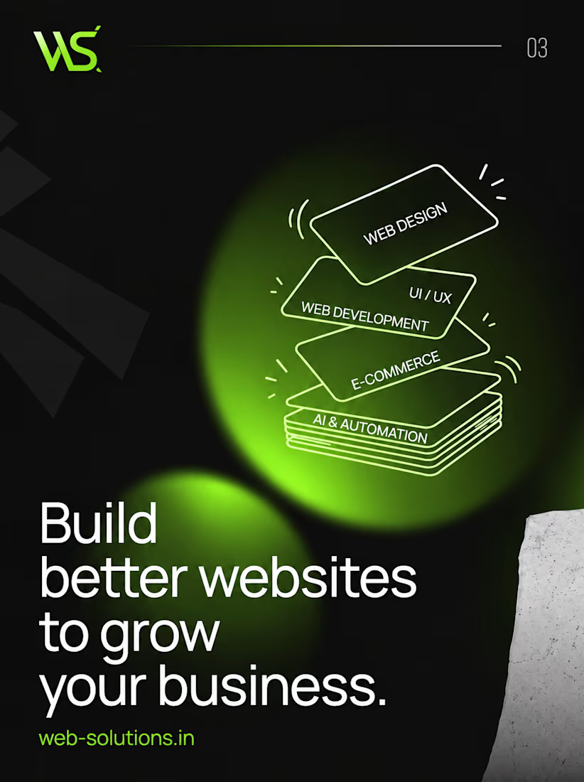
At Web Solutions, we build modern, high-performance websites designed to make businesses stand out and turn visitors into customers.
Modern & premium designs
Fast & responsive websites
Mobile-first experience
Business-focused functionality
Built to convert
Have a business that deserves a better online presence? Let’s build it.
DM us to get started.
#websolutions #webdesign #webdevelopment #website #businesswebsite #webdesigner #webdeveloper #digitalmarketing #smallbusiness #businessgrowth #branding #onlinedigitalpresence

The network for creativity
Join 1.25M professional creatives like you
Connect with clients, get discovered, and run your business 100% commission-free
Creatives on Contra have earned over $150M and we are just getting started




Related posts

Creating immersive digital experiences with smooth website animations ✨
Designed & developed by Usman DevHub Tech & Creative Studio.
We create premium websites with modern UI, interactive animations, and unique visual experiences that help brands stand out. 🚀
Want a website like this for your brand?
DM us and let's discuss your project.
#WebDesign #WebDevelopment #WebsiteAnimation #UIDesign #CreativeStudio #DigitalAgency #UsmanDevHub


that gold bottle swirl looks so good. how long was that clip?

The Last Banner: "Characters" section
Japanese cinematic gaming site concept

Ohhhh this is nice

Which color direction feels right for this digital payment app?
While designing a full digital payment app experience, from bills overview to payment confirmation, I explored two different color systems for the entire flow. Same screens, same functionality, just a different accent palette and personality.
Option 1 - Neon Green. Bold, high-energy, and gives a sharp, fintech-forward feel throughout the journey.
Option 2 - Cyan/Blue. Cool, modern, and leans more premium and trustworthy across the whole app.
Would love your honest UX/UI take, which direction feels more trustworthy, engaging, and appropriate for a digital payment app, and why? 👇
3 voted
38%
5 voted
62%
8 votes
Closed

Cyan/Blue