The network for creativity
Join 1.25M professional creatives like you
Connect with clients, get discovered, and run your business 100% commission-free
Creatives on Contra have earned over $150M and we are just getting started
Back to feedPost

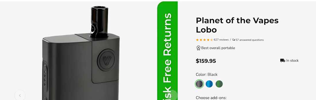
Your reviews are probably in the wrong place.
Most PDPs bury them at the bottom, after specs and shipping info. But shoppers look for proof the moment they hesitate, usually next to the price and the Add to Cart button.
Here's the layout I use on ecommerce PDPs:
Star rating + review count right under the title (tap to jump).
Two or three short snippets near the buy box that answer the top objection (fit, flavor, battery life).
Q&A right after the description, so doubts get answered before they turn into exits.
Full reviews lower down, filterable by use case.
Social proof works best when it shows up at the moment of doubt, not after it.
Where do your reviews live right now?
#Ecommerce #CRO #ProductDesign

The network for creativity
Join 1.25M professional creatives like you
Connect with clients, get discovered, and run your business 100% commission-free
Creatives on Contra have earned over $150M and we are just getting started



Related posts

Photographer Portfolio Website
"Capturing light, emotion, and the moments you never want to forget." That line set the tone, and the layout follows it.
The hero is one motion-blurred portrait washed in red. The photographer's name runs across the bottom in a condensed white face, so large the screen cuts it off. The photo keeps its soft focus, and the name still reads first.
Thin grid lines split the page into narrow columns, and the small copy sits justified inside them. The loose photo gets a strict structure to lean on.
A single round red button with an arrow sits right on the letters and marks where to go next.
Designed by the Hue & Machine team.
#WebDesign #Photography #PortfolioWebsite #EditorialDesign #Typography #UIDesign #ProductDesign #CreativeDirection #ResponsiveDesign #FigmaDesign


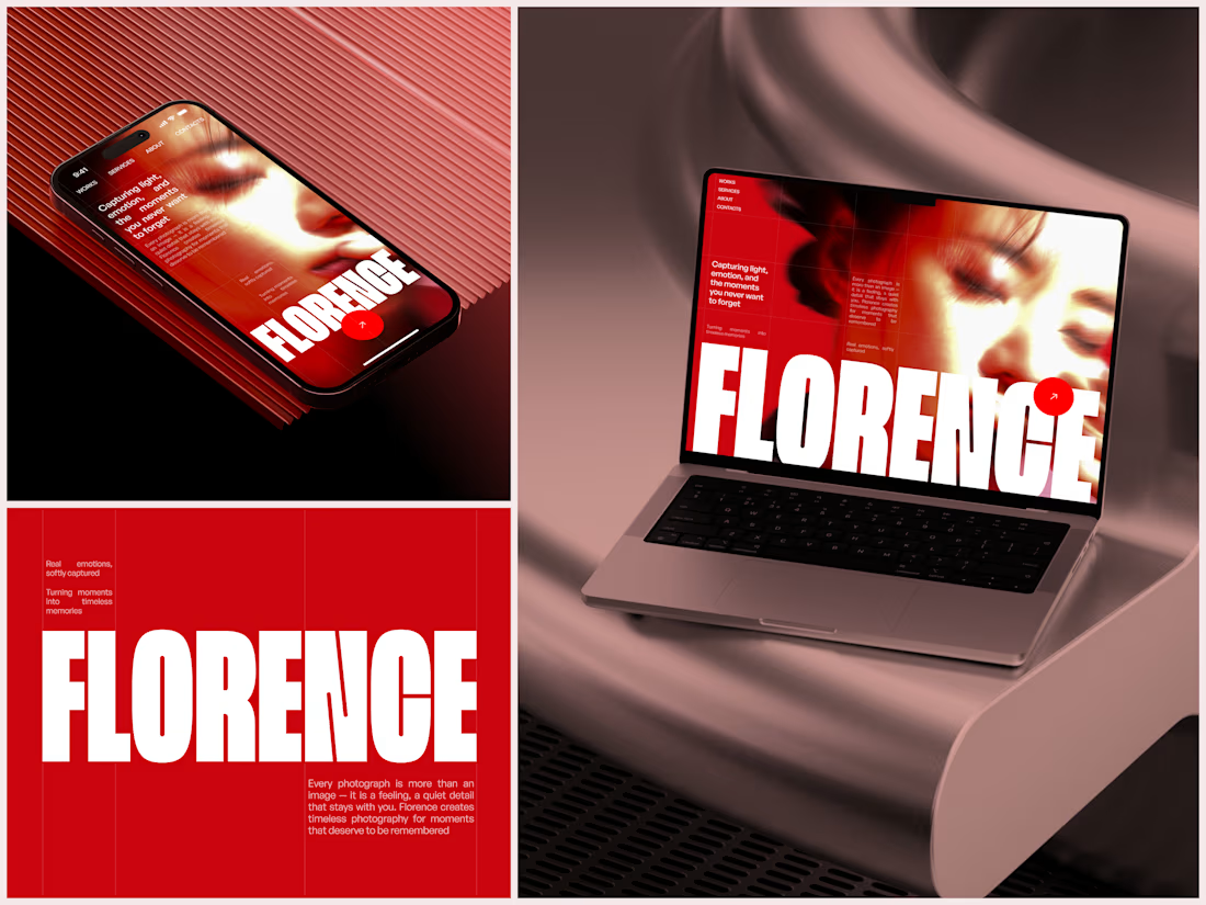

The heavy condensed white FLORENCE over the red portrait is bold, and keeping the same red across phone, laptop and type tile makes the case study read as one system. Did the red come from the photographer's own work, or was it your call?


Brand work for HauntChain
I'm loving building this brand and the results so far
A deFi platform with some gamification


That's cute ❤️